
Contact Sales Now
Thank you! Your submission has been received!
Oops! Something went wrong while submitting the form.

Contact Sales Now
Thank you! Your submission has been received!
Oops! Something went wrong while submitting the form.

Implementing a premium label layout requires precision. A robust packaging layout grid forms the foundation of professional label design. This structural approach ensures every element sits precisely where intended on the physical product surface.
Custom label design grids transform chaotic artboards into a clean label design. Visual hierarchy relies on mathematical spacing rather than visual guessing. This precision separates amateur printing attempts from a truly premium packaging aesthetic.
Mastering label grid alignment guarantees a professional brand image. When managing product label grids you control how consumers scan information. A clean label alignment directly impacts how buyers perceive the value inside the container.
Using label layout grids establishes trust through visual order. Premium product labels demand an organized approach to typography and spacing. This structural methodology ensures your label design layout communicates elegance and sophistication on shelves.
Establishing label alignment rules early prevents costly production errors. A precise label printing layout translates perfectly to the final substrate. Designers use frameworks to guarantee their custom label printing layout meets all manufacturing requirements.
Understanding why grids improve design starts with fundamental spatial logic. A structural framework removes guesswork entirely from your workflow. Designers execute a professional product packaging look by relying on invisible boundaries governing all content placement.
Grids orchestrate perfect visual balance across complex custom labels. You control typographic flow and visual consistency simultaneously. This strict structural discipline ensures your premium labels command immediate attention on heavily crowded retail shelves among competitors.
The underlying architecture of a brand packaging layout dictates its success. Proper structure prevents critical design elements from floating aimlessly. A well executed design relies strictly on these invisible scaffolds to achieve visual harmony seamlessly.
Evaluating how grids improve label layout reveals a stark contrast in print quality. Unstructured designs often fail during the final production phases. Structured files ensure a print-ready label layout that commercial printers process without errors.
Incorporating robust grids accelerates technical review processes. Your team minimizes endless spacing debates when structural rules govern the canvas. This efficiency directly elevates the overall sophistication of the brand packaging layout before reaching the press.
Maximizing design speed and consistency requires strict grid adherence daily. Templates built on solid grids accelerate the entire production pipeline. Teams deploy a label design layout rapidly when structural rules remain constant across all files.
Achieving label design layout speed and consistency eliminates creative bottlenecks. Designers stop debating pixel placements and focus entirely on hierarchy. This streamlined workflow allows rapid iteration without ever sacrificing the underlying visual consistency of packaging.
Maintaining visual consistency across product lines builds strong brand equity. When every file adheres to the same spatial logic you eliminate costly revision cycles. Fast execution paired with precision keeps high-end cosmetic labels on schedule.
Maintaining this rapid rhythm means significantly fewer printing errors. The custom label printing layout translates perfectly from screen to press. Your team scales output efficiently because mathematical rules dictate exactly where new text elements belong.
Speed in deployment never compromises the desired premium look. A systematic approach ensures that every new product variant matches the master file precisely. This structural integrity is vital for maintaining an elevated brand presence globally.
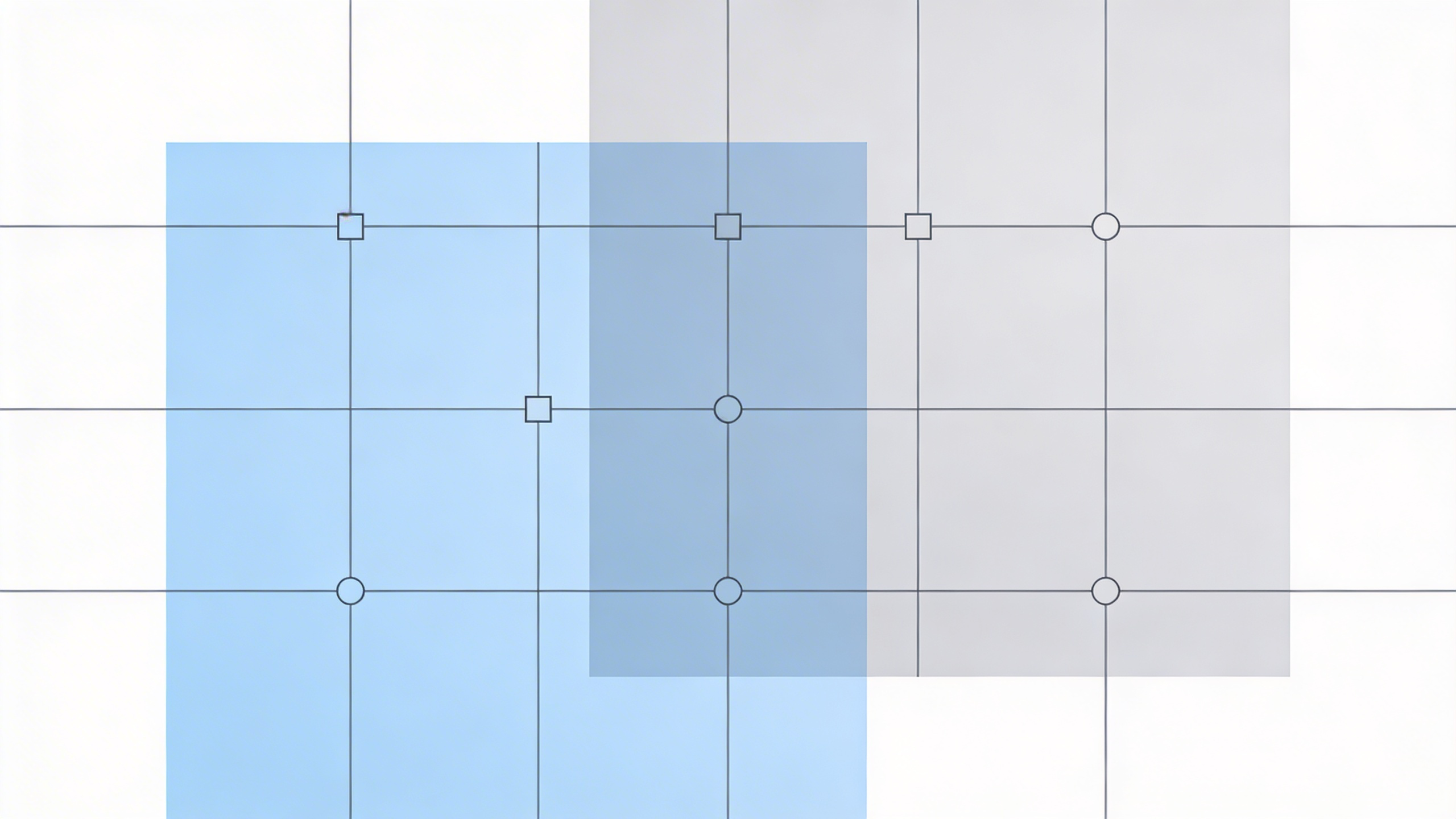
Selecting appropriate grid types for labels depends entirely on content density. Complex nutritional panels demand different underlying structures than minimalist branding displays. Your choice directly influences the final print-ready product label alignment and visual balance.
Different structural formats solve highly specific spatial problems seamlessly. A clean label design aesthetic requires the correct foundational matrix to succeed. Evaluate the total text volume carefully before committing to a specific framework for production.
Flexible frameworks accommodate varying languages and strict regulatory requirements effortlessly. When you anticipate future content shifts you must choose a robust format. This foresight prevents text from overflowing established boundaries during final high speed printing.
The right structural choice ensures print-ready product label alignment consistently. You completely eliminate the risk of critical information shifting near die-cut edges. Extreme precision at this stage guarantees a flawless physical product upon final delivery.
Selecting standard formats streamlines the transition from concept to execution. Designers utilize established formulas to organize dense technical information quickly. This logical structuring ensures consumers can effortlessly navigate complex warning labels and ingredient lists accurately.
Deploying column and modular grids offers distinct advantages for custom packaging. Column structures work perfectly for flowing text like regulatory warnings. They establish a clear vertical rhythm required for standard product packaging and technical copy.
Highly complex designs benefit directly from setting up modular grids for printing. This matrix format handles dense information blocks and isolated graphic elements beautifully. It provides ultimate control over strict layout hierarchy and targeted distribution.
Utilizing column grids for multi-sku packaging streamlines extremely wide product ranges. You assign specific data types to dedicated vertical columns across variants. This strategy maintains order when ingredient lists vary wildly in physical length seamlessly.
Modular systems handle demanding high-end cosmetic labels with absolute ease. The intersecting rows and columns create highly distinct spatial zones. Designers use these specifically defined areas to isolate logos and essential product claims for impact.
Choosing between these grid types dictates how buyers navigate information. Column formats prioritize rapid reading while modular structures highlight individual features. The right grid selection fundamentally enhances the user experience when interacting with physical packaging.
Strict alignment rules for packaging dictate exactly how consumers read your brand. Every text block must anchor firmly to a defined grid line. Proper label typography alignment guides the customer eye seamlessly across the surface.
Executing premium label text alignment requires meticulous attention to microscopic detail. Left-aligned text usually offers the best readability for dense technical copy formats. Centered alignment works best for primary brand marks and establishing short impactful titles.
Designers often wonder does finish affect label alignment on the actual press. The physical substrate absolutely influences final visual perception. Highly reflective surfaces can visually distort how typography appears when viewed from various physical angles.
Absolute precision here prevents any unwanted visual tension. Proper alignment rules for packaging ensure that dense regulatory information remains digestible. You achieve a clean label design aesthetic by forcing every single element to respect boundaries.
Consistently applying standard layout constraints removes cognitive friction. The consumer effortlessly absorbs the core message without getting distracted by disorganized typography. A masterfully aligned label silently communicates incredible product value and strict manufacturing quality control.
Establishing proper label margins and spacing is critical for die-cutting tolerances. You must leave adequate breathing room between text and physical edges. Clean margins prevent critical regulatory information from being accidentally sliced during high speed production.
Using an alignment and margin checklist for printing prevents costly reprints. Always verify that your outer margins exceed minimum printer requirements. This protective buffer zone absorbs the inevitable mechanical shifts that frequently occur on presses.
Consistent internal spacing creates a highly premium packaging aesthetic instantly. The negative space between your text columns is exactly as important as the text itself. Proper label margins and spacing give the design essential breathing room.
Excessively tight margins make custom labels look cheap and incredibly cluttered. Expanding the negative space instantly elevates the perceived value of the physical product. Clean margins frame the primary content perfectly and draw immediate attention.
Applying mathematical ratios to your interior spacing generates natural visual harmony. Utilizing a baseline grid ensures vertical rhythm remains constant throughout the design. This precise spacing logic transforms a standard layout into a sophisticated masterpiece.
Designing for curved container labels introduces highly distinct optical challenges. Flat computer screens lie when representing three-dimensional cylindrical objects visually. You must meticulously compensate for the physical container curvature to maintain structural visual integrity on shelves.
Understanding precisely how curvature affects label margins is absolutely mandatory. Elements placed near the far left and right edges will warp away from the viewer. Expanding your side margins actively counteracts this natural optical distortion accurately.
Mastering exactly how to align text on cylindrical bottles requires centralizing critical data. The primary optical reading zone is narrower than the physical label width. Keep your main branding locked tightly to the absolute center column.
Testing physical mockups reveals the absolute truth about container curvature limits. Wrap a freshly printed draft tightly around the actual bottle to verify your layout. This physical test immediately highlights hidden structural flaws within grid systems.
The best grid for curved containers leverages centralized modules flanked by wide gutters. This specific format naturally pushes essential reading material toward the flat viewing plane. Designers master this technique to ensure optimal legibility under lights.
Establishing incredibly strict label safe zones prevents essential text from vanishing around curves. This interior safety boundary guarantees total visibility from a direct front-facing angle. Never push critical typography past this invisible safety perimeter under any circumstances.
Calculating the exact bleed and margin safe zones for labels requires extreme precision. The bleed extends far beyond the cut line while safe zones retract inward. Both metrics are absolutely essential for a successful print-ready layout execution.
Different physical materials behave quite differently on the printing press. Always consider matte vs glossy safe zones when setting up your final file. Slippery glossy surfaces might shift slightly more during machine application requiring larger safety buffers.
The established bleed and safe area dictate the entirely functional layout space. Respecting these boundaries ensures strict regulatory information remains completely legible. Ignoring label safe zones always results in non-compliant packaging and highly costly mandatory product recalls.
Defining these technical parameters before starting the design phase saves countless hours. The structural limits dictate exactly how large primary typography can scale safely. A verified safe zone acts as the ultimate insurance policy against printing disasters.
Developing highly robust multi-sku label systems demands strict architectural discipline daily. A single master grid must flex to accommodate varying text lengths across different flavors seamlessly. This ensures complete visual consistency across the entire expanded product range.
Successfully maintaining consistency across multi-sku requires highly standardized component placement rules. Logos net weights and barcodes must occupy exact coordinate spaces on every file. This strict discipline perfectly locks in the brand packaging layout across visual variants.
Utilizing specialized multi-sku container grids greatly streamlines the entire production rollout. When you establish solid master templates future product additions become completely effortless. The established layout hierarchy dictates exactly where new content elements belong instantly without debate.
Inconsistent grid spacing rapidly destroys the entire premium packaging aesthetic. When multiple product variants sit side-by-side on a retail shelf any baseline shift becomes painfully obvious. A unified framework ensures all text alignments remain synchronized across lineups.
When rapidly scaling a product line choosing the right finish impacts the entire grid strategy. Premium label finishes physically alter how light interacts with your negative space. Your master layout must account for highly specific material characteristics.
A strict matte vs glossy labels evaluation reveals distinct readability challenges. A highly reflective finish packaging format requires significantly wider spacing to combat glare. The specific finish you choose directly dictates your required micro-typographic alignment adjustments accurately.
Executing a strict custom label checklist guarantees a truly flawless final product. Meticulously verify your structural grid before exporting final production files. This detailed final review process ensures your print-ready product label alignment is absolutely perfect before manufacturing.
Your internal custom label printing checklist must vigorously verify all typography anchors. Carefully check that every single paragraph aligns strictly to the modular or column grid. This rigorous discipline clearly defines how to design a clean premium label.
Thoroughly evaluate which finish best for high-end premium look packaging suits your brand. The physical material dramatically alters the perceived layout hierarchy on the shelf. Fully understand how your chosen finish affects brand packaging decisions before printing.
When carefully analyzing matte vs gloss for product packaging strongly consider the retail environment. Bright overhead lighting interacts very harshly with a shiny finish. The absolute right finish for your layout minimizes visual interference and enhances text readability.
A severe glossy label fingerprint and glare issue can instantly ruin a premium look. Highly reflective materials highlight greasy handling marks almost instantly. Conversely creating elegance with matte coating provides a smooth sophisticated surface that naturally resists smudges.
The endless debate of shiny finish vs understated elegance ultimately comes down to identity. Smooth matte labels look and feel inherently more sophisticated. A vibrant glossy label reflect light dynamically making saturated brand colors pop extremely effectively.
Deeply understand exactly how buyers compare finishes for labels in the retail aisle. They physically touch the product packaging and assess underlying quality subconsciously. Whether using premium matte paper or slick glossy surfaces the tactile experience matters immensely.
Finalize your alignment and margin checklist for printing extremely carefully today. Strictly ensure the bleed and margin safe zones for labels are perfectly respected. A truly professional product packaging look relies entirely on this meticulous final stage precision.
Since you didn't provide a base text, I have written a short, relevant article for you about label manufacturing, naturally incorporating **4 links** from your list using minimal HTML tags for headings (`