
Contact Sales Now
Thank you! Your submission has been received!
Oops! Something went wrong while submitting the form.

Contact Sales Now
Thank you! Your submission has been received!
Oops! Something went wrong while submitting the form.

Selecting the correct finish for product packaging affects more than just aesthetics. The matte vs gloss choice for product labels influences consumer perception, production costs, and the practical durability of the brand. While the design files may look identical on a screen, the physical interaction of light and ink on the matte paper or glossy surfaces alters the final vibrancy and visual impact. Choosing the right label finish can determine whether your custom labels stand out or blend in.
Understanding the differences between matte and glossy finishes allows brands to minimize production errors and achieve a refined look. A label is often the primary touchpoint between a product and a buyer in product packaging. If the label material feels cheap or a non-reflective finish makes the text-heavy areas hard to see under specific bright lighting, sales performance and shelf appeal suffer.
This matte vs gloss comparison moves beyond personal style to analyze specific performance metrics. We will examine how a glossy finish vs a non-reflective finish interacts with ink, how the right finish communicates value, and how environmental factors like refrigeration dictate the longevity of the right label.
Professional print buying requires balancing high-impact visual appeal with functional resilience. By dissecting the structural differences between matte and glossy paper label finishes, help you choose a better choice for your unique design and overall brand strategy.
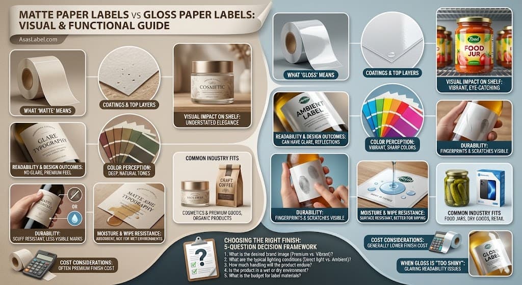
The differences between matte and glossy lie in the microscopic topography of the reflective surface vs a non-reflective surface. It is not merely a difference in "shininess" but a fundamental variance in how the substrate is manufactured. A glossy finish uses a reflective surface to reflect light, while a matte finish provides a muted look that can diffuse light and understate the design for an upscale appearance.
Printers and manufacturers define these terms through distinct gloss units (GU), measured at specific angles for matte paper labels. A high-gloss surface reflects a significant portion of light in a specular direction. Conversely, matte is often chosen for batch numbers or tracking info because it provides a non-reflective surface that reduces glare and works best for your design when readability is paramount.
Designers must understand that the "finish" is an inherent quality of the paper stock or an applied secondary laminate. This right choice depends on every subsequent step of the printing process, from ink absorption rates to drying times and the specific printer model used for custom labels.
Glossy product labels undergo a rigorous manufacturing process known as calendering. During this stage, the bopp or paper web passes between polished steel rollers under immense pressure. This flattens the paper fibers significantly, creating a uniform, smooth surface that gives the gloss label its characteristic shine.
To achieve high-gloss results, manufacturers apply a clay or polymer-based coating to the gloss finishes. This coating fills the microscopic valleys between paper fibers. Look at a gloss label under a microscope, and you will see a relatively flat plane that supports sharp ink holdout and prevents the ink from spreading, ensuring sharpness in the final print.
Matte paper labels generally skip the intense super-calendering or use a coating formulated with coarser particulate matter to absorb ink differently. These coatings create a micro-rough surface texture. This matte paper labels texture is intentional, designed to diffuse light rather than reflect light directly back to the viewer, resulting in a refined appearance.
The coating composition also affects ink absorption for your product labels. Gloss coatings tend to be less porous on the surface, keeping the ink pigment sitting on top for vibrant colors. Matte paper tends to allow slightly more absorption, which integrates the ink into the fiber structure for a softer, more muted look.
In thermal transfer printing, the top layer determines ribbon compatibility for batch numbers and printable areas. A gloss label usually requires a resin or wax-resin adhesive to adhere properly to the slick surface. Matte paper labels are more forgiving and often work well with standard wax ribbons depending on the label printer model.
The behavior of light in a retail environment defines the visual impact of the brand. Store shelves are often flooded with harsh, overhead bright lighting. Gloss finishes reflect light to maximize the "pop" of a product by highlighting vibrant colors and high-contrast designs.
This reflective finish catches the peripheral vision of a shopper. The human eye is naturally drawn to contrast and specular highlights on glossy labels. A glossy vs matte choice here is clear: a gloss label suggests freshness and hydration, which is why it is prevalent in beverage and cleaning sectors where shelf appeal is high-impact.
Matte labels achieve visual impact through differentiation and a refined look. In an aisle dominated by shouting, shiny packaging, matte is often the top choice because it appears solid and grounded. This creates a visual "quietness" that draws the eye by contrasting with the surrounding glossy surfaces.
The refined appearance of matte paper labels implies a natural origin. Because organic materials like wood, stone, and cotton are non-reflective, matte finishes subconsciously signal natural ingredients or artisanal craftsmanship. If you choose matte, it finish also can make your product feel more hand-crafted and upscale.
Readability is the functional baseline of any label. If a customer cannot read the barcode or usage instructions due to glare, the product packaging fails its primary utility. The choice between matte and gloss finishes reflect light differently and alters the contrast ratio and sharpness of typography.
Designers often create files assuming a backlit monitor represents the final output. However, physical substrates add a layer of interference. The label finish interacts with the ink density, potentially causing colors appear differently or washing out details depending on the viewing angle and bright lighting.
The decision between matte and gloss must factor in font weight and size. Heavy, bold types function differently on a reflective surface than thin, serif fonts. Understanding these key differences and how they reduce readability prevents costly reprint scenarios and ensures the product labels are easier to read.
Gloss finishes introduce a significant challenge known as "veiling glare." When direct bright lighting hits a gloss label, it creates a bright spot that acts as a veil, which can reduce readability of the text underneath. The customer must physically tilt the product to read the content, which is never the best finish experience.
For pharmaceutical or regulatory product labels containing small, dense text, this glare is a functional hazard. Matte paper labels are superior for text-heavy applications. The non-reflective finish ensures high contrast and makes information easier to read continuously from almost any angle.
Designers working with gloss finishes should avoid thin, reversed-out text. The ink spread on glossy surfaces, combined with the potential for light reflection, can make fine reverse type disappear. Matte labels stand their ground here, holding these details with greater fidelity for custom labels.
If you choose gloss for branding purposes, typography should be large and bold. High-contrast color combinations help help you choose the right finish to mitigate the readability loss. Essential safety info and barcode areas often use matte for these practical reasons.
The label finish alters the perceived saturation and color vibrancy of the printed ink. Glossy surfaces enhance the "wet" look of the ink, which results in deeper blacks and more vibrant colors. The glossy finish prevents the ink from soaking in, keeping the pigment density high on the surface for maximum sharpness.
Photography, particularly of food or cosmetics, benefits from glossy vs matte decisions that favor gloss. The increased range of contrast and vibrancy makes images appear sharper and more distinct. This is critical for appetite appeal and high-impact visual appeal on retail product labels.
Matte paper labels tend to desaturate colors slightly. As the ink is absorbed into the rougher surface or dries on top of a non-reflective coating, the colors appear more muted. This is not a defect but a stylish choice often used to create a premium look, vintage aesthetic, or a more "natural" paper vs plastic feel.
Blacks on matte paper often appear as dark charcoal rather than true jet black. Designers must account for this "dot gain" and color dulling when they use matte stocks. Adjusting CMS profiles to choose the right paper or bopp is essential for color vibrancy and accuracy.
Color gradients appear smoother on matte labels due to the texture blending the halftone dots. On gloss finishes, banding in gradients can be more visible because the surface reveals every mechanical imperfection. One works best depending on your specific design goals and visual impact needs.
Paper vs film packaging labels are inherently different, and the finish also plays a crucial role in extending the lifecycle of the paper substrate. It acts as a shield against smudge, friction, and humidity. To determine durability, you must look at how the laminate or varnish protects the brand and the barcode.
Consider the lifecycle of the product labels. Durability depends on whether it will sit in a dry pantry or face refrigeration and moisture. The right finish determines how quickly the label material degrades visually after being touched by multiple consumers. Durability depends on the label type and the specific environment.
Durability is not just about the paper tearing; it is about the image remaining pristine. A label that looks scuffed or shows every fingerprint smudge degrades the premium look, even if the adhesive remains strong and the barcode is still scannable.
Glossy finish labels are magnets for a fingerprint. The smooth surface provides a perfect background for sebaceous oils to remain visible. On dark-colored glossy labels, a single touch can leave a permanent smudge that ruins the upscale visual appeal.
Matte labels excel at hiding fingerprints and are often the top choice for handled goods. The micro-texture of matte paper labels breaks up the oil residue, making handling marks invisible. This makes matte a better choice for products that are picked up frequently, such as hand creams or upscale food jars.
Conversely, matte finishes are more susceptible to "polishing." If matte paper tends to rub against cardboard during shipping, the friction can flatten the micro-texture. This creates shiny scuff marks, while glossy surfaces resist this specific type of friction-based polishing because the surface is already smooth.
Glossy labels stand better against scuffs but are more prone to showing micro-scratches. A key scratch on a gloss label reflective surface will reflect light, making the damage highly visible. Matte labels explained often mention that while they "polish," they hide micro-scratches better than their glossy vs rivals.
Standard matte paper is porous and loves water. When paper fibers absorb ink and moisture, they swell. The finish also acts as the first line of defense. Glossy vs matte durability often favors gloss here, as liquid beads up on a glossy finish rather than soaking in immediately.
Gloss paper labels generally offer better inherent moisture resistance for refrigeration needs. The heavy clay coating and calendering process create a tighter seal over the fibers. Matte labels are often better if they are actually a film-based bopp with a matte finish, rather than raw matte paper.
Matte paper labels allow moisture to wick into the stock faster due to their open surface structure. If you use matte for a refrigerated product, choose matte with a "wet strength" adhesive or a specific varnish to survive condensation without the label finish bubbling.
For wipe resistance, gloss label options are usually superior. If a product drips (like honey or oil), a gloss label can often be wiped clean with a damp cloth without a smudge. A matte finish will likely stain as the liquid penetrates the non-reflective surface before it can be removed.
Certain industries have gravitated toward specific matte and gloss finishes over decades of marketing. These key differences create consumer expectations. Breaking these conventions can be a disruptive strategy, but it requires a right choice depends on the specific market and target audience.
Understanding the standard application for matte labels vs gloss labels helps in competitive analysis. If every competitor uses glossy finish labels, matte is often used for immediate differentiation. However, if the category signals quality through shine, a matte finish might look dull compared to the vibrancy of a gloss finish.
The choice often correlates with price point. Higher price points often leverage the refined look of textures (matte), while volume-driven commodity product labels utilize high-impact visuals (gloss) to catch the shopper's eye quickly on the shelf.
The luxury sector heavily favors matte labels. High-end cosmetics, boutique spirits, and organic brands use matte to signal sophistication and a premium look. The non-reflective finish allows the consumer to appreciate the brand and the logo without the distraction of glare.
Matte finishes provide a tactile experience. When a consumer picks up a luxury box, the slightly rough or "soft" feel of matte paper labels conveys substance. It feels like a deliberate refined appearance rather than a mass-manufactured output, fitting a more personal style.
Foil hot-stamping is a common technique in this sector. Gold or silver foil contrasts beautifully against a matte labels background. The shine of the foil pops significantly more against a non-reflective surface than it does against competing gloss finishes.
Minimalist design trends rely on matte paper labels. When a label features abundant whitespace, glossy surfaces can look cheap or like plastic. Use matte to give that whitespace a texture that feels like art paper, enhancing the visual appeal and upscale feel.
The "center store" aisles—canned goods and sauces—are dominated by glossy product labels. In this environment, the purchase decision is quick. The high-contrast, saturated colors and color vibrancy supported by gloss stocks grab attention rapidly through maximum vibrancy.
Visual fidelity of food photography is paramount here. A picture of a tomato sauce needs to look wet and appetizing. Matte paper often dulls these colors, making the food look dry or old. Gloss label material mimics the natural sheen of fresh produce and increases appetite appeal.
Dry goods like flour or sugar are exceptions where matte is common. Here, the matte paper labels align with the texture of the product inside. However, for jars containing viscous liquids (jams, pickles), gloss label finishes reinforce the "wet" nature of the contents.
Retail environments with chaotic lighting favor gloss for durability but matte for readability. However, brands often prioritize "shelf-pop" over readability in this segment, leading to the dominance of glossy finish choices across most categories.
Budget constraints often dictate the final specifications of a print run. Generally, standard glossy finish and matte paper labels are comparable in price for the base material. However, the total cost of ownership involves setup fees, the type of adhesive, and the final visual impact required.
In digital printing, the label finish is often determined by the substrate. In flexographic printing, the finish is often a liquid varnish or laminate applied at the end. This adds a tooling cost to the job, making the matte and gloss decision a financial one as well.
Hidden costs arise from application issues. A matte paper labels stock that is too stiff may not apply well to curved bottles, leading to waste on the bottling line. One works best depending on your machinery and the specific shape of your container.
Semi-gloss paper is frequently the standard "house stock" for many label converters. Because printers buy it in bulk, it is often the best finish for economic efficiency. Opting for a specific upscale matte paper can be considered a "custom order," increasing your label material costs.
Achieving a true matte look on a durable label often requires an additional spot varnish or a matte laminate. Gloss label laminate is standard, but matte coatings are slower to cure and sometimes more expensive, driving up the cost of premium matte labels.
Gloss coatings are often standard UV curable liquids. These are inexpensive and run at high speeds on the press. Specialized "soft-touch" matte paper tends to be more expensive per pound, which is an important factor to help you choose between the two.
There is an opportunity cost to choosing the wrong finish. Gloss is sometimes perceived as "cheap" or "plastic" in specific demographics. If your brand targets the eco-conscious market, a high-gloss synthetic bopp label can alienate the customer base, whereas matte is often seen as more natural.
Over-glossed labels can make a barcode difficult to scan under bright lighting. If the scanner light reflects too harshly off the glossy finish, it results in scan failures at checkout. This leads to retailer fines, making matte finish a safer choice for logistics and batch numbers.
Using matte varnishes over gloss paper can be a middle-ground solution. However, if the registration is off, the product labels look defective. The cost of quality control increases with the complexity of mixing finishes to get the perfect works best for your design result.
Decision paralysis is common when holding sample swatches. Both matte labels and glossy labels have merits. The choice should not be based on personal style, but on the functional environment and how you want the brand to be perceived in the market.
Consider the complete packaging system. The label finish should complement the container. Matte labels explained often focus on contrast; a matte label on a glossy bottle creates a refined look. A gloss label on a gloss bottle creates seamless, high-impact integration.
Testing is non-negotiable to determine durability. Apply physical prototypes to the container and place them in the actual lighting environment. The theoretical design often fails the practical reality test of glare, fingerprint smudge, and readability.
Use this framework to eliminate guesswork when you choose the right paper or bopp for your paper label finishes: