Contact Sales Now
Thank you! Your submission has been received!
Oops! Something went wrong while submitting the form.

Contact Sales Now
Thank you! Your submission has been received!
Oops! Something went wrong while submitting the form.

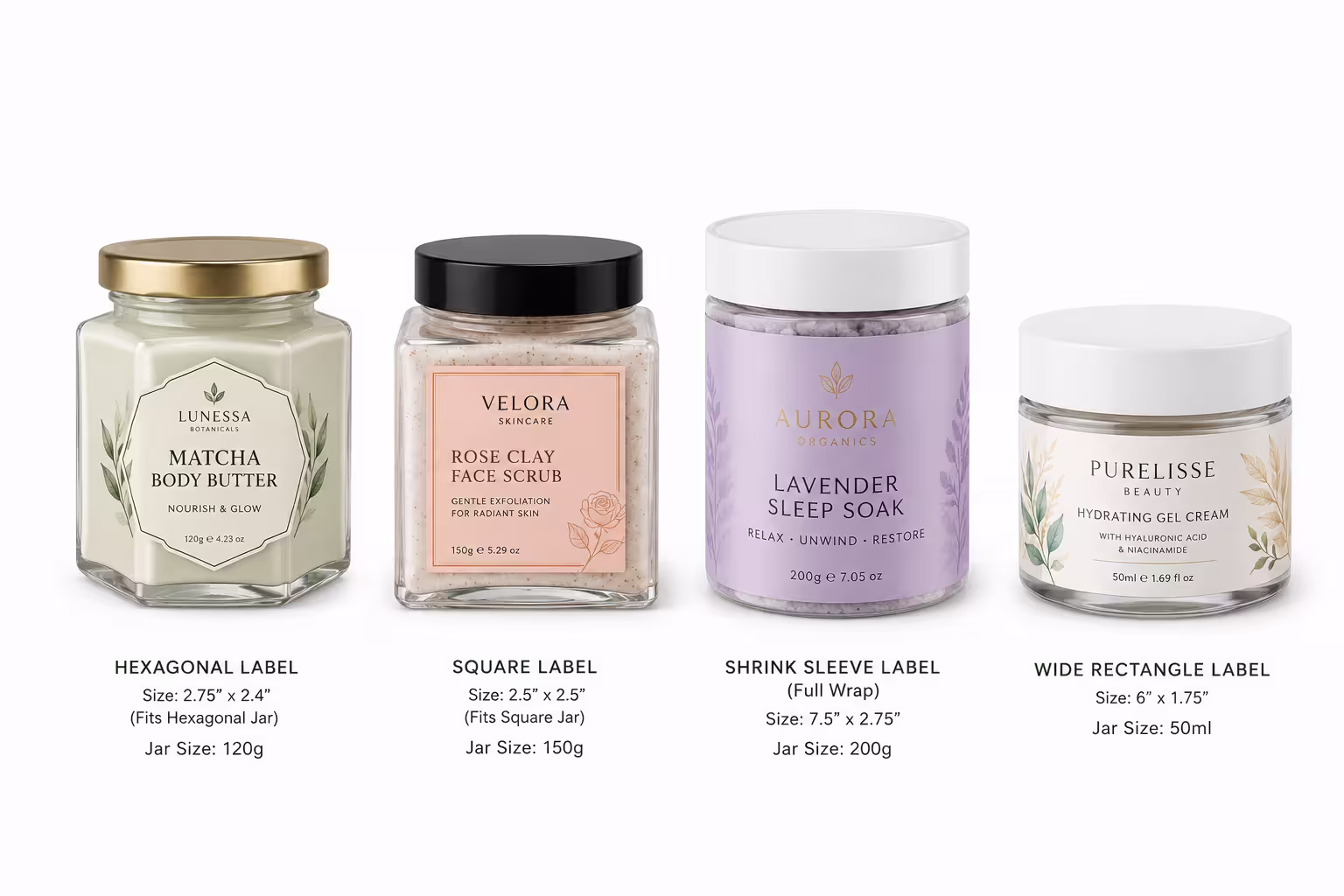
Hexagonal and square jars already have a strong shape, so the label must respect the container geometry. A poorly sized label fights the jar angles, while a clean front panel makes balms, creams, and scrubs look structured and premium.
These labels are ideal when the container shape is part of the product value. The label should enhance the glass edges, keep the front face balanced, and support a premium skincare or body care story.
Geometric jars need label formats that align with the flat panels. Front and back labels usually work better than full wraps because they preserve the shape and avoid awkward corner bending.
Glass jars pair well with materials that feel refined and print with high detail. Clear films keep the jar visible, textured papers add tactile value, and metallic films can elevate limited edition or luxury ranges.
The adhesive should bond firmly to glass without creating bubbles on the flat face. For tamper seals or labels near corners, the adhesive must also handle slight bending without losing grip.
Finishing should make the geometric shape feel intentional. Matte and soft-touch finishes create a refined skincare feel, while foil, embossing, or spot UV can highlight the logo without overwhelming the flat label panel.