Contact Sales Now
Thank you! Your submission has been received!
Oops! Something went wrong while submitting the form.

Contact Sales Now
Thank you! Your submission has been received!
Oops! Something went wrong while submitting the form.

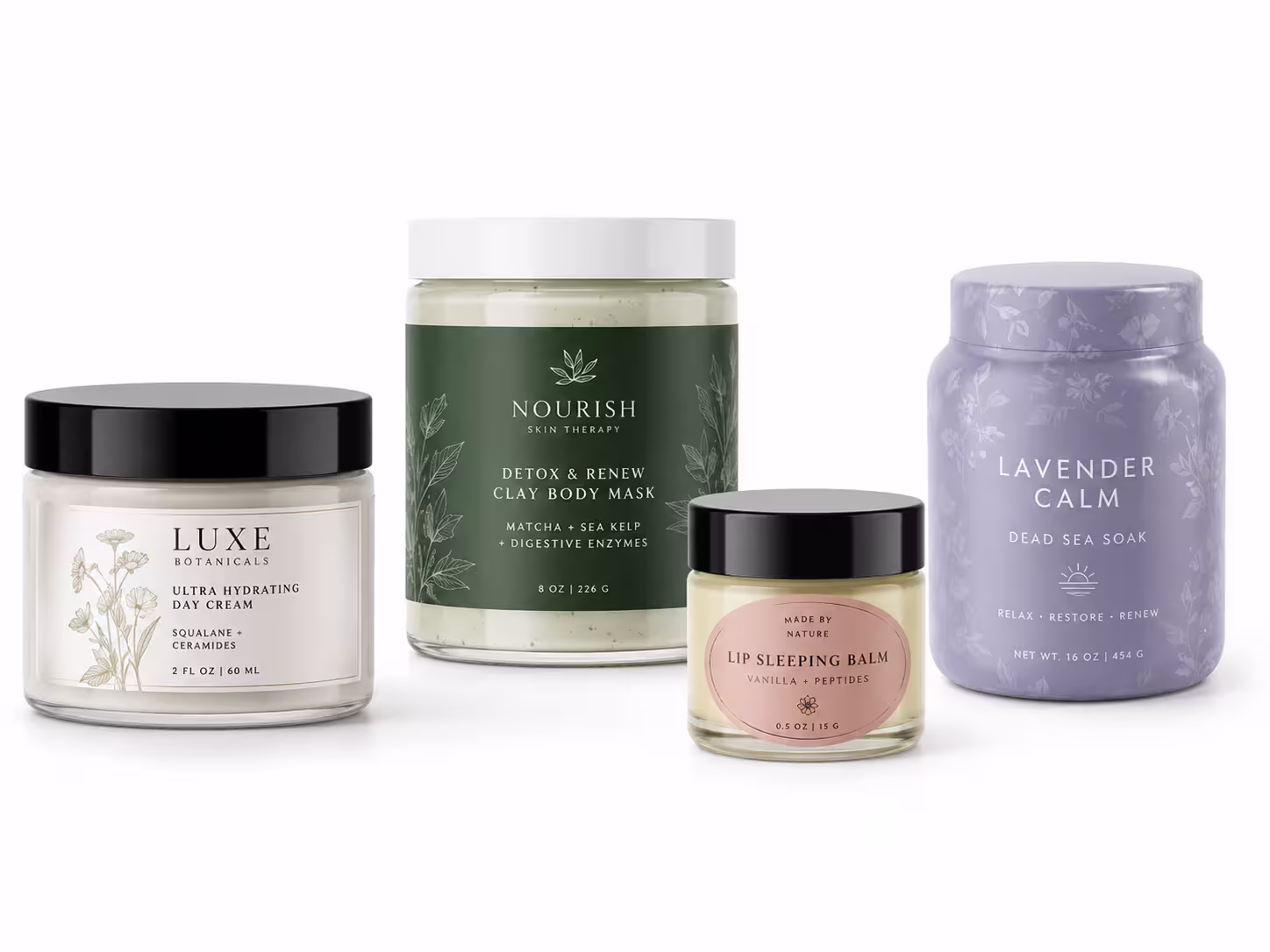
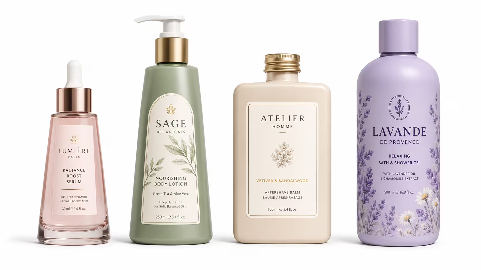
Wide-mouth cosmetic jars give customers a direct view of texture, color, and fill quality. The label must make the product feel clean and premium while guiding the eye across the lid, side wall, and base without hiding the jar shape.
Jar labels work well for products where texture is part of the buying decision. The format should support strong front branding and enough space for ingredients, usage directions, batch details, and safety information.
Cosmetic jars often need more than one label because customers view them from different angles. A coordinated set keeps the packaging consistent and prevents the lid, base, or tamper area from looking like separate design pieces.
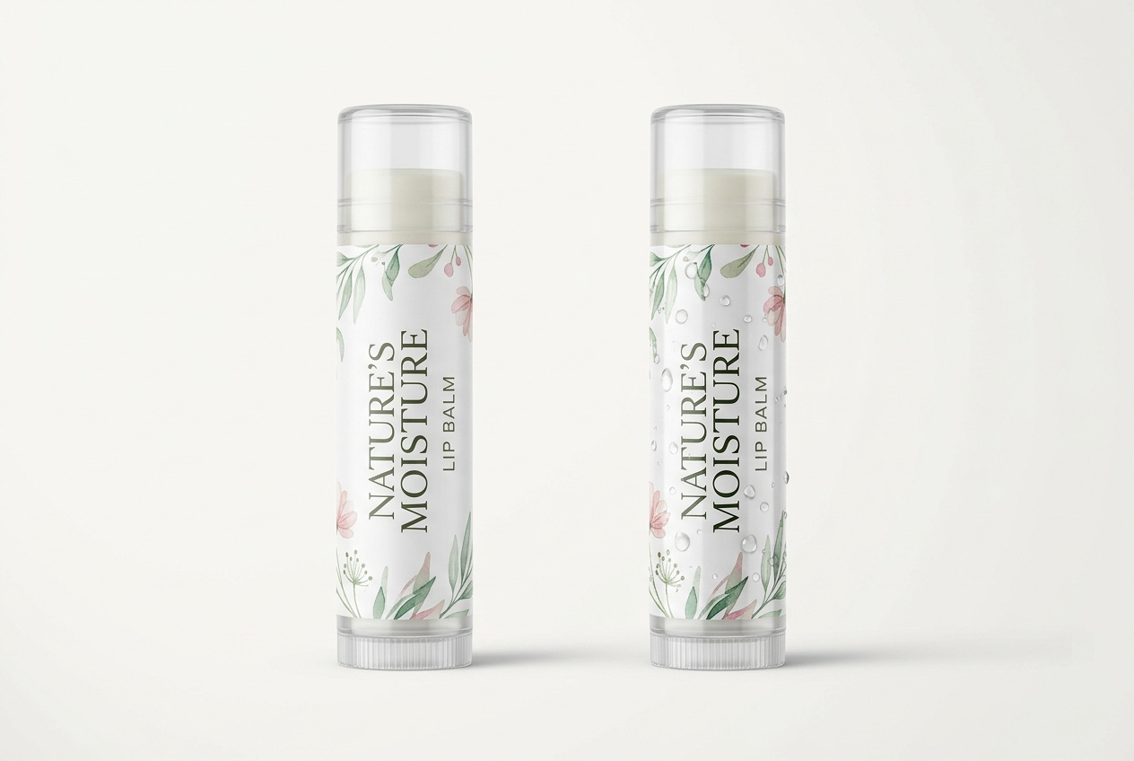
Jar labels need materials that print cleanly and resist oils, moisture, and finger contact. The right material depends on whether the brand wants a luxury paper feel, a wipeable film surface, or a transparent label on clear plastic or glass.
The adhesive must match the jar surface and the label position. Side wall labels need flexibility, base labels need flat adhesion, and tamper seals need enough grip to show product protection without tearing too early.
Finishing makes a jar feel more expensive even before it is opened. Matte creates a soft skincare look, gloss improves color depth, and foil or spot UV can highlight the logo, ingredient story, or product range name.