
Contact Sales Now
Thank you! Your submission has been received!
Oops! Something went wrong while submitting the form.

Contact Sales Now
Thank you! Your submission has been received!
Oops! Something went wrong while submitting the form.

The globally harmonized system of classification constitutes the backbone of modern chemical safety and international trade. Implementing these protocols ensures that hazard communication remains consistent across borders, reducing reliance on variable national standards. Supply chain efficiency depends directly on this uniformity.
Adhering to these standards is not merely about regulatory compliance or avoiding fines. It creates a seamless flow of critical safety data from the laboratory to the end-user. Accurate GHS chemical label creation acts as the first line of defense against workplace accidents and environmental contamination.
The globally harmonized system of classification and labeling of chemicals is a logic-based framework developed by the United Nations. It creates a universal standard for defining health, physical, and environmental hazards. This system of classification and labeling replaces the patchwork of hazardous material regulations that previously complicated global trade.
Adoption of this framework varies slightly by country, with competent authorities like OSHA in the United States integrating it into the hazard communication standard (HCS). The core objective remains identifying intrinsic hazards and communicating them clearly. It shifts the focus from performance-based standards to specific, prescriptive classification criteria according to osha.
This GHS system utilizes a "building block" approach. This allows meaningful hazard classification of chemicals at various stages of their lifecycle, from production to disposal. Understanding this modularity helps professionals navigate the specific requirements of their jurisdiction while maintaining international compatibility.
The framework links the safety data sheet (SDS) directly to the container label. Any discrepancy between the codified data in the SDSS and the physical label constitutes a compliance failure. This synchronization ensures that the detailed technical safety data supports the immediate visual hazard symbols found on the product.
The primary purpose of this harmonization is the protection of human health and the environment during chemical handling. By utilizing standardized elements and hazard symbols, workers can instantly recognize dangers regardless of their native language. This visual recognition is critical in emergencies where reading detailed text takes too long for workplace safety.
Facilitating international trade serves as the second major purpose. Previously, exporters had to re-label products for every destination country, incurring significant costs and logistical delays. A single, unified globally harmonized system of classification streamlines the movement of hazardous substances significantly.
Consistency reduces the administrative burden on chemical manufacturers and distributors. Maintaining a single database of classifications that applies to multiple markets increases operational efficiency. It allows regulatory teams to focus on accurate ghs classification rather than navigating conflicting regional rules.
Agencies use these GHS labels to enforce workplace safety protocols effectively. When inspectors see a ghs chemical label that is compliant, they can immediately correlate it with the facility’s hazcom program. Non-standard labels trigger deeper audits and potential citations for failing to meet the "right-to-know" requirements.
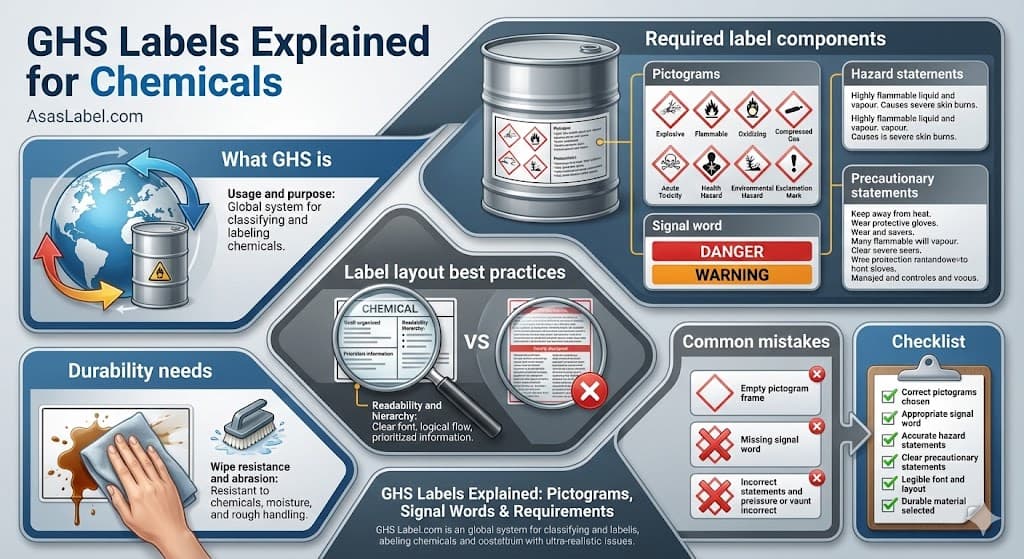
Regulatory bodies mandate six specific label elements on every hazardous chemical container. These components must appear together on the ghs label and remain legible throughout the product's lifecycle. Missing any single component, such as the product identifier, renders the product misbranded and creates liability.
The arrangement of these GHS-compliant labels does not have a strictly mandated template, but all information must be located prominently. The logical flow of label components provided by the manufacturer aids in quick cognition. Designing these labels requires balancing regulatory text density with visual clarity.
The product identifier serves as the primary link to the safety data sheet. It must match the product name or code exactly as it appears on the material safety data sheets. This traceability is non-negotiable for emergency response teams identifying unknown substances during spills in the U.S. and abroad.
Supplier Identification provides the necessary contact information. This includes the name, address, and telephone number of the manufacturer, importer, or other responsible party. This ensures that downstream users can reach the source for emergency hazard information or technical clarification.
GHS pictograms act as the most immediate visual indicator of risk. These symbols consist of a black hazard pictogram on a symbol on a white background, framed by a red diamond. The red border is mandatory; a black border is not compliant under OSHA or EU CLP regulations.
There are nine pictograms designated by the United Nations, each representing a specific hazard class. Physical hazards include flammability involving the "Flame" symbol, or oxidizers depicted by the flame over circle. These alert handlers to risks of fire or explosive reactions immediately.
Health hazards utilize symbols like the skull and crossbones for acute toxicity. The "Health Hazard" pictogram, depicting a silhouette with a starburst on the chest, indicates chronic risks. These encompass carcinogenicity, respiratory sensitization, or target organ toxicity.
The "Exclamation Mark" hazard pictogram serves as a catch-all for less severe health hazards. It indicates risks such as skin irritation, eye irritation, or skin sensitization. It often replaces other hazard symbols for lower category risks but never appears alongside the skull and crossbones.
Transport pictograms differ slightly but the standardized GHS system takes precedence for workplace labels. While transport diamonds deal with immediate emergency response during shipping, GHS pictograms focus on workplace safety during use. Both may appear on chemical containers, but the workplace label requires the red diamond.
The signal word indicates the relative level of severity of the hazard. There are only two authorized signal words in this labeling system. GHS uses “danger” to represent the more severe hazards, while “warning” is used used to indicate less severe hazards.
A ghs label will never contain both signal words. The classification logic dictates that if the chemical triggers a “danger” classification, “warning” shall not appear. This hierarchy prevents confusion and ensures the user can indicate the severity of the maximum risk level immediately.
Some low-hazard chemical products generally classified in lower categories may not require a signal word at all. However, if the classification criteria are met, the presence of the word is mandatory. Determining this requires precise analysis of the toxicological data provided by the manufacturer.
Typography for the signal word plays a crucial role in label components. It generally appears in uppercase bold letters to distinct it from the rest of the text. It serves as the textual anchor for the user's attention, right next to the GHS pictograms.
Hazard statements describe the hazards of the chemical, including the degree of hazard. These are GHS hazard statements assigned to a specific hazard class and category. Manufacturers cannot paraphrase these standardized phrases; they must appear exactly as codified.
Each statement corresponds to a specific H-code in the globally harmonized system of classification. For example, "Highly flammable liquid and vapor" is a specific string of text. These codes (like H225) help internal tracking, but the full text must be labeled on the actual container for the user.
Users may see multiple hazard statements on a single ghs chemical label if the mixture poses multiple risks. A solvent might be both flammable and corrosive. In such cases, all relevant ghs hazard statements must be listed to provide a complete risk profile for every hazardous chemical.
Grouping these ghs hazard statements logically helps with readability and handling hazardous materials. They are usually placed below the signal word and GHS pictograms. For a complex mixture, the calculation of these hazards involves cutoff values and bridging principles defined in the osha’s hazard communication standard.
Precautionary statements provide standardized measures to minimize or prevent exposure and adverse effects from exposure. These are actionable ghs precautionary statements for the user. They cover four distinct areas: Prevention, Response, Storage, and Disposal.
Prevention statements include instructions like "Keep away from heat/sparks/open flames" or "Wear protective gloves." These are proactive measures that must be taken before interacting with the hazardous chemical. They set the baseline for safe operation according to OSHA standards.
Response statements dictate immediate actions following accidents to prevent exposure. Phrases such as "If in eyes: Rinse cautiously with water for several minutes. Remove contact lenses if present and easy to do" provide critical first-aid guidance. These instructions must be accurate to the hazards associated with the chemical products.
Storage requirements often specify temperature ranges or incompatibility warnings, such as a gas cylinder that must be stored under pressure. "Store in a well-ventilated place" is common for volatiles. Improper storage is a leading cause of chemical hazard incidents and facility fires, making this section vital for safety training.
Disposal statements ensure environmental compliance and prevent environmental hazards. They direct users to dispose of contents in accordance with local, regional, and international regulations. This prevents chemical products from being poured down drains or tossed in general waste, which attracts severe environmental pictogram related penalties.
Effective GHS chemical label design goes beyond essentially checking boxes for specific information. The layout must guide the eye through the label elements in a priority sequence. In a high-stress environment, the user must be able to identify the hazard instantly without searching.
Grouping related information creates cognitive efficiency in workplace labels. The signal word and GHS pictograms should usually sit close together, often at the top or left side of the ghs label. This establishes the immediate "Stop and Look" reaction required for health and safety.
Use ample white space to prevent the label from looking like a wall of text and causing "warning" fatigue. Cluttered labels lead to safety issues where users ignore the text entirely. Separating the hazard statements from the precautionary statements with spacing or subtle lines improves processing speed for those handling hazardous materials.
Orientation matters based on the chemical containers shape. For cylindrical drums, a curved landscape orientation might be necessary. The vital hazard information must be visible without rotating the heavy container, ensuring that the chemical hazard is visible from the approach angle.
Font legibility is paramount in industrial environments where labels are required to be clear. Using sans-serif fonts like Arial or Helvetica ensures that characters are distinct even when the label is slightly damaged or viewed from a distance. Decorative fonts have no place in GHS-compliant labels.
Hierarchy is established through point size and weight in the labeling system. The product identifier and signal word should command the largest text size. Hazard statements generally follow in a medium weight, while detailed ghs precautionary statements may slightly reduce in size but must remain legible.
Contrast ratios must be high to remain compliant. Black text on a white background is the standard for a reason. Colored backgrounds for text areas are generally discouraged as they can reduce contrast and make it difficult to inhale or read specific safety information under poor warehouse lighting.
Regulatory bodies often suggest minimum font sizes based on container capacity according to OSHA guidelines. A small vial requires a different approach than a 55-gallon drum. However, even on small containers, the text must be labeled to be readable without magnification to be considered compliant with the standard for classifying and communicating hazards.
A ghs label that falls off or fades to white is a regulatory violation. The physical integrity of the label components is just as important as the hazard information printed on it. Industrial environments present harsh conditions that standard office paper labels cannot withstand.
Chemical manufacturers must anticipate the environment where the container will be stored. This includes exposure to sunlight, extreme temperatures, and humidity. Marine shipments face saltwater spray, demanding the highest tier of GHS-compliant labels and adhesive performance to prevent exposure to every hazardous chemical.
Adhesive selection differs based on the container material. Low-energy surfaces like polyethylene and polypropylene plastics are notoriously difficult for standard adhesives. Specialized high-tack adhesives are required to prevent "flagging" or peeling at the edges of workplace labels.
The substrate material usually shifts from paper to synthetic stocks like vinyl or polyester. These materials resist tearing and moisture absorption. A disintegrated paper label during a safety training audit is an immediate red flag for inspectors regarding overall occupational safety and health administration standards.
The ghs chemical label must resist the very contents of the container it identifies. If a solvent drips down the side of a bottle, it must not dissolve the ink or the material safety data. Wipe resistance is a critical performance metric for compliant labels used for handling hazardous substances.
Thermal transfer printing generally offers superior durability for workplace labels compared to direct thermal or standard inkjet. Using resin ribbons on synthetic labels creates a bond that resists harsh solvents. This ensures the ghs precautionary statements and target organ toxicity warnings remain complete even after spills and cleaning.
Abrasion resistance protects the ghs label during transport and handling. Containers rub against each other on pallets and conveyor belts. If the pictograms or skull and crossbones scratch off, the hazard communication is lost, and the package becomes a hazard class violation.
For maritime shipping, BS 5609 certification is the gold standard for GHS in 2012 and beyond. Section 2 tests the persistence of the adhesive after three months of seawater immersion. Section 3 tests the print durability, ensuring every hazardous chemical label survives a catastrophe at sea and allows users to inhale air safely without toxic exposure.
One of the most common mistakes is "over-labeling" or providing conflicting information. This occurs when old workplace labels are not fully removed or covered, leaving two different signal words visible. This creates dangerous ambiguity for workers handling hazardous materials and is an instant citation.
Failing to update labels when the safety data sheet changes poses a significant legal risk. If new toxicological data shifts a chemical from a Category 2 to a Category 1 health hazard, the ghs chemical label must be updated within a specific timeframe. Stagnant label data implies a lack of hazard classification process control.
Improper labeling of secondary containers is rampant in many facilities. When workers transfer chemicals from a large drum to a spray bottle, that bottle requires a ghs label. Leaving secondary containers blank or marking them with shorthand codes violates the osha's hazard communication "right-to-know" principle.
Using "blank" red diamond borders is prohibited for ghs-compliant labels. Some pre-printed stock comes with four empty red diamonds. If a chemical only requires two GHS pictograms, the other two cannot be left empty; they must be blacked out or the label stock changed. An empty red diamond suggest a missing hazard pictogram.
Incomplete supplier identification frequently appears during safety and health audits. Labels that lack a product identifier or phone number prevent immediate contact during emergencies. The supply chain moves fast, but traceability requires complete specific information on every individual unit provided by the manufacturer.
Does the product identifier match the safety data sheet exactly? Confirm that the name, code, and batch numbers align perfectly with the material safety data sheets. This is the first thing inspectors verify when checking if every hazardous chemical is must be labeled correctly.
Are the correct GHS pictograms displayed with red borders? Ensure no black borders are used for hazard pictograms and that no empty diamonds remain on the label. Visual confirmation of the flame over circle or gas cylinder symbols must happen before the print run begins.
Is the signal word consistent with the hazard class and category? Check that “danger” and “warning” do not appear simultaneously on the ghs chemical label. Use the classification logic from the sds to validate the single choice according to osha standards.
Are all GHS hazard statements and precautionary statements included verbatim? Verify that no text has been truncated to fit the ghs label layout. Ensure the P-codes cover prevention, response, storage, and disposal adequately to prevent exposure and adverse effects.
Does the label material survive the fingernail and tape test for workplace safety? Perform a basic adhesion and scratch test on the chemical containers. If the ink smears or the ghs label peels easily, upgrade the substrate and ribbon combination immediately to maintain high-quality safety and health standards.
Is the supplier information up to date on every hazardous chemical? Verify that the phone number is active and the address is current. Ghost addresses on chemical labels create significant liability during incidents and safety training exercises in the workplace.