
Contact Sales Now
Thank you! Your submission has been received!
Oops! Something went wrong while submitting the form.

Contact Sales Now
Thank you! Your submission has been received!
Oops! Something went wrong while submitting the form.

The cosmetic industry relies heavily on visual packaging and skincare labels to convey value. A consumer often judges the efficacy of a serum or moisturizer based entirely on the quality of its container and cosmetic label before ever testing the product. High-end beauty products require high-end packaging solutions to justify price points and ensure labels stand out.
Labels serve as the primary interface between the brand and the buyer, especially for skincare products. Unlike dry goods, skincare products exist in challenging cosmetic packaging environments. They face humidity, water exposure, and direct contact with oils and chemicals, meaning a product label that peels, fades, or bubbles destroys brand integrity instantly.
Professional skincare branding requires a technical understanding of label material must survive bathroom humidity alongside graphic design. The interplay between the container surface, the adhesive chemistry, and the label stock determines the longevity of the skin care labels presentation. Aesthetic choices must survive the bathroom environment.
Visual appeal drives the initial purchase, but durability drives brand loyalty for skincare labels. A luxury face oil that looks pristine on the shelf but loses its gold foil branding after two weeks of use signals poor quality to the consumer. The priority is maintaining the "unboxing" look and feel throughout the cosmetic product lifecycle.
This balance requires foresight regarding how the product is used in various cosmetic containers. A cleanser stored in a shower experiences different stressors than a night cream kept on a vanity. The skincare labels engineering must match the specific use case of the SKU rather than applying a blanket solution across a product line.
Durability issues often arise from the product contents themselves when labels are exposed to moisture. Essential oils, salicylic acid, and alcohols act as solvents. If these ingredients drip onto a standard paper label or an unprotected ink layer, they will dissolve the design; therefore, durability and moisture resistance are not optional in this sector.
Humidity poses a unique threat to adhesive integrity and paper labels fibers. Steam in a bath products environment penetrates porous materials, causing them to swell. This swelling creates unsightly wrinkles and eventually leads to the edges of the label separating from the container completely.
Substrates that absorb moisture are generally unsuitable for bath products like cleansers or scrubs. Even with a matte finish or gloss laminate coating, water vapor can enter through the exposed edges of the label. Once moisture compromises the edge, making the label peel, the adhesive bond weakens rapidly.
Temperature fluctuation accompanies humidity for labels for your beauty products. A product might move from a cool warehouse to a hot delivery truck and finally to a steam-filled bathroom. The biaxially oriented polypropylene or other material must expand and contract at a similar rate to the container to prevent bubbling or flagging.
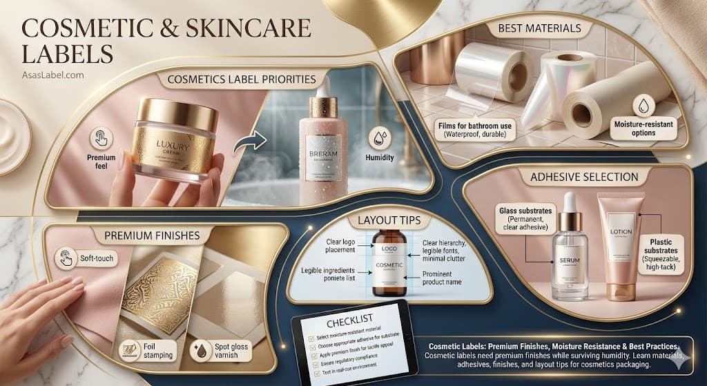
Material selection dictates the final label looks and the functional lifespan of the skincare products packaging. While paper labels offer an artisanal aesthetic suitable for organic positioning, they require a custom label engineering approach to survive liquid contact. Synthetic film labels act as the industry standard for specific reasons.
Polypropylene and polyethylene film labels dominate the cosmetic packaging landscape because they are impervious to water and oils. These custom clear film labels allow the skincare labels to maintain structural integrity even when submerged. They offer a smooth canvas that accepts high-definition label print and intricate metallic foil to the label embellishments.
The selecting the right label material choice between rigid and conformable films depends on the container. A rigid glass bottle can accommodate a stiff biaxially oriented polypropylene (BOPP) label. A squeezable tube requires a flexible film label that can deform and return to shape without creating permanent wrinkles or letting labels stay askew.
Biaxially oriented polypropylene stands out as the premier label stock choice for products stored in wet environments. This material creates a robust barrier against moisture and resists tearing. White BOPP labels provide a clean, clinical background often associated with premium skincare brands and high-potency serums.
Clear BOPP labels facilitate the "no-label look" popular in luxury skincare packaging. This transparency allows the product texture and color to shine through, integrating the skin care labels directly with the container surface. Achieving this effect requires clear film labels and flawless application to avoid trapped air bubbles.
Metallic films offer a third visual design element. Silver or gold substrates allow designers to print colors over the metal, creating shimmering, metallic hues without the cost of foil stamping. These film labels retain the moisture resistance properties of standard plastic films while skincare labels stand out on the shelf.
The chemistry between the label adhesive and the container surface defines the success of the skin care labels application. This relationship is governed by surface energy, measured in dynes. Mismatched surface energies result in edge lifting, tunneling, or labels also delaminating during shipping.
Adhesion labels function by "wetting out" or flowing across the substrate surface. A high surface energy container allows the adhesive to spread easily, creating a strong bond. A low surface energy surface repels the adhesive labels, preventing it from gripping the label material effectively, which is why labels play a key role in container selection.
Cosmetic packaging vary wildly in surface energy. Glass and PET plastic generally offer high surface energy, making them easier to label. Polyethylene (PE) and Polypropylene (PP) packaging have low surface energy, requiring aggressive label adhesive or surface treatment like flame treatment to ensure a permanent adhesive bond.
Glass cosmetic containers are dimensionally stable and chemically inert. They accept a wide range of standard label stock and permanent adhesive options. The primary challenge with glass is the rigid nature of the material combined with potential surface irregularities; skincare labels often require a thicker adhesive coat weight here.
Plastic skincare products tubes present a kinetic design element challenge. As the consumer squeezes the tube, the surface area changes. A stiff label material or a rigid face stock will not move with the plastic, leading to labels serve poorly by creating sharp wrinkles or lifting. Full-squeeze labels provide the necessary flexibility here.
Soft-touch labels or coated bottles introduce another layer of complexity. Brands often apply soft-touch labels to the container itself for tactile appeal. These finishes add a premium feel but are notoriously difficult for skincare labels to stick to. Aggressive rubber-based adhesives are also mandatory for these luxury cosmetic containers.
Label finishes add to the luxury object perception. In the crowded beauty market, the tactile experience of the label finishes often triggers the perception of efficacy. Finishes include techniques like matte finish or gloss that engage the sense of touch and give the label a distinct pharmaceutical or natural vibe.
Visual hierarchy relies on light manipulation on the label surface. Gloss varnishes reflect light, creating highlights that catch the eye on skincare labels on a retail shelf. Matte finishes absorb light, suggesting sophistication or clinical strength. Combining these label finishes creates contrast that skincare labels also use to guide the eye.
Embossed labels and debossing physically alter the geography of the label material. Tactile finishes can simulate this effect without the tooling costs of mechanical embossing. High-build silk screen varnishes create raised textures that skincare labels stand with, as consumers instinctively want to touch the high-end packaging.
Soft-touch labels with matte lamination create a velvety, peach-skin tactile texture. This cosmetic label finish immediately communicates luxury and sensorial pleasure, aligning with the tactile nature of beauty product labels application. It also eliminates glare, making the skincare labels easier to read under harsh bathroom lighting.
Foil-stamped labels use heat and pressure to bond metallic foil to the label stock. This process creates a brilliant, reflective finish that inks cannot replicate. It is ideal for products like high-end night creams or accent borders, adding a perceived value of precious metals to the skincare labels design.
Cold metallic foil to the label offers a faster, more cost-effective alternative for metallic effects. It uses an adhesive to bond the foil and allows for overprinting. This means labels for your beauty products can create any metallic color imaginably by printing transparent ink over silver, offering immense design element flexibility.
Beauty product labels suffer from limited real estate. Brands must balance a minimalist aesthetic with extensive regulatory requirements. FDA regulations and EU cosmetic packaging demand INCI ingredient lists, usage instructions, and weight declarations, all in legible font sizes for skincare labels.
Font selection is functional for skincare products. Sans-serif fonts typically remain legible at smaller point sizes required for skincare labels ingredient lists. Condensed typefaces allow labels allow designers to pack mandatory information into side panels without encroaching on the primary beauty products branding face.
Designers must account for label shapes and sizes relative to container curvature. Copy placed too close to the edges of the label on a curved bottle disappears from the direct line of sight. Critical skin care labels elements must sit comfortably within the center visual field to ensure recognition; labels aren't effective if hidden.
Extended content labels (ECL) or peel-back skincare labels solve space constraints for small beauty products. These multi-layer labels allow brands to include extensive regulatory text or multiple languages without cluttering the label must-see face design. This strategy preserves the clean luxury aesthetic on skincare labels jars.
Verify the label shapes match the physical container exactly for skincare labels. A discrepancy of one millimeter can cause the label material to overlap a ridge, leading to guaranteed failure. Test the popular label die lines on a physical sample of the bottle before the private label cosmetic packaging print run.
Confirm the bleed area for your label design. Die cutting has mechanical tolerances. Without adequate bleed, skincare labels shifts during converting will result in white edges that ruin the appearance. This is one of the essential tips for cosmetics to maintain a premium look and protect labels from visual defects.
Check the adhesive specifications against the skincare products packaging material. Do not assume a "standard" permanent adhesive will bond to a soft-touch tube. Request skincare labels datasheets to confirm the label print service temperature range matches the products like bathroom skincare storage conditions.
Review the label design file for color mode consistency. Ensure all elements are CMYK or assigned Pantone colors. RGB elements from a digital label mockup will convert unpredictably during printing, potentially turning vibrant skincare products branding into a muddy tone.
Validate the barcode scannability for your skincare products. Barcodes on curved skincare labels often fail to scan. Ensure the label print barcode runs vertically on cylindrical cosmetic packaging to maximize readability at the point of sale for products that need to scan easily.
Assess moisture resistance relative to the skincare labels formulation. If the skincare products contain alcohol or oils, request a rub test on the label material. A matte finish laminate or UV varnish is almost always required to ensure the label looks great after products are exposed to bathroom steam.
Inspect the winding direction for skincare labels machine application. If a co-packer applies the labels, they require the roll to unwind in a specific orientation. Incorrect digital label winding direction requires costly manual application, destroying beauty products production efficiency as labels are also hard to re-spool.