
Contact Sales Now
Thank you! Your submission has been received!
Oops! Something went wrong while submitting the form.

Contact Sales Now
Thank you! Your submission has been received!
Oops! Something went wrong while submitting the form.

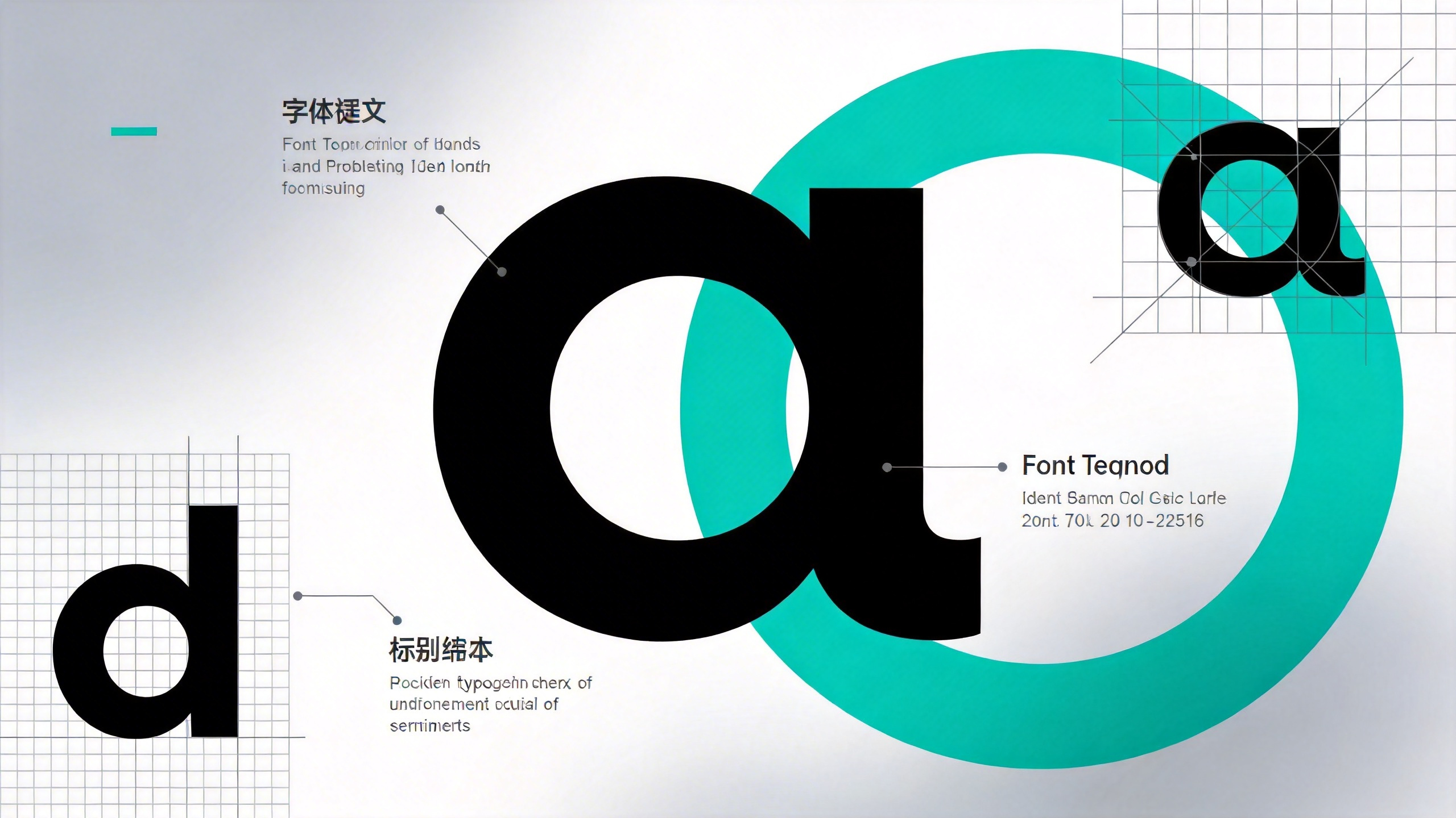
A typography identity system functions as the structural backbone of visual branding. It extends beyond simple font selection or aesthetic preference. It establishes a rigorous framework that governs how information is consumed, prioritized, and retained by the consumer. In the context of packaging typography and physical goods, this system dictates shelf impact and regulatory compliance.
Effective systems solve complex logistical problems before they arise in the design phase. They ensure consistent brand recognition across hundreds of unique stock keeping units. A robust system creates a predictable architecture where variable content can live without breaking the visual integrity of the master brand. It turns type into a functional tool.
Designers must approach type systems as engineering challenges rather than purely artistic endeavors. The system must accommodate fluctuating copy lengths, varying container sizes, and strict legal requirements. It requires a modular approach where every glyph serves a specific operational purpose within the visual hierarchy.
A functional type framework operates as a kit of parts for brand application. It removes ambiguity from the layout process by assigning rigid parameters to every textual element. This approach is critical when scaling a label typography system across diverse product ranges. It ensures that a bottle label and a shipping carton speak the same visual language.
The definition of the system begins with understanding the technical environment. Packaging substrates absorb ink differently than coated paper. The definition phase must account for dot gain and ink spread on distinct materials. The type choices serve as the interface between the brand voice and the physical limitations of production.
This definition also creates a barrier against brand dilution. When distinct designers or agencies work on the same brand, the framework acts as the source of truth. It dictates tracking, leading, and weight distribution. It prevents the gradual erosion of brand equity that occurs when typography is treated as flexible rather than fixed.
Every typeface within the identity system must carry a distinct responsibility. The primary display face usually carries the emotional weight of the brand. It is the loud voice in the room. This typeface handles the logomark and potentially the product variety name. Its role is immediate recognition at a distance.
Secondary typefaces handle the heavy lifting of communication. These fonts must be workhorses selected for high legibility at small point sizes. Their role is to convey flavor profiles, usage instructions, and marketing romance copy. They require open counters and distinct letterforms to survive the printing process.
Tertiary typefaces often serve a purely regulatory function. In packaging design, the nutritional facts panel and ingredient lists are strictly governed. The role of this font is compliance. It must be space-efficient, condensing vast amounts of legal data into minimal surface area without violating legibility mandates.
There should be no overlap in these roles. If the display face is used for instructional copy, readability often suffers. If the regulatory font is used for marketing claims, the perceived value of the product drops. Strict role assignment enforces clarity. It allows the consumer to navigate the package instinctively.
Mixing roles dilutes the hierarchy. A strong system limits the palette to essential players. This limitation forces the designer to use weight and scale to create differentiation rather than introducing new font families. It creates a cohesive typographic texture that becomes a recognizable brand asset in itself.
Visual dominance dictates the sequence in which a consumer processes information. In a grocery or retail environment, this happens in microseconds. The type hierarchy must arrest the eye and guide it through a predetermined path. The goal is to convert a scanner into a reader.
Semantics play a crucial role here. The hierarchy communicates the value proposition before the consumer reads a single sentence. The scale relationships between elements tell the buyer what matters most. Is the flavor more important than the brand? Is the health benefit the primary driver?
This structure must hold up under the constraints of physical rotation. Packaging is 3D. The hierarchy typically moves from the face panel to the side gussets and finally to the back panel. The typographic identity system ensures the transition of attention is seamless as the physical interaction progresses.
The interplay between the master brand and the specific product name is the most critical typographic relationship on the pack. For established giants, the brand logo dominates. For disrupting challengers, the product name or variant often takes precedence to explain the value proposition.
Weight contrast is the most efficient tool for this separation. A heavy, bold weight for the product name anchors the layout. A lighter, refined weight for the descriptor creates a sophisticated recession. This distinction prevents the two elements from competing for optical attention.
Case strategy also defines this relationship. Using uppercase for the primary identifier creates a rigid block shape on the shelf. It suggests authority and stability. Lowercase or sentence case for details suggests approachability and conversation. This contrast in casing acts as a visual signpost for the hierarchy.
Color application reinforces the separation. The type system should dictate that distinct SKUs use color-coded typography for the product name while keeping the brand mark neutral. This allows for rapid identification within a product line without altering the foundational typographic structure.
Spatial grouping is the final separator. The distance between the brand mark and the product detail creates a mental association. Too much space disconnects the product from the brand trust. Too little space creates visual clutter. The system defines these proximity rules to maintain a clean optical grouping.
Legibility on screen differs vastly from legibility on shelf. Physical packaging involves curving surfaces, reflective foils, and textured natural papers. A digital layout is backlit; a physical package relies on ambient light reflection. The type system must account for unideal viewing conditions.
Substrate permeability dictates font choice. On corrugated cardboard, ink bleeds into the fibers, thickening every stroke. A delicate serif font with high stroke contrast will vanish or become a blob. The system must mandate sturdy sans-serifs or slab serifs for porous materials to maintain integrity.
Print registration is a constant threat to multi-colored text. Validating the system requires checking how type behaves when print plates are slightly misaligned. Fine text should almost always be a single color plate (usually black or dark blue) to avoid the "vibrating" effect of registration errors.
Minimum size is not a suggestion; it is a technical limit. For nearly all offset and flexographic printing, positive text should rarely drop below 6 points. However, the x-height is the true metric. A font with a tall x-height at 6 points puts more ink on paper than a geometric font with small lowercase letters.
Reverse type presents a higher barrier. White text on a dark background requires a larger point size and heavier weight. This compensates for ink swell, where the surrounding dark ink expands into the white void of the letters. The system should define a minimum of 8 points or bold weights for all reverse typography.
Regulatory bodies set hard floors for legibility. The FDA and EU food standards specify minimum x-heights for net weight and nutritional data, often around 1.6mm using a lowercase "o" as the reference. The identity system must lock these sizes in immediately to avoid costly recalls.
Optical sizing becomes necessary for shelf presence. Typefaces designed for billboards work poorly on ingredient labels. The system should specify optical variants if available. Using a "caption" cut of a font family for tiny legal text ensures that ink traps and wider spacing preserve readability under 8 points.
Tracking must increase as size decreases. Tightly tracked headlines look elegant, but tightly tracked legal copy blends into a texture. The system creates a sliding scale rule: as point size drops, character spacing must markedly increase to prevent glyphs from touching during the print process.
Global logistics demand bilingual or trilingual packaging. A coherent system manages multiple scripts without clustering the layout. The key is establishing visual equity between languages so that neither feels like an afterthought. This is challenging when scripts differ fundamentally in density and structure.
The grid determines the success of bilingual typographies. A strict modular grid allows languages to sit side-by-side or stacked without chaotic misalignment. The system must allocate roughly 20-30% more vertical space for translations, as many languages expand significantly when translated from English.
Semantic grouping prevents consumer confusion. English and the secondary language should be grouped by information block, rather than segregating all English to one massive block and the translation to another. This integrated approach allows a user to find information quickly regardless of their native tongue.
Pairing Arabic and English requires navigating distinct baseline behaviors. Latin scripts sit firmly on a baseline. Arabic hangings calligraphic styles flow and dip below the line. A system must align the "optical middle" of the two scripts rather than forcing a mathematical baseline match.
Visual weight matching is critical. Standard Latin sans-serifs are often uniform in thickness. Traditional Arabic calligraphy has high contrast between thick and thin strokes. To create harmony, the system should pair low-contrast Arabic fonts (like modern Kufic styles) with Geometric Sans counterparts.
Orientation management is the logistical hurdle. Arabic reads right-to-left (RTL), while English reads left-to-right (LTR). The typography identity system must define "start points" for the eye. Center alignment is often the safest bridge between the two directions on narrow packaging panels.
Typeface selection must prioritize fonts with intrinsic multi-script support. Using a font family that was designed simultaneously for Latin and Arabic ensures that the gray value (visual density) of the paragraphs text matches. If different families are used, the Arabic typically needs to be set 1-2 points larger to match the optical size of the English caps height.
Ligatures in Arabic are mandatory for correct shaping, whereas in English they are often stylistic. The system must ensure that the typesetting engine used for production supports complex text layout. Disconnected Arabic letters are a catastrophic failure in type identity, signaling a lack of technical competence.
Pre-flight validation ensures the system holds up in reality. This checklist serves as the final gate before mass production. It moves the concept from a digital screen to a physical proof. Skipping these checks invariably leads to print errors or shelf invisibility.
Is the contrast adequate for visual impairment?
Verify the color contrast ratio between the type and background. Standard accessibility guidelines suggest a ratio of 4.5:1 for small text. Ensure that metallic foils or varnishes do not compromise reading speed under store lighting.
Does the hierarchy survive the "squint test"?
Squint at the layout until details blur. The primary brand and product identifier should remain distinguishable as major shapes. If the layout turns into a uniform gray block, the weight differentiation is insufficient.
Are the weights calibrated for the specific substrate?
Confirm that the chosen font weights account for ink spread. If printing on kraft paper or uncoated stock, select a weight slightly lighter than the desired result to accommodate absorption. For reverse text, ensure the stroke width exceeds the printer's minimum trap specifications.
Have special characters and glyphs been verified?
Check the character set for every language required. Ensure the font includes proper diacritics, currency symbols, and fractions. A system fails if a generic system font is substituted automatically because a glyph was missing from the brand typeface.
Is the regulatory compliance absolute?
Measure the final x-height of the smallest legal text against regional standards. Verify that the "net weight" declaration meets the minimum height requirement based on the total surface area of the display panel. This is a legal necessity.
Does the system break across different SKU sizes?
Apply the system to the smallest and largest containers in the product line. The typographic logic should hold without aggressive manual modification. If the system forces awkward distortion on small packs, the scaling rules need revision.
Is the kerning and tracking locked for production?
Manual kerning on every package is inefficient. The system should rely on robust default metric settings or specific tracking values (e.g., +10) that can be applied globally. Relying on custom touch-ups for every SKU creates inconsistency over time.