
Contact Sales Now
Thank you! Your submission has been received!
Oops! Something went wrong while submitting the form.

Contact Sales Now
Thank you! Your submission has been received!
Oops! Something went wrong while submitting the form.

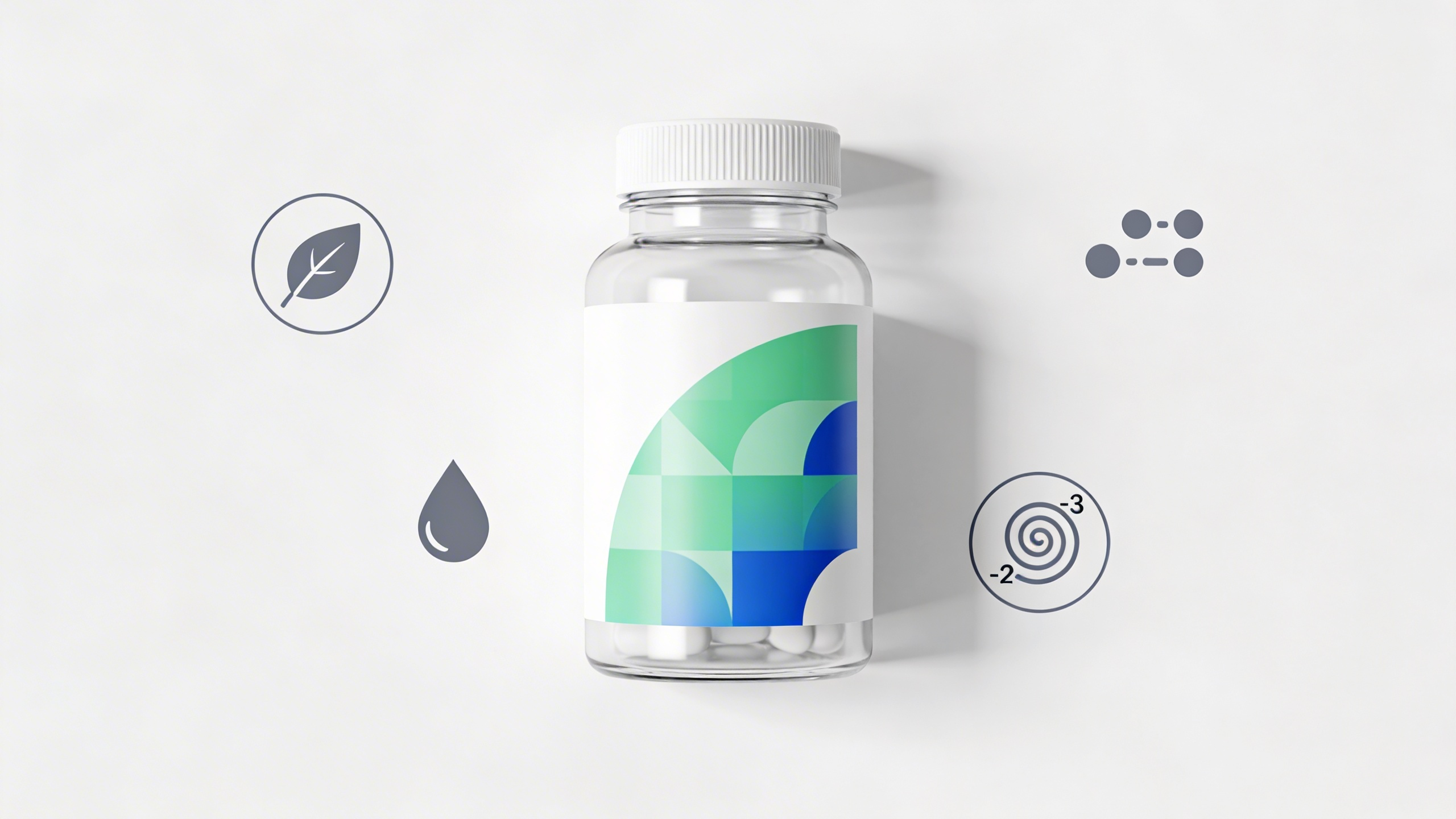
Effective labeling bridges the gap between complex chemical formulations and consumer trust. Your product might have the highest bioavailability in its class, but the packaging dictates the initial purchase decision. Manufacturers must manipulate a limited surface area to satisfy strict regulatory bodies while maintaining brand integrity.
The label serves two distinct masters. It acts as a legal document verifying contents for the FDA and a marketing vehicle for the customer. Balancing these requirements requires precise planning before the design phase begins. Errors at this stage result in costly recalls or misbranding letters.
Optimizing this real estate demands a granular understanding of material science and typography. You are not just printing a sticker. You are engineering a durable information delivery system that must survive shipping, retail shelving, and daily consumer handling.
The primary goal reaches beyond simple identification. A successful label establishes a hierarchy of information that guides the consumer's eye from the brand promise to the necessary biological data. This visual flow must occur within milliseconds for a product to stand out in a saturated market.
Designers often prioritize aesthetics over function, leading to compliance failures. Your objective is the seamless integration of mandatory elements, such as the statement of identity and net quantity, into the artistic vision. The regulatory framework should inform the design structure, not fight against it.
Consider the shelf environment where your bottle will live. Does the label contrast sufficiently with competitors? Does the finish catch the light in a way that implies premium quality? Every square millimeter of the Principal Display Panel (PDP) must work to convert a browser into a buyer.
Trust is a transaction that happens through transparency. Consumers today verify claims instantly using smartphones. If the Supplement Facts panel is obscured, poorly formatted, or difficult to read, credibility evaporates. A clean, legible layout suggests a clean, high-quality formulation inside the bottle.
Visual clarity correlates directly with percieved efficacy. When proprietary blends and standardized extracts are listed clearly with their respective milligram dosages, you signal that you have nothing to hide. Vague labeling implies under-dosing or "fairy dusting" of active ingredients.
The layout must also accommodate third-party certification seals. Marks from organizations like NSF, USP, or Non-GMO Project act as shortcuts for trust. These seals require specific spacing and placement rules that must be respected during the layout process to maintain their authority.
Color psychology plays a subtle but critical role in impact. Clinical brands benefit from white space and serif fonts, suggesting medical authority. Lifestyle performance brands often utilize metallic substrates and bold sans-serif typography to imply energy. Aligning visual cues with the target demographic’s expectations reduces friction.
Sectioning the information panel is not a creative choice but a legal requirement. The law dictates the location of the Information Panel generally to the immediate right of the PDP. This space is rigid, leaving little room for artistic interpretation.
You must clearly distinguish between "Dietary Ingredients" and "Other Ingredients." The flow barriers between these sections prevent consumer confusion regarding what constitutes the active payload versus the excipients, fillers, or capsules used in manufacturing. Strict adherence to 21 CFR 101.36 is non-negotiable.
Font size compliance is a frequent failure point. The lowercase letter "o" must meet specific height requirements measured in millimeters. Failure to meet these minimums renders the product misbranded, regardless of the accuracy of the text itself. Every element must be legible without magnification.
The Supplement Facts panel acts as the core of your regulatory compliance. It must list serving size, servings per container, and all dietary ingredients with their Daily Values (DV). If a DV has not been established, a specific footnote is mandatory to maintain transparency.
Listing botanical ingredients requires specific taxonomy. You cannot simply list "Green Tea." You must specify the plant part used, such as the root or leaf, and the scientific name if the common name is rare. This precision protects against class-action lawsuits regarding ingredient integrity.
Proprietary blends offer intellectual property protection but require careful formatting. The total weight of the blend must be listed, followed by the ingredients in descending order of predominance by weight. You cannot obscure the contents, only the specific ratios of the components.
Allergen declarations under FALCPA must appear adjacent to the ingredient list. The word "Contains" followed by the source of the major food allergen is standard practice. Ambiguity here poses a severe health risk and liability. Cross-contamination warnings, while voluntary, are best practices for shared manufacturing lines.
Disclaimer statements regarding FDA evaluation must accompany any structure/function claims. This "box" generally appears at the bottom of the content block. It must be bolded and set apart from other text, clearly stating the product is not intended to cure or prevent disease.
The physical composition of the label matters as much as the ink. A supplement bottle undergoes significant stress during accurate application. The choice of material dictates how well the label conforms to the curve of the container and how it handles environmental moisture.
Paper stocks offer a tactile, organic feel suitable for natural brands. However, they are porous. Without heavy lamination or varnishing, paper absorbs humidity and oils, leading to staining and degradation. Paper is generally reserved for dry environments or secondary packaging like boxes.
Synthetic films generally perform better for primary containers like HDPE or PET packers. These materials offer superior tensile strength and flexibility. They resist tearing during the machine application process and maintain their integrity even when the consumer handles the bottle with damp hands.
Biaxially Oriented Polypropylene (BOPP) serves as the industry standard for nutritional supplements. It is waterproof, oil-resistant, and incredibly thin. BOPP film conforms tightly to small diameter bottles without "flagging," where the label edge lifts away from the surface creating a gap.
White BOPP provides a clean, pharmaceutical canvas. It allows for high-contrast printing and vibrant color reproduction. It blocks the view of the capsules inside, which can be beneficial if the product has variable color or sediment that might look unappealing to the uneducated eye.
Clear BOPP facilitates the "no-label look." This approach works well for clear PET bottles where showcasing the product is a selling point, such as with liquid softgels. However, clear substrates require a white under-print for text legibility, adding a layer of complexity to the prepress process.
Metallic or Silver BOPP creates inherent premium value. By printing transparent inks over the silver substrate, manufacturers can achieve foil-stamping effects without the cost of hot stamping dies. This material catches the eye on retail shelves effectively but requires careful color management to avoid muddiness.
Product safety features are essential for ingestible goods. Consumers will rarely purchase a supplement if the tamper-evident features are missing or damaged. These mechanisms provide visible proof that the product has remained sealed from the factory to the home.
Induction sealing acts as the primary barrier. This foil liner adheres to the bottle lip via electromagnetic induction. While not part of the external label, the label design must account for the neck height required to accommodate the induction cap without interfering with the closure mechanism.
Exterior tamper evidence usually involves shrink films. These can cover just the neck or the entire bottle. Incorporating these elements requires understanding how heat tunnels distort graphics. Designers must pre-distort artwork to ensure it looks correct once the film shrinks around the container contours.
Neck bands, also known as cut bands, are cost-effective safety seals. They are usually made of PVC or PETG film. Perforations are necessary for easy removal. The label design should ideally color-match or complement this band, as it becomes a permanent visual element until purchase.
Full-body shrink sleeves offer 360-degree branding real estate. This method eliminates the need for adhesive labels entirely. The film shrinks to conform to the bottle shape. This allows for more information space, which is valuable for multi-language products or extensive ingredient lists.
However, shrink sleeves present specific challenges. The "smile" or "frown" distortion at the top and bottom of the container requires 3D modeling during the design phase. Text placed in high-shrink areas will become illegible. Critical regulatory text must remain in the low-shrink zones of the container.
Durability issues often arise after the product leaves the manufacturing facility. Scuffing occurs when bottles vibrate against each other in master cartons during transit. If the ink is not protected, the brand logo or ingredient list can rub off before the retailer even stocks the item.
Lamination provides the robust protection needed for supplements. A thin layer of clear polypropylene is applied over the printed ink. This adds thickness and acts as a shield against abrasion. It also enhances the visual finish, allowing for high-gloss or soft-touch matte effects.
UV varnishes offer a cheaper alternative to lamination but provide less physical protection. They are liquid coatings cured by ultraviolet light. While they seal the ink, they do not offer the same resistance to friction or chemical exposure as a physical laminate layer.
Adhesive migration creates aesthetic failures known as "ooze." If the adhesive is too aggressive or the roll is wound too tightly, the glue seeps out from the edges. This collects dust and grime, creating a dirty ring around the label. Selecting the correct adhesive for the bottle material is critical.
Environmental stress cracking is a rare but serious issue. Some adhesives contain volatile compounds that react with plastic bottles, causing them to become brittle and crack. Ensure your label converter verifies the compatibility of the adhesive chemistry with your specific HDPE or PET container.
Before committing to a full production run, a rigorous audit is mandatory. Visual proofing is insufficient for regulatory compliance. You must measure, verify, and cross-reference every element against current FDA guidelines to ensure market viability.
Verify the Statement of Identity. It needs to be one of the most prominent features on the PDP. It must be parallel to the base of the package. Ensure it uses a bold type that is at least half the size of the largest print on the label.
Check the net quantity of contents statement. This must appear in the bottom 30 percent of the PDP. It must list contents in both U.S. Customary and metric measures (e.g., 60 Capsules / Net Wt. 30g). The font size depends on the surface area of the display panel.
Audit the "Distributed By" section. If you are not the manufacturer, you must state "Manufactured for" or "Distributed by" followed by your company name and physical address. A website or phone number alone is not sufficient unless a full address is listed in a public directory.
Measure the Information Panel elements. Ensure the hairlines separating the heavy bars in the Supplement Facts are the correct thickness. Verify that the font used inside the table is legible and meets the minimum point size, usually 4.5 point or larger depending on package size.
Confirm the barcode functionality. A scannable UPC is vital for retail. Ensure the quiet zones (white space) around the bars are sufficient. Printing barcodes on metallic substrates or red backgrounds often leads to scanning failures at the point of sale.
Finally, review claims against substantiation files. Ensure every structure/function claim on the label corresponds to evidence you hold on file. The label text must perfectly match the notification letter you intend to send to the FDA within 30 days of marketing.