
Contact Sales Now
Thank you! Your submission has been received!
Oops! Something went wrong while submitting the form.

Contact Sales Now
Thank you! Your submission has been received!
Oops! Something went wrong while submitting the form.

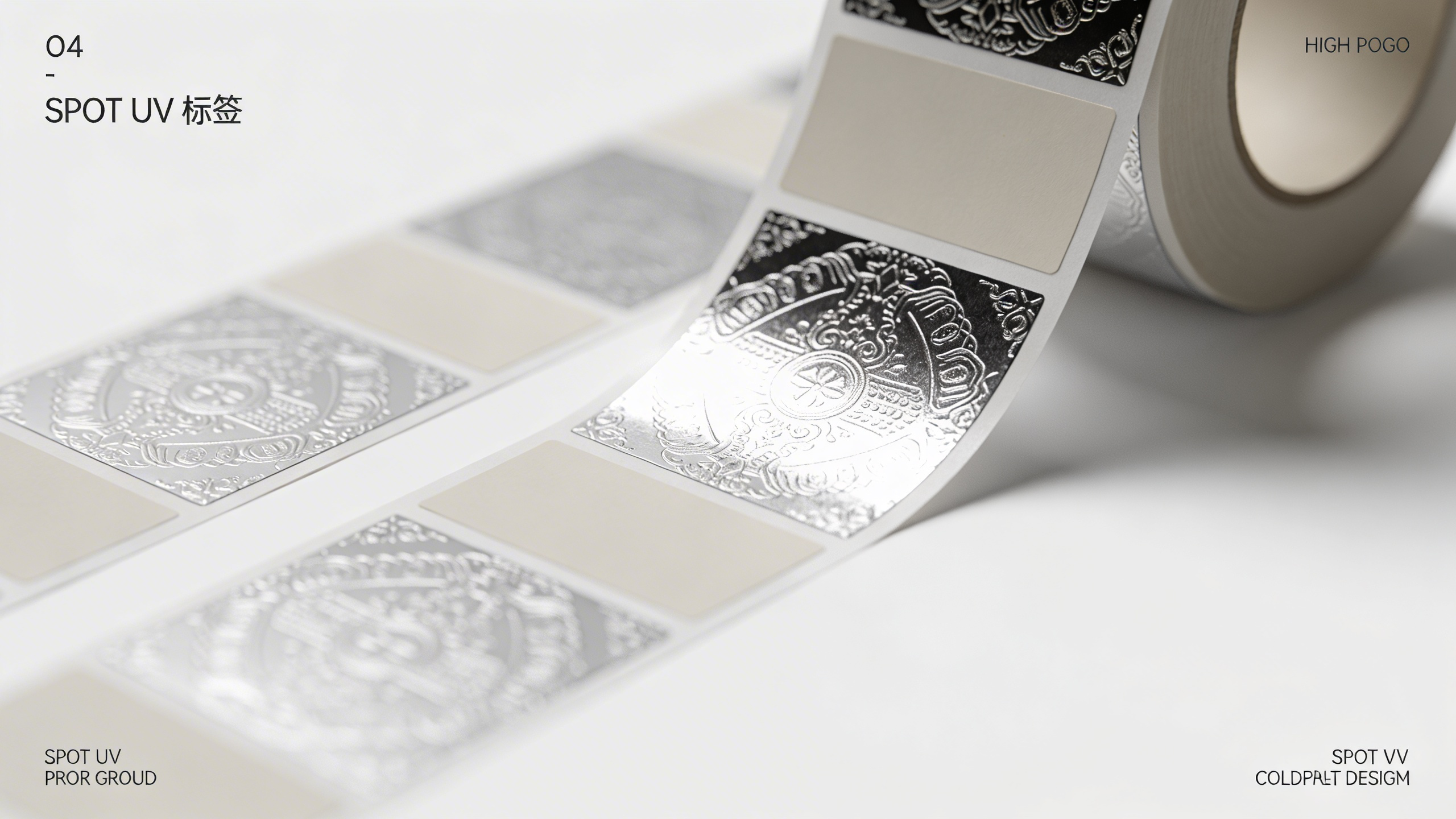
Brands seeking immediate shelf impact often turn to Custom Spot Gloss Stickers. This finishing technique transforms flat designs into multidimensional experiences. It moves beyond standard printing by applying a clear, shiny coating to specific areas of a label.
The result is a striking contrast between the base material and the highlighted elements. Premium Spot Varnish Labels signal quality to the consumer before they even touch the product. The visual difference captures attention in crowded retail environments.
Designers utilize Raised Spot UV Printing to add physical depth. This technique creates a perceptible ridge that consumers want to run their fingers over. It engages not just sight but also the sense of touch, creating a memorable brand interaction.
Luxury Product Labels rely heavily on these subtle cues. High-end cosmetics, supplements, and boutique food items use this method to justify price points. The gloss effect acts as a stamp of authenticity and attention to detail.
Designers must understand the mechanics of Spot High Build Varnish to invoke these results. It is not merely a design choice but a calculated engineering of light and texture. Understanding the process ensures the final output matches the digital vision.
Spot UV is a precise post-print process that involves applying a clear polymer coating to specific coordinates on a substrate. The term comes from the Ultraviolet curing process used to dry the liquid instantly. High-intensity UV light creates a solid, durable finish the moment the sheet passes under the lamps.
This rapid curing allows for sharp edges and prevents the coating from bleeding into surrounding areas. Unlike varying drying times of standard inks, the chemical reaction here is immediate. This speed prevents dust contamination and ensures a glass-like smoothness over the selected artwork.
The application requires a separate plate or a specific digital layer in the print file. This layer instructs the machine exactly where to drop the gloss polymer. It operates independently of the CMYK ink layers beneath it.
Understanding this separation is vital for designers. The clear coat is an embellishment, not a color. It interacts with the ink or substrate below it, intensifying colors or creating ghosted images on dark backgrounds.
It is crucial to differentiate Spot Varnish vs Flood Varnish when specifying print orders. Flood varnish covers the entire surface of the label from edge to edge. Its primary purpose is protection against scuffs, moisture, and handling during shipping.
Flood varnish offers a uniform sheen, either matte or gloss, across the whole product. It provides a functional barrier but lacks the design-specific emphasis of spot application. It treats the entire label as a single unit rather than highlighting specific components.
Spot application acts as a design element rather than just a protective layer. It isolates specific visual data for emphasis. By leaving the majority of the label uncoated or matte, the gloss areas pop with significantly more intensity.
Flood varnish is standard for durability; spot varnish is strategic for aesthetics. Using both in tandem often yields the best results. A soft-touch laminate provides the protective base, allowing the spot gloss to function purely as a visual and tactile accent.
Luxury packaging trends indicate a shift away from loud, chaotic colors toward sophisticated textures. Why spot UV looks premium is rooted in the interplay of light. The human eye is naturally drawn to the difference in light reflection on a single plane.
Perceived value increases when a product demonstrates manufacturing complexity. Consumers subconsciously recognize that Tactile Label Effects require extra steps and higher production costs. This conveys that the brand invests in quality, implying the product inside is equally superior.
The gloss finish acts as a highlight reel for the packaging. It tells the consumer exactly where to look. By controlling the reflection of light, brands guide the buyer’s gaze to the most persuasive elements of the package.
This technique separates Custom packaging solutions from generic alternatives. A standard label looks flat and utilitarian. A spot-enhanced label looks curated and intentional. This distinction is the primary driver behind shelf appeal in competitive markets.
The effectiveness of this finish relies entirely on contrast. The most powerful combination is Matte Lamination with Spot Gloss. The matte background absorbs light, appearing soft and muted. The gloss areas reflect light, appearing sharp and vibrant.
Visual texture is created without adding new colors. The same black ink looks like charcoal under a matte finish and like obsidian under a gloss coat. This tonal variation adds richness to the design palette without increasing ink costs.
Soft-touch matte laminates amplify this effect further. They provide a velvet-like friction that contrasts sharply with the slick, frictionless surface of the UV coating. This haptic feedback turns the package into an interactive object.
Print finishing techniques that engage touch increase ownership potential. Research suggests that when a customer holds and touches a product, the likelihood of purchase increases. The variation in texture invites that physical connection.
Knowing where to apply the varnish is as important as the varnish itself. The best uses of spot UV amplify the hierarchy of information. It should not be applied randomly but used to support the narrative of the label.
Product differentiation often comes down to these finishing touches. In a lineup of similar products, the one that catches the light differently wins the initial attention. Brands must be strategic about which elements deserve this premium treatment.
Over-application dilutes the effect. If the entire label is glossy, nothing stands out. The goal is to create focal points that anchor the design. Restraint is often the key to elegance in high-end packaging.
Specific industries, such as Wine bottle labeling and Cosmetic label printing, rely heavily on this. They often use minimal color palettes, relying on the varnish to create the necessary drama and intrigue on the shelf.
Applying spot gloss to logos establishes an immediate brand authority. It makes the trademarked symbol the most reflective part of the package. This reinforces brand recognition even from a distance or at oblique angles.
Logos and Patterns benefit immensely from "blind" spot UV. This involves applying the gloss over a dark background with no matching ink underneath. It creates a subtle, ghosted watermark effect that is only visible when the light hits it.
This technique adds layers of discovery. The consumer might not see the pattern immediately. Upon rotating the bottle or box, a glossy pattern reveals itself, creating a moment of delight and sophistication.
Iconography indicating features like "organic" or "cruelty-free" can be lifted with a touch of gloss. It draws the eye to these selling points without requiring bold font changes or clashing colors.
Highlighting product names ensures the specific SKU stands out. For a line of supplements, the brand name might be matte, but the specific ingredient (e.g., "Magnesium") receives the gloss. This aids navigation on the shelf.
The gloss acts as a highlighter pen. It dictates the reading order. The eye jumps to the glossiest element first. Designers use this to enforce the hierarchy, ensuring the most critical information is consumed immediately.
Focal point management is essential in clutter-free design. Instead of making the font larger, the designer adds a gloss finish. This keeps the typography elegant while still commanding attention.
Variable data or small legal text should generally avoid spot UV. The coating can sometimes compromise the legibility of fine print. Reserve the gloss for headlines, hero art, and primary identifiers.
Execution fails without adherence to Spot UV Design Guidelines. Design rules are dictated by the physical limitations of the printing press. Ignoring these leads to misprints, waste, and rejected jobs.
Creating Vector artwork is the first requirement. Pixel-based images often lack the sharp definition needed for creating varnish plates. A clean vector path ensures the machine knows exactly where the edge of the gloss begins and ends.
Communication with the printer is vital regarding file setup. Usually, the spot UV layer must be a specific spot color (often magenta or cyan) set to overprint. This tells the RIP software it is a finish, not an ink.
Foil stamping alternatives often involve high-build UV. However, unlike foil, UV is transparent. It relies on the substrate or ink below to generate the color. Designers must visualize the final stack of layers during the digital phase.
No printing press is perfect. UV Coating Registration refers to the alignment between the ink printed on the paper and the varnish applied afterward. There is always a slight margin of error, known as shift.
Registration tolerance is usually around 1/64th of an inch, though digital presses are improving. Because of this, designing tight borders around small text is risky. If the varnish shifts slightly, it will look like a printing error.
To mitigate this, designers often use "grow" or "choke" techniques. They might make the spot UV shape slightly smaller than the ink shape underneath. This ensures that even with a minor shift, the gloss remains over the color.
Print embellishment requires designing for the worst-case scenario. If the design breaks because of a millimeter shift, the design is too fragile for mass production. Robust designs account for these mechanical variances.
Liquid polymer flows before it cures. Minimum Line Weights prevent the varnish from closing in on itself or failing to adhere. Thin lines may disappear entirely or pool together into a blob.
High-Contrast Label Design requires substantial line thickness. Generally, a line weight of 0.5 points or 1 point is the absolute minimum. This varies depending on whether the varnish is flat or High Build (raised).
Raised spot UV requires thicker lines. The higher the pile of varnish, the wider the base needs to be to support it. Think of it like building a structure; a tall wall needs a thick foundation.
Overprint settings must be checked carefully. If the spot layer knocks out the ink below, you will get gloss on white paper instead of gloss on color. The spot color must sit on top without erasing the data beneath.
Even with great concepts, Spot UV Mistakes happen during execution. Common mistakes usually stem from misunderstanding how light interacts with the surface. The most frequent error is assuming gloss will fix a bad layout.
Illegibility is a major risk. Placing gloss over small white text on a black background can make it unreadable. The reflection obscures the fine letterforms. Legibility must always take precedence over special effects.
Cracking is another issue. If a heavy deposit of UV varnish is placed over a fold line or score, it will likely crack when the package is assembled. The cured polymer is hard and brittle compared to the flexible paper.
Adhesion failure occurs when UV is applied over incompatible coatings. Certain wax-based inks or heavy laminates repel the UV fluid. Consulting the printer about material compatibility is a non-negotiable step.
More is not always better. Overuse and visual noise degrade the premium feel. If every element on the label has a spot finish, the human eye has nowhere to rest. The contrast, which is the whole point, is lost.
Design clutter confuses the consumer. When the background pattern, the logo, the text, and the nutritional facts all shimmer, the hierarchy collapses. The label becomes a chaotic mirror rather than a branded communication tool.
Restraint demonstrates confidence. A single, perfectly placed gloss element is sharper than a label covered in shine. Selective Gloss Coating implies a curated choice, whereas total coverage implies a lack of decision-making.
Packaging aesthetics rely on balance. The matte areas are just as important as the gloss areas. The "negative space" of the matte texture frames the gloss, giving it the stage to perform. Respect the matte.
A Spot UV checklist is essential before sending files to production. This final review prevents costly reprints and ensures the client's expectations match the printer's capabilities. It transforms an artistic file into a manufacturing blueprint.
Verify the separation layers first. Turn off all regular CMYK layers and view only the spot channel. Does it look correct in black and white? This is exactly what the plate-maker or digital engine will see.
Confirm the registration supports. Check that no critical gloss elements are dangerously close to the cut line or the bleed edge. Trimming variances can slice off the gloss effect if it is placed too near the margin.
Digital varnish application allows for prototyping. If possible, run a single proof. Digital systems can produce one-off samples to verify the tactile effect and light interaction before committing to a full production run.
The foundation of the strategy is the base. A matte base combined with a selective highlights plan guarantees the highest impact. Ensure the underlying laminate is specified correctly as "scuff-free matte" or "soft touch."
Review the Brand assets one last time. Does the gloss align perfectly with the logo geometry? Are the vector nodes clean and simplified? messy vectors result in jagged gloss edges.
Consumer perception is the final judge. Imagine the product on the shelf under fluorescent retail lighting. Will the glare obscure the name, or will it highlight it? The angle of light in a store differs from a computer screen.
By following these steps, you ensure that the Raised Spot UV Printing serves its purpose: to elevate the perceived value of the product. It turns a label into a luxury signal, driving sales through superior design and flawless execution.