
Contact Sales Now
Thank you! Your submission has been received!
Oops! Something went wrong while submitting the form.

Contact Sales Now
Thank you! Your submission has been received!
Oops! Something went wrong while submitting the form.

Effective hazard communication relies on bypassing the lag time inherent in reading text on a product label. In high-stakes environments where a hazardous product is handled, the brain processes visual data significantly faster than linguistic data. This biological reality dictates the necessity of a standardized ghs pictogram in safety protocols to ensure health and safety for all personnel.
Safety professionals understand that during a crisis, cognitive tunneling restricts a worker's ability to process complex instructions. Pictograms serve as an immediate anchor for attention. They trigger pre-attentive processing, allowing the viewer to recognize a chemical hazard before they consciously analyze the ghs label. Understanding ghs pictograms is essential for maintaining workplace safety and compliance with the globally harmonized system.
This bypass of the language center is critical in multi-lingual workforces. Manufacturers shipping a hazardous substance globally cannot rely solely on translated text to ensure safety. A standardized hazard symbol typically transcends linguistic barriers, ensuring the message remains intact regardless of the viewer's native tongue. The use of ghs symbols helps standardize hazard information across different regions.
The reliance on visual cues aligns with the globally harmonized system of classification. While engineering controls are superior, effective warnings act as a necessary bridge when risks cannot be fully eliminated. The pictogram is not merely a supplement to the text; it is often the primary mechanism for hazard recognition. Pictograms and labels are required on labels according to the hazardous products regulations.
Standardization prevents ambiguity. When an employee moves from one facility to another, the visual language of the ghs system must remain consistent. This creates a learned reflex, where specific geometries and a hazard pictogram trigger immediate behavioral modifications without the need for relearning. Nine ghs pictograms are visual anchors that are required for a variety of hazard categories.
Reaction time is the delta between stimulus presentation and the initiation of a motor response. In safety scenarios involving hazardous chemicals, milliseconds determine the severity of an injury. Textual warnings require decoding, which involves recognizing letters, forming words, and comprehending syntax, whereas a pictogram indicates a type of hazard immediately.
Visual symbols function differently. The human brain identifies the shape and color of a hazard symbol in a fraction of a second. This rapid identification allows the motor cortex to engage faster. For example, seeing a specific electrical shock symbol prompts a physiological withdrawal response almost instantly. Pictograms are standardized to ensure they provide a clear standard for hazard recognition.
Research into ergonomics and human factors engineering confirms that symbolic recognition minimizes cognitive load. Low cognitive load is essential in high-stress environments where operators are monitoring multiple data streams. Adding complex text increases the mental burden, whereas ghs symbols streamline the decision-making process. Nine ghs pictograms are visual tools that help prevent less severe health effects and long-term health issues.
The layout of a warning label influences this speed. Placing the ghs pictogram to the left of the text follows the natural reading path of left-to-right languages. This ensures the hazard is identified before the instructions are read, priming the brain to accept the safety command and align with osha's hazard communication standard requirements.
Consistency in symbol design further aids speed. If a facility uses variations of the same icon, it forces the brain to pause and verify meaning. Adhering strictly to standards ensures that the neural pathway for recognition remains unobstructed and efficient. Pictograms are visual tools used to categorize hazards like acute toxicity, organ toxicity, and environmental hazards.
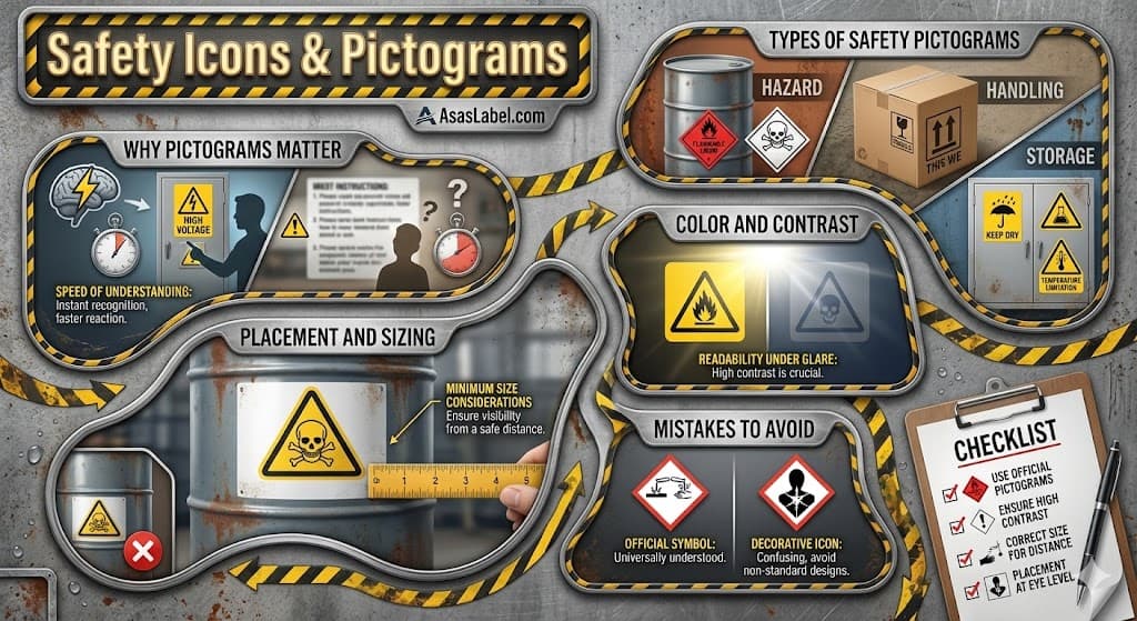
Not all graphical symbols serve the same function. Distinguishing between the nature of the information is the first step in compliant labeling. A hazard alert requires a fundamentally different visual approach than an instruction for safe equipment operation. The system of classification and labeling of chemicals provides the framework for these distinctions.
The geometry of the signage often dictates the category. Triangular shapes almost exclusively denote warnings. The instability of the triangle shape on a vertex creates distinct visual tension, which psychologically signals caution or danger to the observer. However, for a ghs label, the diamond shape is the standard for hazard classification.
Circular shapes usually indicate mandatory actions or prohibitions. A blue circle demands compliance, such as wearing hearing protection. A red circle with a diagonal slash explicitly forbids an action. Recognizing these geometric codes is as important as recognizing the icon inside them. In the ghs system, this is replaced by the diamond with a red border.
Square or rectangular shapes are typically reserved for general information, fire safety, or emergency egress. These shapes represent stability and information rather than immediate threat. Using the wrong shape for a hazard creates cognitive dissonance and reduces the effectiveness of the warning. This is why understanding ghs pictograms is essential for any workplace hazardous materials information system.
The Globally Harmonized System of classification and labeling of chemicals introduces the diamond shape on a white background with a red border. This is specific to chemical labels. Mixing ghs pictograms with general machinery safety icons requires careful layout planning to avoid visual clutter and ensure compliance with hazardous products regulations.
A hazard pictogram communicates the intrinsic properties of a substance or machine that can cause harm. These include symbols like the corrosion pictogram, flame pictogram, or the skull and crossbones for acute toxicity. The focus is entirely on the potential for injury or death from hazards associated with the product.
Handling instruction pictograms focus on the integrity of the product or the packaging. Icons like "Fragile" or "This Way Up" are logistical instructions. Confusing a handling instruction with a safety hazard pictogram dilutes the urgency of genuine safety warnings. GHS symbols are reserved for serious chemical hazards like pyrophoric materials or organic peroxides.
Storage pictograms bridge the gap between safety and logistics. Symbols indicating temperature limits or moisture sensitivity primarily protect the asset. However, for chemicals under pressure, storage icons become safety-critical. A gas cylinder pictogram on gases stored under pressure is a safety directive, informing the user of pressure that can explode if handled improperly.
Proper segregation of these categories on a label is vital. GHS symbols should be grouped with the signal word and hazard statement. Handling icons should reside near logistical data. Mixing them indiscriminately creates a "fruit salad" effect that complicates interpretation. Labels and safety data sheets must be synchronized to avoid confusion.
The visual weight of a ghs hazard symbol must always dominate handling icons. If a package contains a corrosive substance or a health hazard, that symbol must be larger and more prominent than the umbrella symbol. Prioritization in design reflects the prioritization of risk categories provided by health canada or osha.
A perfectly designed safety label fails if it is placed outside the operator's line of sight. Placement strategy must account for the workflow and the physical interaction with the equipment. The hazard pictogram must be visible from the position where the chemical hazard is encountered to ensure workplace safety.
Occlusion is a common failure point. Adding workplace labels to removable guards that are frequently set aside renders the warning useless during maintenance—often the most dangerous time. Labels are required to be affixed to the permanent chassis of the machinery or the primary container of the hazardous chemicals whenever possible.
Viewing angle impacts recognition. Labels placed on curved surfaces or high operational heights may suffer from perspective distortion. If a ghs pictogram is viewed from an extreme angle, the aspect ratio changes, potentially making the icon unrecognizable. This is why understanding how pictograms appear is critical for safety programs.
Proximity is the next variable. The warning must be located close enough to the hazard to create a clear association, but far enough away to allow the user to react safely. A warning label placed directly on a high-voltage busbar is useless if reading it requires entering the arc flash zone. Pictograms are visual warnings that must be present and easy to see.
Surface energy and texture affect adhesion and long-term placement. A label on a textured powder-coated surface requires a different adhesive aggression than one on stainless steel. If the label peels, it creates a risk where hazards associated with the product are no longer communicated.
Size selection is not an aesthetic choice; it is a mathematical calculation based on safe viewing distance. OSHA’s hazard communication standard and ANSI Z535 provide formulas to determine the minimum height of a safety symbol based on how far away the observer will be. A health hazard pictogram must be legible to prevent chronic health effects.
For a standard viewing distance of less than one meter, a symbol height of at least 15mm is often recommended. As the distance increases, the size must scale considerably to maintain legibility. A sign intended to be read from across a warehouse floor requires ghs symbols measuring several inches in height to be effective.
Complexity of the details within the icon also dictates size. Simple geometric shapes like a flame pictogram can be deciphered at smaller sizes. Complex graphics, such as a target organ toxicity warning or a pictogram for reproductive toxicity, require more surface area to resolve the necessary details for understanding ghs risks.
Lighting conditions influence the perceived size. In low-light environments, the resolving power of the eye diminishes. Labels in dimly lit maintenance corridors must be larger than those in brightly lit assembly areas to achieve the same level of recognition for skin and eye protection or respiratory safety.
You must also account for text-to-symbol ratios. While the pictogram attracts attention, if it is disproportionately small compared to the signal word panel, the visual hierarchy is disrupted. The hazard pictogram should generally align with the height of the signal word header to ensure a complete guide for the user.
Color coding is a secondary language in safety labeling. Adherence to the globally harmonized system of classification color codes prevents confusion. Red is universally reserved for the border of a ghs pictogram. Using red for other purposes on supplier labels violates user expectations and diminishes the impact of actual hazard warnings.
Yellow is the dedicated color for general warnings, while GHS uses white backgrounds with black symbols. Blue denotes mandatory actions, and green indicates safe conditions. Deviating from this palette for branding purposes introduces unnecessary risk and potential liability for any hazardous product manufacturer.
Contrast ratios determine legibility. The luminance contrast between the pictogram and its background must be sufficient for the eye to distinguish edges clearly. Black symbols on a white background with a red border provide high visibility, which is why this combination is the standard for a ghs hazard symbol.
Safety managers should consider color blindness. Approximately 8% of the male population experiences some form of color vision deficiency. Therefore, color should never be the sole method of communicating the hazard. The shape and the graphical content must stand alone even if viewed in grayscale or on labels and sdss that are photocopied.
Material degradation affects color integrity. UV exposure causes red inks to fade to pink and eventually white. Choosing high-grade, UV-resistant pigments ensures that a corrosion pictogram or a flame over circle remains identifiable and does not fade into a meaningless shape over time.
Glare is the enemy of readability. Glossy laminates on safety labels can reflect overhead lighting, rendering the hazard pictogram invisible from certain angles. Matte finishes or textured polycarbonates diffuse light, preserving the visibility of the nine ghs pictograms.
In environments with variable lighting, retroreflective materials may be necessary. These materials bounce light back to the source, making the icon visible when illuminated by a flashlight. This is underutilized in industrial facility management for gases stored under pressure or other hazardous chemicals that might catch fire.
Photoluminescent materials are critical for egress and fire safety icons. In the event of a power failure, these icons must remain visible. While not typical for a ghs label, the decay time and brightness must meet building codes. For chemical safety, a high-contrast environmental pictogram must remain visible even in dirty conditions.
Dirt and grime accumulation reduces contrast. In heavy industrial environments, the background color can be obscured. High-contrast designs with thick strokes resist the visual degradation caused by surface contamination better than fine-lined illustrations. This is vital for the skull and crossbones pictogram indicating acute toxicity.
Consider the color temperature of the facility lighting. High-pressure sodium lights wash out colors, making red and black difficult to distinguish. Under such lighting, the diamond shape and the specific pictogram inside become the primary recognition factors, reinforcing the need for compliance with osha’s hazard communication standard.
A frequent failure in label design is information overload. Attempting to cram too many symbols onto a single label reduces the effectiveness of each. If a substance presents multiple hazards, prioritize the most severe risks rather than creating a collage of icons. The ghs hazard statement should complement the visual warning.
Inconsistency across a facility undermines the safety culture. Using a modern ghs pictogram on one container and an outdated style on the adjacent unit confuses operators. Standardization across the plant floor is mandatory for maintaining a cohesive message. Labels and safety data sheets must always be in sync.
Using low-resolution images is a technical error that reflects poorly on safety training and management. Raster images that pixelate when scaled imply a lack of professionalism. GHS pictograms should always be generated from vector graphics to ensure crisp, sharp edges at any size for every hazardous product.
Ignoring the "surround shape" is a subtle but dangerous mistake. Placing a black hazard pictogram directly on a metal surface without the unifying red diamond removes the context of the ghs system. The red diamond border is what classifies the icon as a safety device and a standard for hazard communication.
Failure to update labels following retrofits or a change in the safety data sheet (sds) leads to misinformation. If a machine guard is modified or a new hazardous material is introduced, the legacy labels may no longer apply. Outdated warnings are ignored warnings that lead to long-term health effects.
The trend toward "flat design" in corporate branding should not encroach on ghs-compliant labeling. Simplifying a hazard pictogram to match a company's aesthetic often removes critical details required for understanding ghs risks. Safety symbols must be robust, not pretty, to ensure workplace safety.
Decorative icons often lack the research-backed design of official globally harmonized system of classification standards. Nine ghs pictograms have undergone rigorous comprehension testing. A custom-designed icon lacks this validation, and validation is key to defensibility in court if a chemical hazard occurs.
Subtle color shifts to match brand palettes are dangerous. Using a "burnt orange" instead of the red required for ghs symbols reduces immediate recognition by personnel trained on standard safety colors. Adherence to the system of classification and labeling is non-negotiable for hazardous product labels.
Clip art is not a substitute for proper ghs pictogram usage. Using generic cartoons to depict accidents trivializes the risk. Safety communication requires a professional tone. Cartoonish figures usually fail to convey the severity of hazards associated with things like reproductive toxicity or chronic health effects.
Avoid abstract symbols where concrete ones exist. An abstract shape representing "general danger" is less effective than a specific health hazard pictogram or a corrosion pictogram. Specificity drives compliance; abstraction drives confusion in any hazard classification safety program.
Do the pictograms on site align with current globally harmonized system standards? An audit must verify that legacy symbols are not being used where newer, globally recognized ghs symbols are available. The goal is universal comprehension of hazards associated with every hazardous chemical in the facility.
Are the ghs labels intact and legible? Walk the floor and physically inspect labels for abrasion or UV fading. A label that cannot be read is a citation waiting to happen. Map out areas where labels are frequently damaged and investigate more durable material options to protect your safety data sheet (sds) links.
Is the viewing distance appropriate for the hazard class? Stand at the operator's station. Can you clearly distinguish the details of the hazard pictogram? If the operator must squint to see the cylinder pictograms or the health hazard pictogram, the symbol is too small and fails the complete guide for safety.
Do the symbols match the actual hazard present according to the safety data sheet? Machine modifications often render old labels and sdss obsolete. Verify that the flame pictogram is not present on a container that is no longer flammable, and conversely, that new target organ toxicity hazards have been labeled.
Is the signal word consistent with the risk level implied by the ghs pictogram? Ensure that a "DANGER" header is not paired with a minor instructional icon, and that "WARNING" headers are used appropriately for hazards that don't involve acute toxicity. The severity level must align with the hazard classification.
Are specific precautionary statement requirements visualized? Relying on a blanket sign is often insufficient. Specific areas with chemicals under pressure or those requiring respiratory protection should have the specific ghs hazard icons applied directly to the equipment or supplier labels.
Have you accounted for language barriers in your safety training? Ask staff with limited English proficiency to interpret the ghs pictograms without reading the text. If they cannot explain the hazards associated with the product based on the visual alone, the pictogram has failed and needs re-evaluation.