
Contact Sales Now
Thank you! Your submission has been received!
Oops! Something went wrong while submitting the form.

Contact Sales Now
Thank you! Your submission has been received!
Oops! Something went wrong while submitting the form.

Packaging acts as the silent salesman on the shelf and is critical to your brand image. Unlike digital assets, physical packaging and the product label incur significant production costs and rigorous lead times. Errors discovered after printing result in wasted materials and financial loss. Established brand guidelines prevent these expensive mistakes by setting clear boundaries for the design team and prepress technicians, ensuring the product label design is visually appealing.
A robust packaging brand guidelines document serves as the single source of truth for your internal team and external vendors to create a cohesive brand. It eliminates ambiguity regarding color palette standards, logo and brand placement, and typography. By defining these parameters upfront in the design process, you ensure that the brand identity remains intact across various products and various substrates and printing methods.
Brand equity relies heavily on repetition and familiarity to reinforce brand recognition. When a consumer walks down an aisle, they identify products by brand colors, color blocking, and consistent design elements in the architectural layout. A well-designed set of guidelines ensures that each SKU, regardless of flavor or variation, reinforces the master brand name. This accumulation of brand consistency and brand awareness translates directly to consumer trust and sales volume during purchasing decisions.
Speed to market defines success in the CPG sector for any product or service. When design teams operate without a strict style guide or product label design parameters, every new SKU requires a fresh creative cycle. Guidelines streamline this process by providing a template approach, whether you are using professional software or tools like Canva. Designers stop inventing and start executing, drastically reducing the time from concept to shelf.
Consistent application of label brand guidelines removes the friction between creative agencies and print production houses. When a design file arrives with standardized CMYK color profiles and distinct layer structures, prepress time decreases. You avoid the back-and-forth design changes and communication loops that typically delay product launches and inflate production budgets for custom labels.
Scalability and brand recognition drive the need for rigorous documentation. A startup might manage three products, but a scaling brand manages hundreds. As your portfolio expands into new categories or regions, the brand style guides ensure new packaging design aligns with legacy products. This systematic approach allows for rapid expansion without diluting the visual elements and visual language that make your brand stand out in a competitive market.
Operational efficiency improves when utilizing a modular design system outlined in your style guide to bring packaging ideas to life. By standardizing common design elements like nutrition facts panels, barcode placement, and the product name, you create a plug-and-play workflow. This brand consistency allows creative energy to focus on the variable artwork that drives consumer engagement and resonates with your brand’s identity.
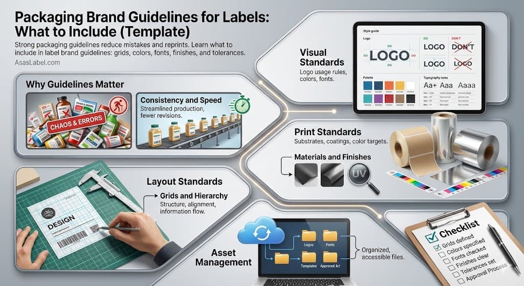
Visual elements for packaging labels differ vastly from digital or general print guidelines. The physical interaction with the product changes how visual elements like logos are perceived. Your brand guidelines must address how the product label looks under store lighting, in shadows, and when distorted by the shape of the container for a particular product.
Color reproduction stands as the most critical visual standard in packaging and labeling. A hexadecimal code meant for a screen offers no help to a printer using CMYK. Your guidelines must specify exact Pantone colors and their CMYK breakdowns for the color palette. This ensures the brand colors look the same on a cardboard box as they do on a plastic pouch, maintaining a strong brand identity.
Typography guidelines require specific attention regarding readability and legal requirements. Product packaging often necessitates small font sizes for product details such as ingredients and regulatory information. The guidelines must dictate minimum point sizes and allowed typeface weights to ensure text remains readable and meets compliance with regulatory standards after the ink spreads on the substrate.
Imagery guidelines must move beyond aesthetic choices to technical feasibility to reflect your brand values. You must define the style of photography or illustration and how it interacts with the background. Specifying the resolution and color profile for raster images is non-negotiable within this section to prevent pixelation or muddy printing results that could hurt the brand experience.
Your primary logo faces its harshest environment on custom packaging. It competes with erratic backgrounds, distracting patterns, and structural folding. The brand guidelines must enforce a strict clear space policy to isolate the brand mark from these elements. This "buffer zone" preserves the integrity and authority of the logo and brand on a busy shelf.
Minimum size requirements differ for printed labels compared to web. Your style guide must specify the smallest allowable size in millimeters rather than pixels, depending on the size of the packaging. This measurement often depends on the printing technique; for example, a logo printed via offset can be smaller than one printed on corrugated cardboard via flexography.
Define allowable color variations for specific substrates to keep your brand consistency high. A logo that works well on white paper may disappear on a kraft background or a metallic can. Provide specific monochrome or high-contrast versions of the brand mark for these challenging environments. This ensures brand awareness remains high regardless of the right packaging material used.
Placement rules should dictate where the logo sits on the Principal Display Panel (PDP) to make your label easier for the brand to recognize. Whether perfectly centered or anchored to the upper third, consistent positioning helps consumers scan the shelf. Guidelines should also forbid covering the logo with stickers, promotional bursts, or structural folds that obscure the overall brand identity.
Packaging layout deals with three-dimensional space and consumer ergonomics. Unlike a flat brochure, product packaging has multiple viewing angles. The guidelines must address how the design flows from the face to the side panels and back. The brand experience involves picking up, turning, and opening the object to use the product.
A strong brand identity strategy directs the consumer’s eye through a hierarchy of information using well-designed design elements. The guidelines must establish the order of communication. The brand name usually comes first, followed by the product name, flavor variant, and finally, a product description or key benefits. This sequence must be rigid to prevent consumer confusion at the point of purchase.
Legal requirements dictate much of the packaging and labeling layout. The style guide must reserve specific zones for a common label that contains mandatory information such as net weight, nutrition facts, and warnings. By locking these areas in the layout standards, you prevent designers from inadvertently minimizing legal text in favor of aesthetic choices.
Flexibility within the layout structure is essential for accommodating different aspect ratios for various products. A layout that works on a tall olive oil bottle may break when applied to a wide distinct jar. The design tips should demonstrate how the design system adapts to vertical, horizontal, and square formats without losing brand consistency.
Establishing a grid system is essential for maintaining order across diverse SKUs. The grid provides the scaffolding for all design elements and helps you create a style guide for your product. It dictates margins, column widths, and alignment points. In product packaging, this grid must account for the safe area, ensuring no critical content sits too close to the cut line or fold.
Information hierarchy determines how quickly a shopper understands the particular product. Your guidelines should categorize text into primary, secondary, and tertiary levels. Primary text includes the brand and flavor. Secondary text covers a product description and romance copy. Tertiary text handles ingredients and manufacture details. Distinct typography guidelines should separate these levels visually.
Standardizing the architecture of the Principal Display Panel is crucial to help consumers make fast decisions. Define where the flavor cue sits relative to the product shot. If you use color coding for variants, specify how much surface area that brand colors should occupy. This uniformity allows consumers to find their preferred variety based on layout cues alone, setting your product apart.
The grid must also account for manufacturing tolerances and the shape of the container. Mechanical limitations mean the print can shift slightly during production. Your design tips should include generous bleed areas and safe zones within the grid. This buffer prevents text from being chopped off or white gaps appearing at the edges of the packaging labels.
The gap between a digital design file and a printed physical object is bridged by technical print standards. Ignoring this section leads to print disasters for your new branding. Your brand guidelines must speak the language of the printer, addressing ink limits, trapping, and overprinting settings. This technical specificity protects the brand from poor production quality.
Total Area Coverage (TAC) or total ink limit is a vital metric to include in your brand style guides. Different materials like eco-friendly paper can only absorb a certain amount of ink before they warp or smear. Identifying the maximum ink density prevents production issues. This is specific to the print vendor, but your guidelines should set baseline expectations for coated versus uncoated stocks.
Black is not just black in packaging labels. The typography guidelines must distinguish between standard black (100% K) and rich black (a mix of C, M, Y, and K). Text usually remains standard black to keep it crisp, while large backgrounds require rich black for density. Specifying these CMYK values prevents gray-looking backgrounds or fuzzy text in your custom labels.
Addressing the print process itself is necessary. Digital, offset, rotogravure, and flexography all yield different results. Your style guide should explain how artwork must be modified for each common label type. For instance, flexography often requires adjustments to gradients to avoid a hard "break" where the dot percentage drops to zero.
The substrate is the canvas of packaging and fundamentally alters color perception. Printing on clear plastic requires a layer of white ink underneath artwork to make it opaque. Your brand identity guidelines must explain technical setups like this to ensure colors remain vibrant rather than translucent for your pressure-sensitive labels.
Finishes add perceived value and tactile engagement to the brand experience. The style guide should define when and how to use elements like spot UV varnishes, matte coatings, or soft-touch laminates. Restraint is key here. Guidelines should dictate that finishes highlight specific brand elements, like the logo, rather than applying them indiscriminately.
Embossing and foil stamping require specific vector artwork setup in your design file. Guidelines must instruct designers on how to create separate layers for these effects. Detailed rules regarding the minimum line weight for foils are necessary because lines that are too thin will not adhere properly to the board during the stamping process, which is important to your brand quality.
Sustainability claims and eco-friendly choices link directly to material selection. If the strong brand values eco-friendly practices, the guidelines should mandate specific sustainable packaging or post-consumer waste materials. This section ensures that the physical components of the package reinforcement of your brand’s identity and values.
Disorganized files lead to versioning errors where obsolete barcodes or ingredient lists hit the press. Asset management guidelines prevent this liability for your overall brand. You must establish a rigid file naming convention that includes the SKU number, date, and revision code. This logic helps anyone in the supply chain identify the correct design file instantly.
Digital Asset Management (DAM) protocols should be outlined clearly to maintain a consistent brand. Define where working files live versus where final press-ready PDFs are stored. Limit access to the final production folder to a select few stakeholders to prevent accidental overwrites. This hierarchy creates a secure environment for your intellectual property and new branding assets.
Layer management in design files enhances efficiency in the design process. Guidelines should mandate that die-lines, artwork, and special finishes exist on separate, clearly labeled layers. This structure allows prepress operators to toggle layers on and off for checking, ensuring that the structural dieline does not get printed on the final product without permission.
Handling linked images requires strict discipline to protect your brand image. All high-resolution images must be linked, not embedded, to keep file sizes manageable. The brand style guides should require packaging files to be "packaged" via software tools, collecting all fonts and links into a single folder before transfer to vendors for your custom labels.
A comprehensive checklist acts as the final firewall between the design team and the manufacturing floor. This list transforms abstract guidelines into concrete action items. It forces the approver to slow down and verify every millimeter of the product label design against the established standards and legal requirements to ensure consumer trust.
Check the structural dieline against the physical sample for your custom packaging. Ensure the artwork dimensions match the CAD drawing exactly. Verify that the orientation of the layout matches the winding direction if the labels provide machine application. A mismatch here results in upside-down labels on the packaging line.
Scrutinize the barcode and QR codes for readability. Visually checking them is insufficient; the checklist must mandate scanning the printed proof with a verifier. Confirm the barcode numbers match the SKU product codes in the inventory system to prevent retail scanning errors for your various products.
Proofread every word of the legal requirements copy. This includes ingredients, allergen warnings, and distribution addresses. Cross-reference this text with the official document provided by the regulatory team. Typos in this section trigger immediate recalls, making this the highest-stakes part of the design process.
Verify color separations and overprint settings in the design file. Use output preview tools to check that spot colors are defined correctly and not converted to process colors unless intended. Confirm that black text is set to overprint on top of brand colors to prevent registration gaps on the product label.
Inspect the bleed and safety margins one last time. Ensure that background images extend to the bleed line and that no critical visual elements like logos or legal requirements are encroaching on the safe zone. This final check guarantees that minor shifts during cutting and folding will not ruin the brand experience for the product within.