
Contact Sales Now
Thank you! Your submission has been received!
Oops! Something went wrong while submitting the form.

Contact Sales Now
Thank you! Your submission has been received!
Oops! Something went wrong while submitting the form.

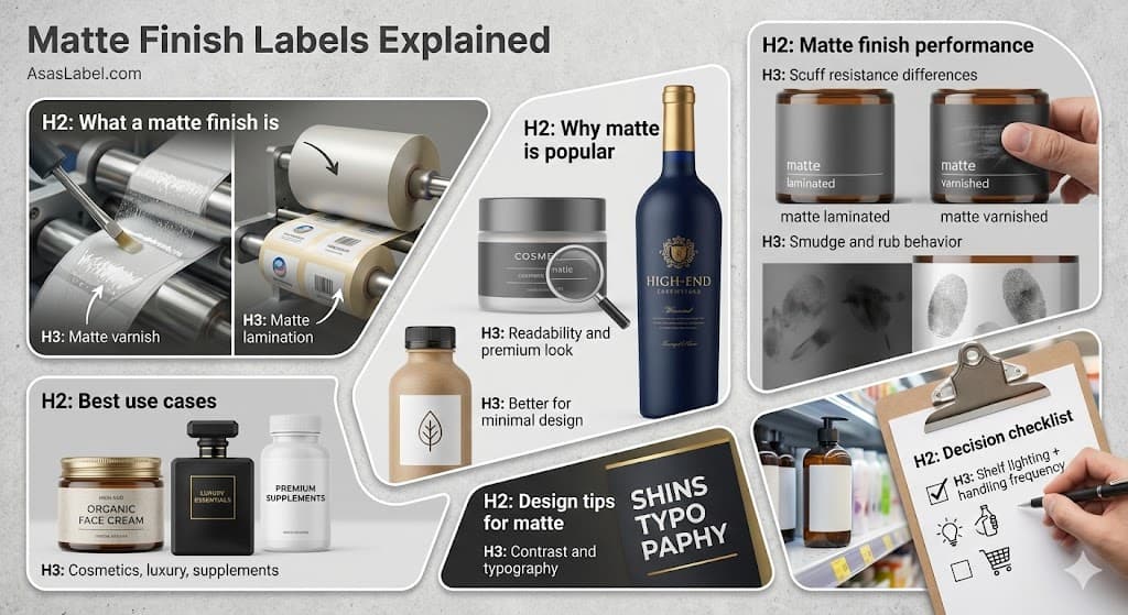
A matte finish is defined primarily by its interaction with light. Unlike glossy labels that reflect light directly back to the viewer in a condensed execution, a matte label surface disperses light in multiple directions. This physical phenomenon is known as diffuse reflection. It eliminates specular highlights and creates an understated or flat appearance that many associate with varied tactile textures for product packaging.
The surface topography of a matte finish is microscopically rough. It is this uneven surface that scatters light waves rather than bouncing them back coherently. This lack of reflection allows the true color of the matte paper or film and the ink to be viewed from almost any angle without the interference of glare. It creates a visual softness and sophistication that stands in stark contrast to shiny finish alternatives.
From a manufacturing standpoint, achieving this non-reflective finish requires a specific matte coating or physical texturing during the conversion process. Whether applied via a liquid matte over glossy ink or a secondary film layer, the goal is always to disrupt the surface tension that creates a reflective finish. This results in a matte label that feels natural to the touch and offers a subdued finish for high-end cosmetic brands.
Substrate absorption plays a minor role, but the label finish is largely a surface-level modification. The underlying material, whether matte paper or biaxially oriented polypropylene (BOPP), retains its structural integrity while the outer layer dictates the visual and tactile experience. This finishing option changes how consumers interact physically with the product packaging during new product launches.
Matte varnish serves as a liquid matte coating applied during the printing process, typically via a flexographic station. It uses UV curing or aqueous solutions to seal the ink. The layer is incredibly thin, often only a few microns thick. It provides a subtle, non-reflective finish that does not significantly alter the stiffness of the matte label stock.
Varnishes are generally more cost-effective for high-volume custom labels. They are excellent for matte paper stocks where a textured, organic feel is desired. However, because the layer is so thin, it offers limited durability against heavy abrasion or moisture compared to glossy sticker film solutions. It effectively sets the ink but adds minimal physical bulk to the product labels.
Matte lamination acts as a completely separate layer of polypropylene or polyester film adhering to the top of the printed substrate. This process adds measurable thickness and durability to the final label construction. The right label finish best provides a substantial barrier against water, oil, and chemicals, making it superior for durable goods where you need labels to stand the test of time.
The look and feel of lamination is often more uniform than varnish. Because it is an extruded film, the matte and glossy finishes available are perfectly even across the web. Premium matte laminates also tend to be smoother to the touch compared to the slightly toothier feel of a matte varnish. This distinction is crucial when choosing between matte and gloss for your brand identity.
In terms of protection, lamination wins on durability. It prevents the printed artwork from a smudge or rub under significant friction. Varnish is more susceptible to wearing down if the product faces rigorous supply chain handling. However, newer UV-curable finishing options are narrowing this performance gap when brands decide between matte or gloss.
The shift toward matte labels is often correlated directly with broader consumer trends favoring authenticity and understated elegance. Glossy labels often trigger associations with mass-market, budget-friendly commodities found in high-volume retail environments. Excessive shiny finish can be perceived as artificial, which contradicts current prefer matte finishes for organic and natural goods.
A matte surface suggests a lower level of processing, even if the manufacturing effort is identical to gloss. This psychological association allows premium brands to command higher price points. The subtle elegance implies a handcrafted or artisanal logic. It aligns the finish perfectly with the "clean label" movement in food and beverage sectors, where the packaging must reflect the purity of the ingredients.
Furthermore, the visual noise in retail environments is at an all-time high. When a shelf is dominated by shouting colors and glossy surfaces, a light-absorbing matte label finish acts as a visual break. It draws the eye by offering a place to rest. This leverage matte labels approach helps products stand out by whispering rather than screaming sophistication.
Readability is a functional imperative when you choose the perfect right label. High-glare environments, such as supermarkets with harsh overhead bright lighting, can render glossy labels stand illegible. Spectacular reflection obscures text and mandates that the consumer physically tilt the product to read. Choosing the right finish like matte solve this usability friction immediately.
By scattering the overhead light, matte materials ensure the label is easy to read under various lighting conditions and from all viewing angles. This is particularly vital for pharmaceutical or informational labels where small typography must be deciphered quickly. The non-reflective surface ensures that the communication hierarchy remains intact regardless of the type of label used.
Beyond utility, the premium look of matte is rooted in tactile haptics. Soft-touch premium matte techniques create a velvety feel that mimics the texture of sophistication. This tactile engagement invites the consumer to hold the product longer. Increasing the duration of physical interaction is statistically linked to higher conversion rates for cosmetic product launches.
The finish affects how colors appear. On a matte surface, colors appear deeper and more saturated because surface reflection does not wash them out. Black ink on a matte label looks like absolute black, whereas on a glossy sticker, it often appears dark gray due to light interference. This saturation signals the subtle elegance of premium brands seeking a high-end feel.
Minimalist design relies heavily on negative space and topography to complement the brand. Without complex graphics to distract the eye, the right finish becomes the focal point. Matte labels offer a way to turn white space into a design element. The matte surface becomes part of the visual narrative for brands that want an understated look.
The "no-label look" is often harder to achieve with glossy surfaces on matte containers due to the visible edges catching light. A clear matte label finish applied to frosted glass or matte plastic containers creates a seamless integration. This finish you choose can make it look effectively printed directly on the surface, removing the visual boundary of the glossy labels.
Typography on minimal designs requires razor-sharp edge definition. Matte labels are often preferred because they prevent the microscopic dot gain spread sometimes seen with fluid inks on a shiny finish. This retention of detail allows for ultra-thin font weights and delicate serif fonts to remain crisp and intentional for cosmetic labels.
Furthermore, brands looking for minimal designs often utilize pastel or muted color palettes. These desaturated tones can look plasticized under a gloss label finish. A matte over glossy lamination softens the hues further, giving them a contemporary, sophisticated pastel appearance that brands seeking sophistication prefer for their product labels.
Performance must be evaluated distinct from aesthetics when choosing between matte and gloss. While matte finish labels offer a superior premium look for specific verticals, they possess unique physical characteristics. The microscopic peaks and valleys that create the non-reflective finish are also physical vulnerabilities when brands choose the right finish.
Engineers and packaging specialists must consider the durability and coefficient of friction (COF). Matte surfaces generally have a higher COF than glossy labels. This means they do not slide against each other as easily on a conveyor line. This higher friction can lead to issues in high-speed automatic dispensing if the machinery is not calibrated for types of label finishes.
Chemical resistance depends largely on whether the right label finish is a varnish or a laminate. Generally, the surface energy of a matte finish is lower, which can impact how secondary stamping or uv coding adheres. Understanding these options for brands is critical before choosing the right finish for a full production run.
A common matte vs gloss misconception is that matte labels are often easily scarred. The reality is nuanced. Matte laminates are generally softer than a glossy sticker. When a hard object drags across a matte label, it can flatten the texture. This creates a glossy streak known as "burnishing," which unlike glossy labels, shows as a visual defect.
This burnishing effect is not a removal of ink, but a change in the matte surface topography. Using a scuff-resistant premium matte laminate addresses this issue. These specialized films maintain the subdued finish even after transit vibration or shelf stocking, which is why they are ideal for high-end product labels.
Conversely, matte labels stand the test of time by hiding different types of damage. Micro-scratches that would fracture the light reflection on glossy labels, making them look worn, are often invisible on a non-reflective surface. The matte finish also hides minor surface imperfections that occur during normal packing and shipping procedures.
Standard matte varnishes offer the least durability. For wine logistics or cosmetic tubes that travel in purses, a standard varnish will show transit wear quickly. In these scenarios, choosing between matte and gloss leads many to upgrade to a thermal-transfer receptible matte label film or a high-grade uv coating for brand integrity.
Fingerprint marks are the enemy of premium brands. Glossy surfaces are notorious for highlighting oily residue from consumer handling. Matte labels are often far more forgiving of lipids and oils found on fingertips. They absorb or disperse the oil visually, keeping the product packaging looking clean and understated.
However, dark-colored matte label designs face a specific challenge. If the ink coverage is heavy and the matte finish is porous, skin oils can appear as permanent dark stains. This is less of an issue with plastic laminates but a significant consideration for brands that prefer matte paper or porous varnishes.
Rub resistance refers to ink transfer. Because matte surfaces have a higher tooth, they can act like mild sandpaper against other surfaces. If matte labels are packed face-to-face without proper uv curing, they can abrade each other. This is termed "blocking," though modern finishing options have largely mitigated this risk for custom labels.
Soft-touch matte labels are particularly prone to retaining dirt due to their rubberized texture. While they feel high-end, they can become grimy if used on products handled frequently with dirty hands. The finish you choose can make or break the user experience depending on whether the labels are ideal for that environment.
Selecting the right label finish is as much a strategic business decision as a design choice. Certain industries have codified matte finish best practices as a signal of elegance. Deviating from these types of label finishes requires a deliberate strategy to leverage matte labels to stand out from the shiny finish competition.
The beverage industry, specifically craft beer and wine, relies heavily on matte labels. For wine, a matte paper finish signals tradition. For craft beer, particularly in the aluminum can segment, matte or gloss labels differentiate from mass-market lagers. Matte labels offer a tactile differentiation that glossy labels stand away from.
Industrial applications also favor matte but for different reasons. Barcode scanning reliability is paramount in logistics. Glossy labels can reflect light into scanner lasers, causing read errors. Matte thermal transfer labels are the industry standard for inventory management to ensure text is easy to read under various lighting conditions.
In the cosmetic sector, the "soft-touch" matte label is dominant. This finish you choose can make a huge impact on the product promise. Does the skin cream promise to soften skin? The packaging must physically represent that outcome. The tactile elegance of matte builds subconscious trust in the brand formulation.
Luxury goods utilize matte as a canvas for contrast. High-end spirit brands and perfumes rarely use a full glossy sticker wrap. Instead, they use matte backgrounds to allow metallic foil stamping or gloss label spot uv to pop. The subdued finish serves to recede, pushing the embellished glossy labels stand forward in the visual plane.
The dietary supplement brand uses matte finish labels to project clinical authority. Glossy labels can look like cheap confectionary packaging. A premium matte white or metallic finish conveys a pharmaceutical aesthetic. This suggests rigor and science, helping labels are the way to distance the product from "candy."
For organic brands looking for a natural feel, matte paper stocks are essential. They imply earthiness. A plastic-looking gloss label contradicts an "organic" brand ethos. Even if the type of label is synthetic for durability, a matte finish can simulate natural paper, maintaining the eco-narrative for brands that want that look.
Designing for matte requires a shift in pre-press thinking. Colors will not reflect light with the same intensity as they do under glossy labels. Designers must leverage matte labels for nuanced color palettes, as the finish affects how the final colors appear on the product labels.
The interplay between the substrate and the coating is critical. If printing on a metallic substrate, a matte finish will transform the "chrome" look into "anodized aluminum." This shimmering, frosted finish is incredibly modern. It diffuses the metallic reflection, creating a soft glow rather than a shiny finish.
Mockups are essential when you decide between matte and gloss. Digital PDF proofs cannot accurately simulate how a matte label scatters light. Physical proofs on the actual stock are the only way to gauge how the finish affects specific ink densities. This step prevents disappointment for brands seeking a specific look and feel.
Low-contrast designs can disappear on a matte label if not managed well. Because the finish diffuses light, the boundary between similar colors can blur. High contrast between the background and the typography is recommended to ensure the label is easy to read under various lighting conditions.
Reverse text benefits significantly from a matte finish. On glossy labels, the reflection often bleeds into fine reverse type, making it hard to read. Matte labels stand the negative space open. However, designers should avoid ultra-thin font weights on porous matte paper to prevent ink smudge issues during product packaging.
Spot UV is the ultimate partner for matte and glossy finishes combined. The technique involves applying a high-gloss coating over specific elements while keeping the rest of the matte label finish as a non-reflective surface. This contrast between matte and gloss creates a dynamic 3D effect that makes product labels stand out.
When selecting black inks for matte labels, use a "rich black" rather than just 100% black. A single channel of black ink can look charcoal or washed out under a matte coating. Boosting the black with underlying colors ensures a deep, void-like darkness that reinforces the sophistication of premium brands.
Making the final call between matte and gloss involves assessing the full lifecycle of the brand. It is not merely an aesthetic prefer matte choice; it is a functional durability requirement. Think about where your product will live, as the environment is the primary dictator of the finish you choose.
Consider the application method for your custom labels. If labels are applied by hand, matte label stiffness is forgiving. If applied by high-speed rotary applicators, the static properties of matte over glossy films must be managed. The finishing options and release liner pairing become just as important as the face stock.
Cost is the final arbiter when brands seek to decide between matte or gloss. Standard matte varnish is price-neutral compared to gloss in most flexo environments. However, moving to soft-touch matte labels or textured matte paper increases the unit cost. Labels are the way to go if the investment is justified by the brand positioning.
Audit the retail environment before product launches. Is the product sold in a brightly lit pharmacy or a dimly lit boutique? In bright lighting, matte labels offer better readability. In dim environments, a matte label might look too flat. Spot glossy labels stand elements can help brands looking for shelf impact in low-light scenarios.
Handling frequency dictates label finish durability requirements. A shampoo bottle resides in a shower—a high-humidity, high-friction environment. A matte or glossy finish laminate is required here for durability. A wine bottle is handled once; a matte label varnish is sufficient. For products that are squeezed, you need conformable labels are ideal.
Finally, think about where your product goes during shipping stress. If custom labels are bulk-packed, they will rub against each other. Matte vs gloss friction properties can result in scuffing. Interleaving sheets may be necessary to preserve the premium look of the matte surface upon arrival to the consumer.