
Contact Sales Now
Thank you! Your submission has been received!
Oops! Something went wrong while submitting the form.

Contact Sales Now
Thank you! Your submission has been received!
Oops! Something went wrong while submitting the form.

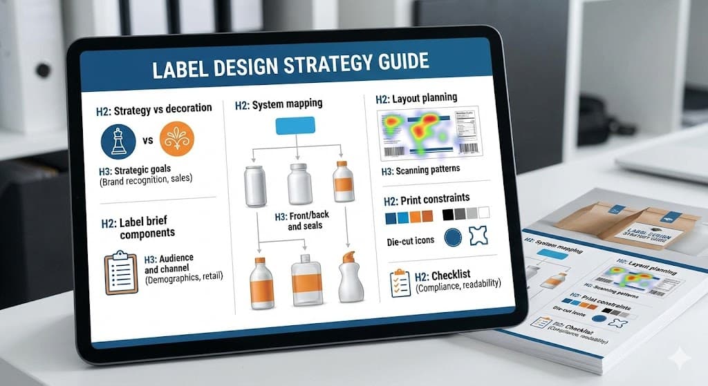
Design in the consumer packaged goods (CPG) sector often suffers from a fundamental misunderstanding. Many stakeholders conflate aesthetic appeal with commercial viability. A pretty label that fails to communicate the value proposition is a failed design. Strategy must always precede artistic execution to ensure market success and the creation of print-ready label artwork that flows smoothly through the printing process.
Decoration focuses on the subjective beauty of the packaging. It relies on trends, personal preference, and artistic flair that may not align with the brand identity. While aesthetics are important for catching the eye, they do not retain the customer or close the sale alone. During label design, shifting from rgb to cmyk color is essential to ensure the high-quality appearance of the final print.
Strategy acts as the functional architecture of the label. It dictates why certain colors are chosen based on psychological triggers and competitor analysis. It determines hierarchy based on information architecture rather than just visual balance. Every pixel in your label artwork must serve a specific commercial purpose, ensuring the graphic elements go straight into production.
Effective label design strategy solves specific business problems. It addresses shelf visibility issues, communicates flavor profiles without reading, and builds brand equity. Decoration is the skin, but strategy is the skeleton. Without the skeleton, the design collapses under market pressure. Using vector graphics in Adobe Illustrator ensures that your logo and professional design remain sharp at any label size.
Brands that prioritize decoration often face costly redesigns shortly after launch. They find that customers are confused by the product offering or that the package blends into the visual noise of the retail environment. Strategic design mitigates these risks by validating decisions against business objectives before a single print-ready pdf goes to the printer.
The first step in any label project involves crystallizing the primary objective. Is the goal to disrupt a stale category with shock value? Or is the aim to establish trust and heritage in a skeptically viewed market segment? These utilize vastly different visual languages and structural approaches, requiring a practical guide to preparing artwork for print.
Differentiation is a common primary goal. In a saturated market, blending in is the fastest route to failure. The strategy must identify the visual tropes of the category—such as green leaves for organic products—and decide whether to leverage them for familiarity or subvert them for distinction. Labeling is essential to make sure your artwork stands out through professional printing.
Brand architecture alignment is another critical strategic goal. A new label often needs to fit within an existing family of products. The strategy must dictate how the design borrows equity from the master brand while establishing enough independence to indicate a specific variant or sub-line. This requires ensuring compliance with various labeling requirements through custom label standards.
Value communication constitutes a third major goal. The label must justify the price point. Premium products require substrates and finishes that tactilely signal luxury. Value-tier products need bold, simple communication that signals economy and efficiency. Misalignment here creates cognitive dissonance for the shopper. Designers must use cmyk to maintain color accuracy during the labeling process.
Finally, the goal of regulatory compliance cannot be an afterthought. The strategy must account for the required real estate for nutrition facts, ingredient decks, and certifications. Planning for these mandatory elements early ensures they do not compromise the visual hierarchy later in the process. Every label artwork file must meet local regulations and safety requirements.
A vague brief guarantees a vague outcome. The creative brief serves as the binding contract between business intent and creative output. It reduces revision cycles and creates objective criteria for evaluating design concepts. Without it, you are designing in the dark and risk labeling mistakes that affect label compliance.
Technical specifications are the foundation of the brief. This includes precise dielines, dimensions, unwind direction, and adhesive requirements. Failure to define these early leads to designs that are technically impossible to manufacture or require significant reworking during the pre-press phase. A die line that is not properly set up your artwork layer can halt the printing process.
Competitive context is equally vital. The brief must include a visual audit of the immediate shelf neighbors. Designers need to know what they are fighting against. If every competitor uses matte black, the brief should explicitly highlight this to encourage a different chromatic approach. Using high-resolution vector artwork is a best practice for effective product differentiation.
The key value proposition acts as the anchor for the visual hierarchy. The brief must answer what the single most important thing to say is. Is it "Gluten-Free"? Is it the specific flavor? or is it the Brand Name? Prioritizing these elements prevents a cluttered design where everything screams and nothing is heard. Ensure your safe zone is respected so critical product information isn't lost during trim.
Production budget constraints must be transparent. Designing for gold foil stamping and spot UV varnishes is wasted effort if the unit cost budget only allows for 4-color process printing on standard stock. The brief must align creative ambition with fiscal reality. Label printing costs are directly tied to the file type and color mode chosen by the label designer.
A product sold primarily on Amazon requires a radically different strategy than one sold in a boutique grocery store. Digital shelves strip away context. The label must be legible at the size of a postage stamp. High contrast and simplified typography become non-negotiable requirements labels. You must prepare artwork to be 300 dpi even for product containers that look small on screen.
Retail environments offer tactile interaction. Here, the strategy shifts to materials and finishes. The audience can pick up the bottle or box. The texture of the paper, the reflection of the foil, and the weight of the stock signal quality to the physical shopper in ways a digital thumbnail cannot. High-quality label artwork often incorporates white ink on metallic or clear substrates.
Understanding the demographic profile informs font selection and color psychology. A younger, Gen Z audience may respond to brutalist typography and acid-bright colors. A baby boomer demographic often requires higher legibility, classic serif fonts, and colors that signal reliability and safety. Selecting the right font and image resolution ensures the final printed product meets consumer safety standards.
Psychographics play a larger role than demographics in modern strategy. Is the audience value-driven or status-driven? A status-driven audience looks for minimalism and subtle cues of exclusivity. A value-driven audience breaks down cost-per-ounce and looks for bold "bonus quantity" callouts. This labeling to make a sale requires artwork for print that is ready for print and perfectly balanced.
The lighting of the sales channel affects color selection. Drugstore lighting is often harsh and fluorescent, washing out subtle pastels. Boutique lighting is warm and dim making dark labels disappear. The strategy must test color palettes against the actual environmental conditions of the primary sales channel. Always use photoshop or illustrator or indesign to check your cyan, magenta, and yellow levels.
Labels rarely exist in isolation. They are usually part of a broader system or Stock Keeping Unit (SKU) portfolio. System mapping establishes the rules that govern how the design stretches across different package sizes and form factors without losing brand coherence. This step by step guide ensures that your design scales across any file size.
Consistency builds trust. If a strawberry jam label looks completely unrelated to the raspberry jam label from the same brand, the consumer assumes a lack of quality control. System mapping defines the constant elements (Logo placement, typography) and the variable elements (Color coding, illustrations). Professional design labels help maintain this essential product trust.
Scalability is the primary benefit of robust system mapping. A good design system anticipates future product launches. It creates a template logic that allows for easy extension into new categories. This dramatically reduces the design costs for future line extensions. Preparing artwork for print becomes much faster when you use vector templates.
Differentiation within the system is just as important as consistency. The consumer must be able to distinguish between 'Spicy' and 'Mild' instantly. System mapping assigns specific visual cues—such as color bands or icon sets—to handle these variations efficiently. Labels are cost-effective when label printing is managed through a unified design file.
The map also accounts for different container substrates. A design might look great on a white plastic tub but fail on a clear glass bottle. System mapping creates adaptation rules for different backgrounds, ensuring the brand colors remain consistent regardless of the underlying material. Use vector graphics and high-resolution assets to avoid labeling errors.
The front-of-pack (FOP) acts as the billboard. Its job is attraction and conversion. However, the design strategy fails if it ignores the interaction between the front, the back, and the closure mechanisms. The label is a three-dimensional object wrapping around a form. Getting your artwork right requires accounting for the bleed and safe zone on all panels.
The "romance copy" typically lives on the back or side panels. This is where the deeper storytelling happens. Strategic layouts ensure a seamless visual transition from the punchy headline on the front to the narrative content on the back. The font styles and spacing must align to maintain a singular voice. Labeling must be clear, with dots per inch set to 300dpi for all product details.
Tamper-evident seals and lid stickers serve dual purposes. They are functional safety requirements, but they are also prime real estate. A strategic designer uses the seal to add branding, such as a logo icon or a "freshness guaranteed" claim, turning a mandatory cost into a marketing asset. This type of label requires a precise die line to ensure it fits the package design.
Alignment across the seam is a technical detail that separates amateurs from professionals. If the design wraps around, the join line must be considered. In shrink sleeves, this is critical. Critical text or imagery must never fall on the seam where distortion is highest. Artwork ready for this level of professional printing must include the name and address and legal requirement info.
UPC placement requires strategic thought. It must be scannable on a flat surface, not hidden in a deep curve. However, it should not disrupt the visual flow. Mapping the "dead zones" of the container helps in placing these ugly but necessary functional elements. Barcode generation is a legal requirement that must meet strict labeling standards for consumer safety.
Layout logic dictates the flow of information. It is the implementation of the information architecture defined in the brief. Good layout is invisible; it guides the eye effortlessly from the hook to the details. Bad layout forces the viewer to work, which usually results in them walking away. Create print-ready layouts to avoid labeling mistakes.
White space is an active design element, not empty space. It frames the content and creates a perception of value. Crowded labels suggest discount products. Generous margins and clear separation between elements signal a premium positioning and make the content more digestible. A well-designed label uses the safe zone effectively to convey information.
Grid systems provide order. Even on a small label, a grid helps align disparate elements like net weight, flavor names, and certifications. This underlying structure creates a sense of stability and professionalism that the consumer senses subconsciously. Illustrator or InDesign is the preferred design software for these vector tasks.
Typography hierarchy requires strict discipline. There should be a distinct difference in size and weight between the primary header, the secondary description, and the mandatory legal text. If everything is big, nothing is big. Contrast is the key to readability. Fonts must be set to cmyk or white ink to ensure they pop.
The rule of thirds works effectively on packaging as well as photography. Placing the focal point—usually the brand mark or the product visual—at the intersection patterns can improve visual tension and interest more than simple center alignment. Graphic design for custom labels relies on these label design fundamentals.
Western consumers scan shelves in predictable patterns. Understanding eye-tracking data allows designers to place key information where the eye naturally falls. The goal is to reduce the cognitive load required to understand what the product is. Labels provide essential information through a step by step guide of visual cues.
The "F-Pattern" is common in digital, but on a physical shelf, the eye often moves in a Z-pattern or a spiral on the specific package. The eye hits the top left, scans across to the brand, cuts down to the imagery, and exits on the weight or flavor descriptor. Logo placement is important information for consumer trust.
Visual gravity pulls the eye downward. Heavier elements types or dark blocks of color at the bottom of the label ground the design. Placing the brand mark at the top utilizes the initial point of contact to establish authority before the eye drifts down to the product details. Labels are designed to make informed choices easier for the consumer.
Blocking effects occur when identical products are lined up shelf-ready. A strategic layout considers how the label looks when repeated. Patterns can connect across multiple bottles to create a "billboard effect" that creates a massive block of color, stopping the scanning eye. Packaging and label design should help your packaging stand out through label artwork unity.
The three-second rule is the ultimate test. A shopper decides in roughly three seconds. The scanning hierarchy must deliver: 1. Brand (Who is it?), 2. Product (What is it?), and 3. Variant (Which one is it?) within that narrow window. If they have to search, you lose layout strategy. Labeling to make an impact means your artwork for print must be print-ready.
Digital screens lie. They project light, making colors vibrant and neon-bright. Physical labels reflect light, often resulting in a duller appearance. A robust strategy anticipates the limitations of the physical medium and designs within the realities of ink and substrate. Prepare artwork by getting your artwork out of rgb color and into cmyk color mode.
Flexographic printing, common for high-volume runs, has strict limitations on gradients and vignettes. A design that fades to zero percent opacity often results in a "hard edge" on the plate. Designers must use minimum dot percentages to avoid this unsightly production error in their label artwork.
Color gamut management is essential. The CMYK color space is smaller than the RGB screen space. Bright oranges and electric greens are often out of gamut. Strategy dictates using Pantone Spot Colors for these hues to ensure brand fidelity, despite the added cost. Set to cmyk to see how cyan and magenta will final print.
Text legibility is governed by the print process. Small reverse text (white text on a dark background) can plug up with ink during high-speed printing. Strategic font selection avoids thin serifs or light weights for small legal copy or ingredient lists. High-resolution vector graphics are a legal requirement for food labeling clarity.
Substrate interaction changes color perception. Uncoated papers absorb ink, causing "dot gain" where the ink spreads and darkens the image. Clear films require a layer of opaque white ink behind the graphics to ensure they stand out against the contents of the bottle. This is a specific requirement for cosmetic labeling.
Bleed and safety zones are non-negotiable. Die-cutting is mechanical and has a margin of error. Strategy ensures that no critical border or text sits too close to the edge, preventing it from being chopped off if the cutting blade shifts a millimeter during production. Bleed is the area that printer software uses to trim the final printed product.
Embellishments like foil stamping and embossing require their own separation plates. These cannot be overly intricate or fine, as the foil may not adhere or the paper may tear. Designing for these finishes requires a simplified approach meant for distinct, bold shapes. This design and printing stage is where professional design meets label printing reality.
Before releasing files to the vendor, a rigorous final check is mandatory. This phase moves from creative strategy to technical quality assurance. A single error here can result in thousands of dollars of wasted packaging inventory. Create print-ready print-ready artwork to avoid labeling errors.
Verify barcode scannability. The bars must have sufficient contrast against the background. Red bars generally do not scan. Sufficient "quiet zones" of white space must exist on either side of the code to ensure readers can isolate it. Barcodes must meet local regulations and safety and compliance standards.
Proofread for regulatory compliance. Ensure the font height of the net weight declaration meets the minimum millimeter requirement for the country of sale. Verify that the ingredient list order matches the formulation percentage accurately. Information on the product must be essential for consumer safety.
Check color modes and resolution. All images must be 300 DPI at actual size or higher. All vector elements should be CMYK or Spot Color, with no stray RGB elements lingering from the drafting phase. Confirm overprint settings to avoid separating colors unintentionally. Use photoshop only for high-resolution raster images.
Inspect the die-line layer. Ensure the technical dieline is set to a non-printing spot color and is placed on a separate layer on top of the artwork. This ensures the printer does not accidentally print the cutting line on the final label. Dielines are the format that ensures that your design is cut correctly.
Confirm the unwind direction. For machine-applied labels, the roll must unwind in a specific orientation (e.g., top off first) to match the applicator equipment. Getting this wrong means the manufacturing line cannot apply your labels. This label requirements detail is essential product info for ongoing compliance.
Finally, conduct a mock-up test. Print the label at 100% scale, cut it out, and tape it to the actual container. Check for distortion, size appropriateness, and legibility in real-world lighting. This physical validation is the final safeguard for your print-ready label artwork strategy and ensures labeling to make a perfect label.