
Contact Sales Now
Thank you! Your submission has been received!
Oops! Something went wrong while submitting the form.

Contact Sales Now
Thank you! Your submission has been received!
Oops! Something went wrong while submitting the form.

Effective label design operates on a timeline measured in milliseconds. When a consumer scans a physical shelf or a digital thumbnail, they do not read every word. They recognize hierarchy patterns. The success of a product relies heavily on how quickly the brain can use visual cues to organize and interpret visual data. A clear visual hierarchy ensures that important information is captured instantly.
Visual hierarchy guides the eye through the overall design. It is the invisible structure that moves the viewer from the most critical heading to the supporting body text. Without a deliberate typography hierarchy, even aesthetically pleasing designs fail to build trust and convert interest into purchase. Hierarchy organizing information creates a visual trajectory that aligns with the consumer's decision-making process.
Designers and brand managers often confuse decoration with communication. A product label must prioritize data points based on an effective hierarchy rather than just fitting elements into available white space. This prioritization ensures that the design work functions as a label system that helps users navigate complex information quickly. Refine your design by ensuring the product name and brand identity are the primary focal points.
Optimizing this typography hierarchy requires a rigorous approach to layout, font selection, and spacing. It moves beyond basic legibility into the realm of rapid cognitive processing where hierarchy creates a logical flow. The goal is to reduce friction between seeing the packaging label design and understanding the value proposition, ensuring people read the right information first.
We will examine the mechanics of label architecture. This analysis focuses on structuring visual elements for maximum impact and ensuring that compliance requirements do not compromise visual integrity. Thoughtful design choices and a clear hierarchy reduces the time needed to make an informed choice.
Market performance correlates directly with the speed of key information retrieval. Consumers face an overwhelming number of various products in any given category. Decision fatigue sets in quickly. A product label that forces the consumer to hunt for information creates cognitive friction, whether hierarchy is present or not. Proper hierarchy becomes the tool to solve this.
This friction results in lost sales. If the eye cannot locate the product name or the primary benefit instantly, the shopper moves to a competitor with a strong visual hierarchy. Hierarchy isn’t merely an aesthetic choice. It is a functional requirement for commercial viability that helps guide users toward the most important design elements.
Strong visual prioritization and design hierarchy establish authority. Brands that present organized, clear hierarchy patterns are perceived as more trustworthy. Chaos on a label suggests chaos in production. Effective visual hierarchy ensures that structured design implies quality control and attention to detail in the design process.
Furthermore, hierarchy supports price positioning. Premium products often utilize three to five levels of hierarchy that differ from value brands. Understanding how hierarchy organizes information allows you to manipulate perceived value through thoughtful design and typographic hierarchy alone.
Comprehension speed is the primary metric for label effectiveness. The human brain processes elements of visual hierarchy before it decodes text. It scans for visual cues such as size to establish context. Speed depends on a predictable title at the top or another anchor to guide the eye along a logical path.
When hierarchy refers to a flawed structure, the eye darts randomly. This is known as the "pinball effect." The viewer bounces between visual elements without absorbing meaning. This delay, even if it lasts only a second, breaks the engagement loop required for a purchase decision. Clear hierarchy reduces this confusion effectively.
Designers must work together to create a linear visual flow. The eye should land on the primary heading, move to the differentiator, and settle on the rest of the text. This controlled movement mimics the logical questions a consumer asks: What is it, why do I want it, and what is in it? Smart design ensures that the most important information stands out.
Testing comprehension involves analyzing scan paths. Successful labels show a clear Z-pattern or F-pattern of engagement. By aligning information with these natural biological habits, brands significantly improve readability. Hierarchy improves the likelihood of critical information being seen and understood.
Reducing cognitive load increases the likelihood of the item being picked up. Once the product is in hand, the deeper typography hierarchy takes over to close the sale. The initial scan must be effortless to facilitate that physical interaction with the brand and product.
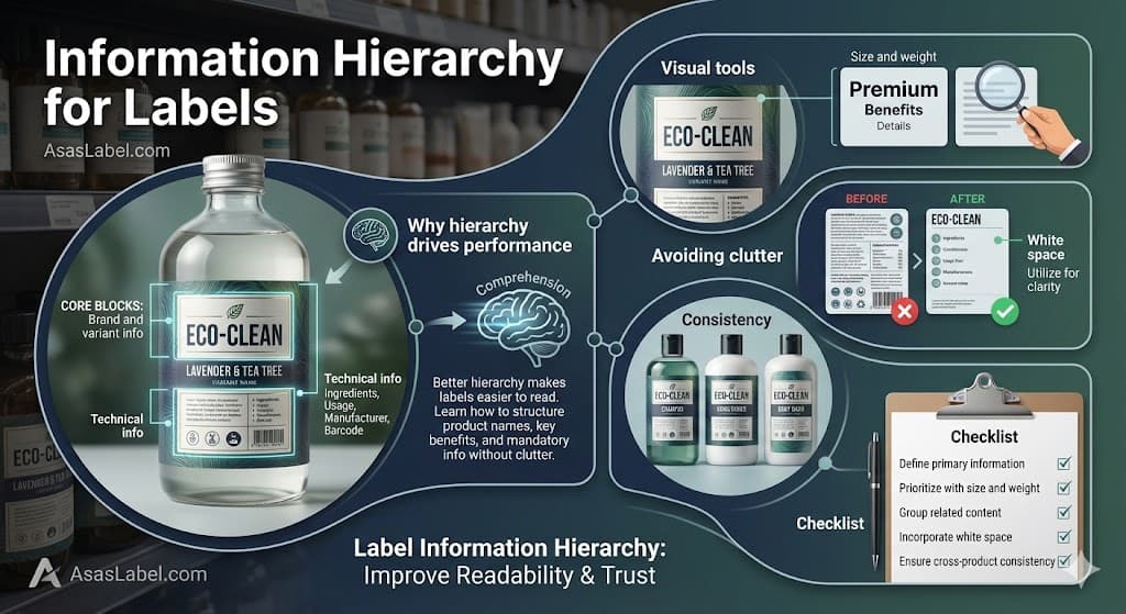
Every label consists of distinct data zones. Identifying and segregating these zones is the first step in successful layout planning. You cannot treat the brand logo, the variant, and the heading level as equal players on the stage. Hierarchy requires you to align text and graphics according to their strategic importance.
The Principal Display Panel (PDP) serves as the primary billboard. It must contain only the essential visual elements. Overloading the PDP is one of the common mistakes that dilutes the core message. Secondary zones should house the supporting text and technical details. Hierarchy controls the visual attention of the shopper.
This zoning approach requires strict discipline. Marketing teams often push to elevate every feature to the top of the page. However, when everything is emphasized with bold text, nothing stands out. You must make hard design choices about which blocks hold the highest strategic value for the product label.
Defining these core blocks early in the design process prevents cognitive clutter. It establishes a blueprint for maintaining visual consistency across different package sizes. Whether hierarchy is simple or multi-layered, it must remain stable to build trust with the consumer.
The relationship between the master brand and the product variant is the most critical hierarchy decision. For established household names, the brand logo usually dominates the title at the top. The trust in the manufacturer drives the purchase, and hierarchy ensures this is the first thing that customers see.
For new or niche products, the specific product name or category descriptor often needs to take precedence. The consumer is looking for "Almond Milk" first, and the brand name second. Misaligning this typographic hierarchy creates confusion about what the product actually is and fails the great label test.
Differentiation between variants relies on a clear hierarchy. If a brand sells three levels of spicy salsa, the distinction between "Medium" and "Hot" must be instantly discernible. This is often achieved through position and visual cues such as size and color rather than just body text.
The variant name should physically connect to the category descriptor. Splitting these elements forces the eye to jump gaps to assemble the full text structure. Keeping them proximal creates a cohesive unit of information that is easier for people read and recall.
Typography choices for these blocks must be distinct. The font used for the brand logo should generally not be used for the variant name to ensure the text makes a clear distinction. Contrast aids in distinguishing the parent entity from the specific item, making visual hierarchy work for the consumer.
Technical information presents the greatest challenge to aesthetic hierarchy. Regulatory compliance demands specific font sizes, contrasts, and placements for net weight and ingredient lists. These are non-negotiable legal constraints that the hierarchy must accommodate.
The strategy here is containment and integration. Technical data should be grouped into blocks that balance the active white space of the label. Instead of allowing legal text to bleed into branding zones, hierarchy organizing information requires strict grids to categorize this content.
Designers should utilize the minimum allowable size of the text for regulatory blocks to preserve the strong visual hierarchy of the brand. However, readability remains paramount. If the consumer cannot read the ingredients, trust erodes. The goal is to make sure your text is accessible when sought, but invisible during the initial scan.
Nutrient facts panels and barcodes should be positioned on the side panels whenever possible to break up text and keep the primary face clean. When they must appear on the front, they require a design element like a containment border to separate them from marketing copy and maintain a logical hierarchy.
Standardizing the treatment of technical blocks across a product line drastically reduces production time. Once a compliant typographic hierarchy is established, it acts as a template for material design. This ensures that legal changes do not necessitate a complete redesign of the effective hierarchy.
Visual elements are the levers designers pull to manipulate visual attention. Hierarchy is not established solely by placement; it is engineered through the interplay of typography and color. These tools create the visual cues that tell the brain whether hierarchy leads to the most important information.
Color acts as the primary signal. A high-contrast color creates a focal point that draws the eye immediately. Conversely, low-contrast palettes push elements into the background. Strategic design choices regarding color temperature can advance or recede specific information blocks, helping to organize information effectively.
Texture and finish also play a hierarchical role. A matte finish creates a different visual weight than a high-gloss spot UV. Using tactile elements on the brand name or heading adds a sensory dimension that reinforces the visual hierarchy and strengthens the brand identity.
Alignment is a subtle but powerful tool. Center alignment suggests formality and classic structure for premium branding. Asymmetric or flush-left alignment creates tension and dynamism, guiding the eye differently. Breaking alignment intentionally is a smart design method to arrest the eye at a specific point on the product label.
Scale creates the most obvious order of importance. The largest element is assumed to be the most important. However, size must be balanced with weight. A large, thin font may have less visual presence than a smaller, bold text typeface. Typographic hierarchy relies on these subtle balances to ensure key information is legible.
Typographic hierarchy often relies on the "Rule of Three." A label should generally operate with three clear levels of type size. Level one is the primary heading. Level two is the secondary descriptor. Level three covers the functional details. This three to five levels approach ensures the text is organized and clear.
Variable font weights allow for nuance within a single font family. Moving from "Light" to "Black" within the same typeface family creates a cohesive look while clearly distinguishing data points. This is cleaner than mixing multiple font families, which can lead to common mistakes and cognitive clutter.
Spacing, including kerning and leading, affects how dense a block of text appears. Tight tracking increases optical density, making a block feel heavier. Open tracking creates an airy, elegant feel. Adjusting these values fine-tunes the hierarchy improves the overall design without changing point size, making visual attention easier to manage.
Case selection serves a hierarchical function. Uppercase text demands attention and suggests authority but can decrease readability for longer phrases. Lowercase or sentence case feels more conversational. Mixing cases effectively demarcates different zones of information and ensures every word is part of the logical hierarchy.
Clutter is the enemy of hierarchy. It occurs when too many visual elements compete for the same level of attention. When everything screams, the consumer hears nothing. Elements of visual clutter degrade the signal-to-noise ratio of the packaging label design and fail to guide users effectively.
Redundant copy is a frequent offender in product design. Repeating the product name or weight in multiple locations confuses the scanning path. Every design element on the label must justify its existence. If it does not add new value or support the clear hierarchy, it is noise that hurts the overall design.
Over-designing background patterns also contributes to common mistakes. If the background texture interferes with the typography, the hierarchy collapses. The background must remain subservient to the data layers above it to ensure the text is legible under various lighting conditions.
Icons and claims badges can quickly overwhelm a layout. While "Non-GMO" is important, plastering five different badges on the PDP destroys the strong visual hierarchy. These should be grouped or consolidated to maintain a clean visual entry point and refine your design for a strong label presence.
White space is not empty; it is active. It is the visual breathing room that allows the hierarchy to function and improves readability. Without sufficient negative space, the eye cannot distinguish where one thought ends and another begins. Spacing is a vital design element in hierarchy patterns.
Increasing margins around the primary heading isolates it, granting it more importance. This is known as the "isolation effect." A small logo surrounded by ample white space often commands more authority than a large logo crowded by text. This makes visual hierarchy ensures the brand identity is clear.
White space also groups related information. By tightening the spacing between related items and increasing the buffer around that group, you create a distinct information island. The viewer instantly understands that these elements work together to create a cohesive message without needing a border box.
In crowded categories, white space acts as a differentiator. A clean, spacious product label signals clarity and purity. It stands out against competitors that utilize wall-to-wall graphics. This thoughtful design approach helps the great label win the visual attention of the shopper.
Designers must defend white space against the urge to "fill the gap." Stakeholders often see open space as wasted real estate. In reality, it is the structural support system that holds up the entire typography hierarchy and ensures that hierarchy guides the eye toward the most important information.
Hierarchy must be scalable. A label system that works for a single item often breaks when applied to a product family with twelve variations. Consistency in hierarchy patterns and typographic hierarchy builds brand recognition and builds trust on the shelf.
Consumers learn how to read your brand identity. Once they understand where to look for the flavor name on one product label, they expect to find it in the same location on the next. Breaking this pattern forces them to relearn the interface, which causes frustration and ignores the hierarchy matters principle.
Grid systems are essential for maintaining visual hierarchy. A master grid dictates the coordinates of the core information blocks. Regardless of whether the product is a bottle or a box, the relationship between logo and heading should remain mathematically relative to maintain a strong label identity.
Handling variable copy lengths breaks many rigid typography hierarchy structures. A layout that works for a short name may fail for a long one. The hierarchy strategy must accommodate the longest possible text structure without shifting the primary anchors of the product design.
Color coding systems must also follow a strict logical hierarchy. If color indicates flavor in one SKU, it cannot indicate strength in another. The design principles of the visual language must remain absolute across the entire portfolio to ensure an effective visual hierarchy that guides the shopper.
Before releasing design work for print, verify the hierarchy against real-world conditions. Print the design at 100% scale. Viewing a product label zoomed in on a monitor distorts perception of size and typographic hierarchy. Ensure the text structure is organized as intended.
Place the prototype on a shelf next to key competitors. Does the primary heading stand out? Does the eye travel the intended path, or does it get distracted? A contextual audit of visual attention is vital to determine whether hierarchy leads to the brand and product hook.
Perform the "squint test." Step back and squint until the details blur. The visual hierarchy should remain visible as abstract blocks. The primary element should still be the darkest or most prominent shape. If the blocks blend together, the hierarchy organizes information poorly.
Check the legibility of regulatory text under poor lighting. Retail environments often have uneven lighting. If the smallest heading or ingredient text is unreadable in shadow, the design fails technical compliance and the typographic hierarchy requires adjustment to improve readability.
Review the flow of information for logical progression. Does the sequence satisfy the "What, Why, How" cognitive loop? Ensure the brand promise connects seamlessly to the product features through a clear visual hierarchy that guides the eye effectively.
Finally, confirm that no design element violates the safe zones. Hierarchy falls apart if critical text is wrapped around a sharp corner. The physical shape of the container must inform the final placement of the visual hierarchy guides the eye to ensure the product label design is a success.