
Contact Sales Now
Thank you! Your submission has been received!
Oops! Something went wrong while submitting the form.

Contact Sales Now
Thank you! Your submission has been received!
Oops! Something went wrong while submitting the form.

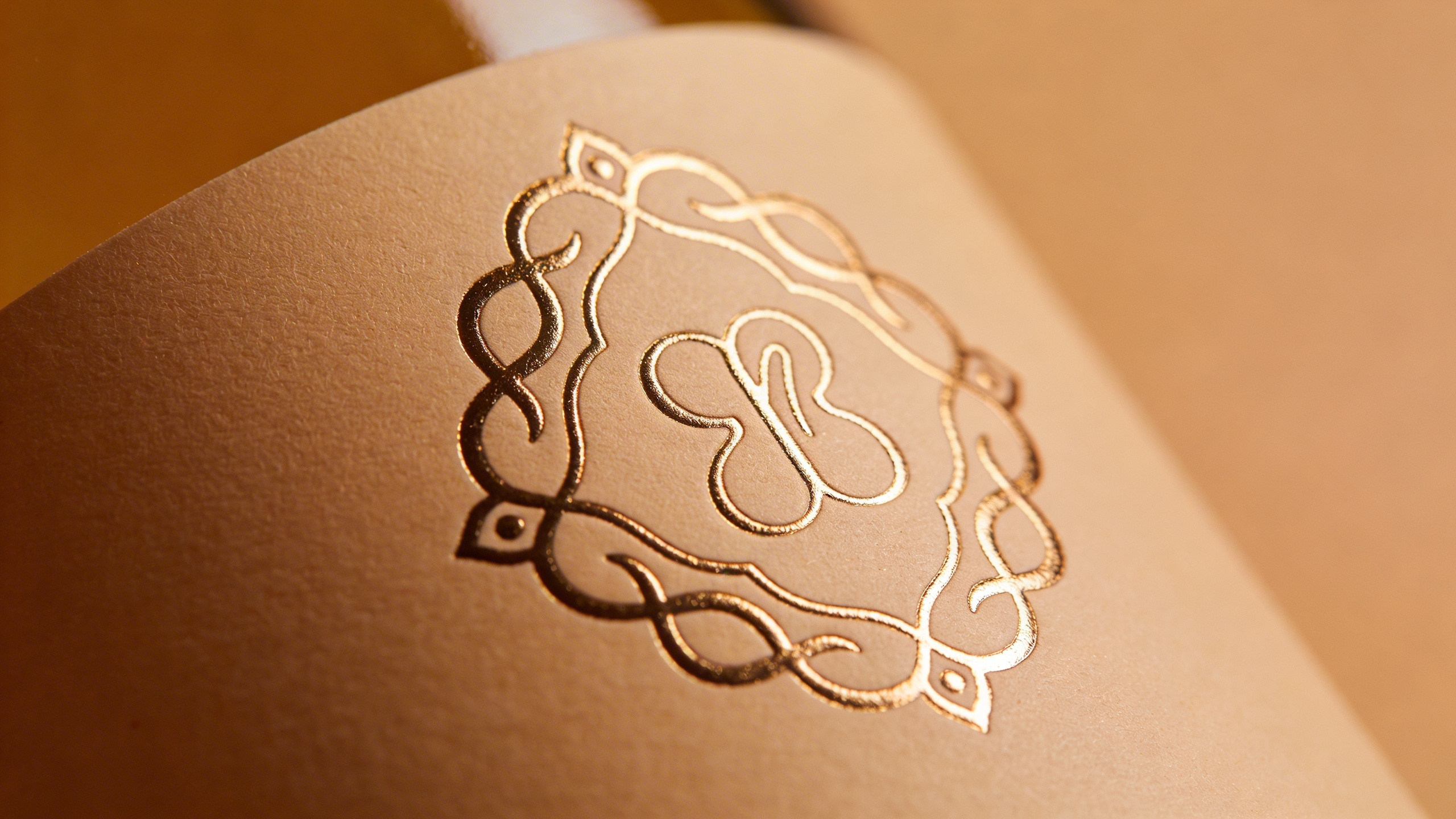
Foil stamping transforms standard pressure-sensitive labels into premium assets that command shelf attention. This embellishment technique utilizes heat, pressure, or adhesives to bond metallic or pigmented film onto a massive variety of substrates. It creates a tactile and visual contrast that standard inks cannot replicate, making your products stand out as a one of a kind offering.
Brands leverage this finishing process to elevate packaging design and signal luxury to consumers. The difference lies in the distinct reflectivity and slight dimensionality provided by the foil layer. Unlike metallic inks, which often appear flat or dull due to absorption, foil remains on the surface and reflects light dynamically, providing a high quality vibrancy to every custom gold or silver foil element.
Understanding the technical execution of this process is critical for production managers and packaging designers. The choice between application methods dictates the final visual quality and the budgetary requirements of the print run. Selecting the right approach requires analyzing the substrate compatibility and design complexity of your custom foil labels.
The core mechanism of adding foil revolves around transferring a specialized film carrier onto the label material. This film consists of multiple layers including a polyester carrier, a release coat, a lacquer or pigment layer, a metalized layer, and finally an adhesive layer. The transfer must be precise to maintain the integrity of the metallic foil artwork.
Successful transfer relies on the interaction between the machine tooling and the surface energy of the label stock. Whether using a rotary press for high-speed runs or a flatbed system for intricate detail, the goal is total adhesion without picking or flaking. The process essentially welds the design onto the material surface, ensuring the final product remains durable and long-lasting on the shelf.
This embellishment serves as more than just decoration; it acts as a tool for brand differentiation. In competitive retail environments like wine, spirits, and cosmetics, the reflective quality of gold foil labels or silver accents triggers an immediate association with high value for the customer. Efficient execution leads to significant ROI through increased purchase intent and expert presentation.
Hot foil stamping remains the traditional standard for luxury and precision. This method uses a heated metal die, usually made of brass, copper, or magnesium, to physically press the foil onto the substrate. The combination of heat and pressure activates the adhesive layer on the foil, bonding it permanently to the paper or film to create premium foil product labels.
The primary advantage of the hot process is the tactile finish it produces. Because the die presses into the material, it creates a slight deboss effect that adds physical depth. This method produces crisp edges and provides superior opacity, making it the ideal choice for dark or textured label stocks where high contrast is necessary for silver foil labels.
Cold foil stamping offers a faster and often more cost-effective alternative for varying designs. Instead of heat, this process utilizes a UV-curable adhesive printed onto the substrate in the shape of the design. The foil web is pressed into the adhesive, cured under UV light, and the excess carrier film is stripped away, allowing for waterproof results on jars or bottles.
Cold foil excels in speed and gradient application. Since it utilizes a flexographic plate rather than a metal die, setup times are reduced, and registration adjustment is easier on press. It allows for overprinting, where ink is applied over silver foil labels to create thousands of custom metallic foil color variations in a single pass.
The market offers an extensive library of foil formulations designed for specific visual outcomes and substrate compatibilities. Designers must move beyond basic reflectivity to consider texture, refraction, and durability. The selection process influences not only the aesthetic but also the label's resistance to scuffing and environmental factors during shipping.
Choosing the correct foil formulation prevents production failures such as inconsistent coverage or poor edge definition. Factors such as the release tightness of the foil carrier must match the press speed and the tack of the adhesive. Without this technical match, the visual effect will suffer from pinholing or incomplete transfer of your metallic labels.
Standard metallic foils offer high brilliance, while pigment foils provide matte or gloss solid colors without the metallic sheen. The latter acts as a robust, opaque alternative to double-hit screen printing. Every foil type contributes a specific "hand" or feel to the finished packaging, influencing the consumer's tactile experience with the final product.
Gold and silver remain the dominant choices for brand owners seeking instant premium recognition. However, the spectrum of metallic foils extends far beyond these two standards. Copper, rose gold, bronze, and gunmetal offer contemporary alternatives that align with modern design trends and help make your products pop.
Colored metallics leverage the same reflective properties as gold foil labels but introduce brand-specific hues such as metallic reds, blues, or greens. These are achieved through tinted lacquer layers within the foil structure. They provide vibrant saturation that ink on metalized paper cannot easily achieve for your custom metallic foil needs.
Pigment foils are essentially dry paint transferred via heat. These are valuable for applying light-colored text, like white or cream, onto clear or dark substrates. Pigment stamping creates a solid, flat look that is incredibly opaque. It solves readability issues on transparent containers without the need for heavy screen-printed inks, giving a luxurious finish.
Holographic foils introduce a dynamic element of light refraction to the label design. These films contain micro-embossed patterns that diffract light, creating a rainbow spectrum or specific 3D effects as the viewing angle changes. Holographic labels are highly effective for shelf-appeal in youth-oriented or tech-focused markets.
Patterned foils offer pre-set designs such as pillars, bubbles, or cracked ice textures. Using these foils adds intrinsic detail to a design without requiring complex die patterns. They are often used as background elements or borders to create depth and visual noise that draws the eye to your custom die-cut labels.
Beyond aesthetics, holographic foils serve a crucial function in brand protection and security. Custom holographic patterns are difficult to counterfeit, making them a practical choice for pharmaceutical or high-end electronics packaging. This dual purpose of security and beauty maximizes the utility of the packaging budget and ensures the final product is one of a kind.
Effective foil application relies on restraint and intentionality within the design hierarchy. Covering an entire label in foil can overwhelm the consumer and reduce legibility. The goal is to guide the eye to key informational or emotional triggers on the package sticker.
Contrast is the driving force behind successful placement. Foil generates the most impact when it is juxtaposed against matte, soft-touch, or uncoated porous paper surfaces. This interplay between light-absorbing and light-reflecting materials creates the visual tension that signifies luxury and delivers a premium foil experience.
Designers should view foil as a highlighting tool rather than a background filler. It works best when used to accentuate specific structural elements of the brand identity. Overuse dilutes the premium feel and creates a "discount" aesthetic that can damage brand perception on the shelf.
The brand logotype is the most common candidate for foil embellishment. Rendering the brand name in gold or silver ensures it remains the focal point regardless of lighting conditions. This technique establishes immediate brand recognition and ensures the name pops off the shelf from a distance, satisfying the most demanding client.
Borders and frames benefit significantly from the structural definition foil provides. A thin metallic stroke can contain the design and separate the label visually from the bottle or container color. This is particularly useful for clear labels on dark glass, where edges might otherwise disappear, making the final product look truly luxurious.
Filigree and ornamental flourishes also serve as prime candidates for foil stamping. These intricate details catch the light at different angles, creating a shimmering effect that invites closer inspection. This application is standard in high-end gift boxes and the wine industry to suggest heritage, complexity, and craftsmanship.
Designing for foil requires strict adherence to physical limitations imposed by the die-making and transfer process. Digital designs can be zoomed into infinity, but the physical world has hard limits regarding tolerance and spread. Ignoring these constraints leads to expensive pre-press revisions for your foil product.
The viscosity of the adhesive and the heat expansion of the metal die dictate the fidelity of the print. Designers must account for "spread," which is the slight expansion of the image area when pressure is applied. Designs created without this tolerance will look heavy or blurry in the final output, losing the vibrancy intended in the template.
Vector files are mandatory for all foil tooling production. Raster images do not provide the clean lines required for acid-etching or CNC milling metal dies. Ensuring paths are closed and complexities are simplified will streamline the transition from digital art to physical tooling for your custom labels.
The most critical specification in foil design is minimum line weight. For hot stamping, lines thinner than 0.25 points often fail to hold the foil or break during the transfer. The die cannot effectively heat such a narrow surface area to activate the adhesive and deliver a clean metallic shine.
Cold foil allows for slightly finer detail due to the nature of flexographic plate imaging. However, lines below 0.15 points still risk poor definition or ragged edges. The adhesive may not transfer cleanly from the anilox roller to the plate and then to the film or paper substrate.
Positive lines (foil on paper) are generally safer than negative lines (paper showing through foil). When knocking out thin lines from a solid block of foil, the foil tends to bridge the gap. Designers should increase the weight of knockout lines to at least 0.5 points to ensure they remain open on the roll.
Typography selection is vital when incorporating foil elements. Serif fonts with extremely thin crossbars often suffer from breaks where the foil fails to adhere. Conversely, heavy bold fonts can fill in at the counters (the holes in "e", "a", or "o") due to foil spread on your product labels.
Kerning and tracking must be opened up significantly for foil text. The slight expansion of the foil material can cause letters to merge if they are set too tightly. A loose track that looks slightly awkward on screen often prints perfectly readable on the final custom foil labels.
Avoid using foil for body copy or ingredient lists. The high reflectivity can make small text difficult to read under store lighting due to glare. Reserve foil for headlines, logos, and large graphic elements where the reflective quality enhances rather than hinders legibility for the consumer.
Even with perfect design files, the physical production process can encounter variables that degrade quality. Understanding common defects allows for quicker diagnosis and correction on the press. Most issues stem from a mismatch between heat, pressure, and dwell time, which are critical for silver and gold foil results.
Substrate selection plays a massive role in defect rates. Uncoated, textured papers are notoriously difficult for foil applications because the foil must bridge the peaks and valleys of the paper fibers. This often requires higher pressure, which can lead to distortion or embossing issues for your premium foil stickers.
Operators and designers must maintain a feedback loop. If a specific foil color or manufacturer consistently causes issues on a specific machine, alternatives must be sourced. There is often a trade-off between the visual shade of the metal and the "release" characteristics of the carrier film used in custom foil labels.
Cracking at the edges of the foil usually indicates a flexibility mismatch. If the label is applied to a tight radius (like a neck label on a bottle), a brittle foil will fracture. Selecting a foil with high elongation properties prevents this post-application failure and ensures high quality.
Misregistration is the misalignment of the foil relative to the printed ink. This is a common challenge, especially with hot stamping on roll labels. To mitigate this, designers should include a "trap" overlap of roughly 0.2mm to 0.5mm where the foil meets the ink, hiding minor shifts for an expert finish.
Dirty edges or "flashing" occur when excess foil transfers outside the intended design area. This is often caused by excessive heat or pressure squeezing the adhesive outward. On cold foil, it suggests the adhesive viscosity is too low, causing it to slump before lamination and curing.
A systematic approach to specification ensures that the vision aligns with manufacturing realities. The checklist serves as a gatekeeper, preventing technically unfeasible projects from reaching the proofing stage. It harmonizes the three pillars of label production: material, machinery, and pricing.
Start by defining the lifecycle of the label. Is it for a wine bottle stored in a cellar, or a shampoo bottle in a humid shower? Environmental resistance dictates the grade of foil required. Standard decorative foils may oxidize or peel under high moisture or chemical exposure conditions, so waterproof options are vital for jars.
Consult with the converter or printer early in the design process. They can provide swatch books that detail the gloss level and release characteristics of available sheet or roll stocks. Matching the foil manufacturer to the printer's capabilities avoids sourcing delays and ensures excellent customer service.
The substrate dictates the stamping method. Porous, uncoated wine stocks generally require hot stamping because the adhesive in cold foil is absorbed too quickly into the paper fibers. Plastic films (BOPP, PE, PP) are excellent candidates for cold foil due to their smooth, non-absorbent surfaces, providing a vibrant metallic look.
Budgeting involves analyzing tooling costs versus run length. Hot stamping requires expensive metal dies, making it costly for short runs but economical for long runs due to lower material waste. The initial investment in the die pays off in quality and speed for high-volume orders, providing a luxurious result.
Cold foil requires practically zero tooling investment beyond standard flexo plates. This makes it the budget-friendly choice for short-to-medium runs or designs that change frequently, providing a quick quote for the client. However, for sheer luxury and tactile prestige, brands often absorb the higher cost of hot stamping to secure a premium market position.