
Contact Sales Now
Thank you! Your submission has been received!
Oops! Something went wrong while submitting the form.

Contact Sales Now
Thank you! Your submission has been received!
Oops! Something went wrong while submitting the form.

Color consistency defines brand identity on the shelf. Deviations in hue or saturation do not merely affect aesthetics; color accuracy impacts how customers perceive the label printing quality. They signal poor quality control to the consumer and erode brand trust in the printer and the product.
Achieving perfect color matching in label conversion requires identifying variables before the press runs. It involves a systematic approach to substrate selection, professional color management, and mechanical calibration to ensure colors appear as intended.
Understanding the root cause of color variation requires looking beyond the artwork file. The physical interaction between ink and material drives most color discrepancies. A label is not a static canvas but a dynamic interplay of chemistry and physics where color remains a shifting variable.
Light refractions change based on the surface texture of the material. Even with identical ink formulations, the perceived color shifts depending on how the light hits the pigment and reflects back to the human eye, making precise color difficult to achieve without color management tools.
The material chosen for the label dictates the final color outcome more than any other variable. Porous materials like matte estate papers or uncoated stocks absorb liquid ink rapidly. This absorption causes dot gain, where half-tone dots spread and darken the image, affecting achieving perfect color.
Ink absorption reduces the gloss level and chromatic intensity. The same red printed on uncoated paper will appear muted and darker compared to a gloss white polypropylene. This is physical absorption versus surface holdout, which complicates color match efforts during the printing process.
Synthetic films generally offer superior ink holdout. The ink sits on top of the surface, curing instantly with UV lamps. This results in sharper dots and more vibrant saturation. However, films introduce their own challenges regarding adhesion and surface tension, requiring constant color monitoring.
The "white point" of the substrate also alters the baseline measurements. Not all white materials are the same grade of white. Some papers have a creamy or yellowish tint, while others are brightened with optical agents, which can lead to color issues later.
When you print translucent CMYK inks over a yellowish paper, the substrate color acts as a filter. Cyan may shift toward green because of the underlying yellow tone of the face stock. Achieving color accuracy starts with measuring the substrate brightness to ensure that the color outcome is predictable.
The pressroom environment acts as a silent variable in color fidelity. Fluctuations in temperature and humidity directly impact the viscosity of water-based and UV inks. As viscosity changes, the amount of ink transferred to the plate changes, making it harder to maintain color across the run.
High humidity can cause paper stocks to swell or distort. This hygroscopic expansion affects registration and color overlap. If the magenta plate does not align perfectly with the yellow, the resulting red simulation will look muddy or blurry, impacting color quality.
Mechanical variances on the press also contribute to shifts. The condition of the anilox rolls in flexographic printing determines ink volume. An anilox roll with clogged cells delivers less pigment, resulting in a weak or washed-out image that fails to meet industry color standards.
Doctor blades, which wipe excess ink from the anilox, wear down over time. As they wear, they may allow streaks or uneven ink distribution. Regular maintenance of printing equipment is required to ensure the mechanical transfer of color remains consistent throughout the production.
Digital design works in RGB, but physical printing relies on subtractive color models like cmyk color. The translation between light-based color and pigment-based color is where many errors originate. Bridging this gap requires strict adherence to standardized color models and every color profile.
Brands must decide early whether to prioritize gamut range or budget. The choice of color system dictates the constraints of the final output. Understanding these limitations through color theory prevents disappointment during the press check.
CMYK printing blends Cyan, Magenta, Yellow, and Black to create a spectrum of colors. This is efficient for photographic images and multi-colored designs. However, the CMYK gamut is limited and cannot reproduce every color verifyable by the human eye, often requiring real-time color adjustment.
Bright oranges, neon greens, and deep navy blues often fall outside the reach of the standard four-color process. When a brand color falls "out of gamut," the press approximates the closest possible match, often resulting in a duller version that fails to meet color expectations.
Spot color, or Pantone Matching System (PMS) inks, solve this issue. These are pre-mixed formulations that deliver a precise color regardless of the other colors on the label. Using a spot color ensures color accuracy and guarantees consistency for logos and brand elements.
Extended Gamut printing helps bridge the gap between CMYK and Spot. By adding Orange, Green, and Violet (OGV) to the CMYK station, printers can simulate roughly 90% of the Pantone library without changing physical inks, achieving perfect color reproduction.
Visual approval is subjective and unreliable. What looks correct to one manager may look off to another. Professional color management moves away from "eyeballing" and toward data-driven metrics using Delta E (ΔE) to ensure color accuracy throughout the printing process.
Delta E measures the distance between two colors in a three-dimensional color space (CIELAB). It calculates the difference between the target standard and the actual printed sample. A lower number indicates a closer match and better color fidelity.
A Delta E of less than 1.0 is generally imperceptible to the human eye. Most commercial print contracts specify a tolerance of Delta E < 2.0 or < 3.0. Establishing this numerical standard removes subjectivity and is a core part of an effective approach to color management.
Brand guidelines must clearly state which illuminant measurement is used. Colors look different under store lighting (fluorescent) versus daylight (D50). This phenomenon is known as metamerism and must be accounted for to avoid color issues on the shelf.
The proof is the contract between the brand and the printer. However, misconceptions about what a proof represents can lead to production errors. Distinguishing between a layout guide and a color contract is necessary for accurate color expectations and achieving the desired color.
Relying solely on on-screen PDFs creates a false sense of security. Monitors emit light, whereas labels reflect light. An uncalibrated monitor cannot accurately predict how ink will look on a specific physical material or ensure color accuracy across different devices.
A digital "soft proof" is primarily for verifying content, layout, and spelling. It confirms that the barcode is in the right place and the ingredients are legible. It is rarely an accurate predictor of final color output or maintaining consistent color across different platforms.
For critical color matching, a physical "hard proof" or "contract proof" is required. This is a high-resolution inkjet print calibrated to simulate the specific press profile and substrate. It serves as the master target for the press operator to maintain color accuracy throughout.
However, even hard proofs have limitations. Inkjet proofing systems do not use the exact same ink or curing method as a flexographic press. They are simulations. They provide a high-confidence target but not a molecularly identical replica, which is why professional color management is critical.
For the highest level of assurance, a "fingerprint" or press proof is conducting. This involves running the actual job on the actual press. While expensive, it is the only way to see exactly how the ink interacts with the substrate and achieve perfect color reproduction.
Color consistency requires a singular point of truth. Large brands often have disconnected approval flows. One team designs the file, another approves the digital proof, and a third attends the press check, which can lead to color discrepancies.
This fragmentation introduces variance. The person signing off on the production run may not know the original intent of the designer. Centralizing color ownership helps maintain the integrity of the brand vision and ensures that the color of printed materials remains constant.
Implemented color management systems (CMS) cloud-based tools can bridge this gap. These platforms allow all stakeholders to view spectral data and digital standards. Everyone works from the same set of numbers rather than subjective memory to ensure that the color remains consistent.
Brands should require their print partners to sign off on a "Golden Sample." This physical label becomes the locked standard for all future runs. It should be stored in a dark, climate-controlled environment to avoid color fading and maintain the original background color.
Once the job is on press, the focus shifts to process control. The goal is to keep the color stable from the start of the roll to the end. Press operators rely on both technology and technique to minimize fluctuation and ensuring color consistency across every label.
Modern printing presses utilize closed-loop systems to monitor output. These systems automatically adjust ink keys and registration to stay within the defined Delta E tolerances. Automation reduces human error and fatigue, making color management ensures better results.
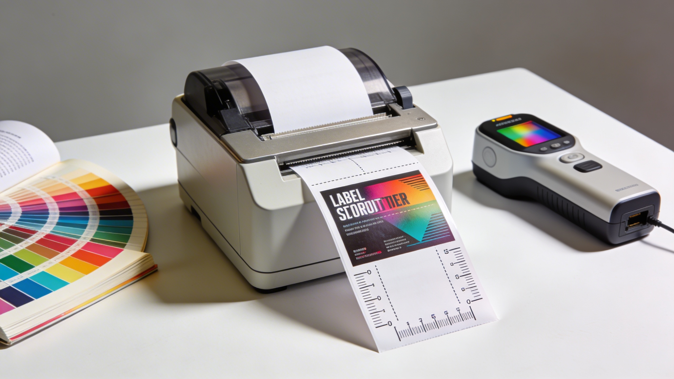
Subjective color assessment is obsolete in high-end label printing. Press operators use handheld or inline spectrophotometers to measure color bars printed in the waste matrix of the label. These devices provide instant spectral data for color verification.
The spectrophotometer reads the spectral curve of the printed ink. It compares this data against the digital reference profile (such as GRACoL or SWOP). If the variance exceeds the tolerance, the operator knows exactly which ink station to adjust to achieve perfect color.
Regular calibration of the press itself is mandatory. This involves "fingerprinting" the press to specific substrates. The printer creates an ICC profile that tells the prepress software exactly how the press reproduces color on that specific machine, ensuring consistent color reproduction.
Laminates and varnishes also affect the final reading. A spectrophotometer reading taken before lamination will differ from the final appearance. Operators must measure both the wet ink and the finished label to maintain color accuracy throughout the printing.
The true test of a printer is not the first run, but the fifth or tenth. Brands demand that a label printed in January matches the one printed in July. This is repeatability, and it relies on strict process standardization and maintaining consistent color across different runs.
Printers must record the exact recipe used for spot colors. Ink kitchens weigh pigments to the gram to ensure the formulation is identical every time. Using "leftover" ink from previous jobs without re-verifying the hue is a common cause of color drift.
Press settings must also be archived. The anilox volume, running speed, and curing temperature should be replicated. If a job is moved from a flexo press to a digital press for a short run, color matching becomes significantly harder, requiring precise color management.
Digital printing offers better repeatability than analog methods. Because there are no plates or mixing of inks, a digital press can hit the same target repeatedly, assuming the machine is calibrated and the substrate remains constant for consistent color reproduction across different orders.
When a label arrives looking different than expected, the investigation must be methodical. Blaming the printer is easy, but often the issue lies in the upstream data or material choices. Isolating the variable is key to maintaining consistent color across the supply chain.
Understanding the interplay between file setup and material interaction solves most mysteries. A slight change in one area can have a cascading effect on the final visual result and impact color accuracy significantly.
Prepress errors are a leading cause of color mismatch. Designing in RGB or not converting spot colors properly leads to unpredictable results. When an RGB file is converted to CMYK by the RIP software, the gamut is compressed, making professional color management essential.
The "rendering intent" setting determines how the software handles out-of-gamut colors. "Perceptual" rendering shifts all colors to maintain relationships, while "Relative Colorimetric" clips out-of-gamut colors to the nearest match. Choosing the wrong intent shifts the entire palette and affects color results.
Overprinting settings also cause issues. If a dark text is set to overprint a background color, it may change hue. Conversely, "knocking out" white text on a rich black background requires precise registration to avoid color halos and maintain color quality.
Designers must embed the correct ICC profiles in their PDF exports. Without an output profile, the printer’s software assumes a default standard that may not align with the designer’s screen environment, which can lead to color discrepancies.
Supply chain issues often force brands to switch material providers. While two materials may both be labeled "White BOPP," their surface chemistry can differ. A slight difference in the topcoat changes how the ink wets out, affecting the specific color reproduction.
Adhesives can also impact color, particularly on thin or clear films. A reactive adhesive may yellow over time, altering the appearance of the label face. Liner thickness affects how the sensor reads the gap, but can also subtly affect winding tension and color laydown, making achieving perfect color a challenge.
Varnishes and laminates act as optical filters. A matte laminate will desaturate colors and lower contrast, making blacks appear dark gray. A high-gloss laminate increases contrast and makes colors appear deeper, shifting the overall color output.
If a brand approves a proof without the laminate simulation, the final product will look drastically different. The entire structure—ink, substrate, plus finish—must be evaluated as a single optical unit to ensure color accuracy across the entire run.
Achieving color accuracy is not an accident; it is an engineered result. Brands that take a proactive role in defining their standards see the best results. Leaving color decisions solely to the print vendor creates ambiguity and leads to inconsistent color reproduction.
By implementing a specific checklist, brands can "lock" their color identity. This reduces the need for expensive re-runs and accelerates time-to-market while ensuring color accuracy throughout the printing process.
Brands with multiple SKUs often face the "rainbow effect" on the shelf. The red on the Strawberry flavor should match the red on the Raspberry flavor logo. Consolidating these runs into a single production batch helps ensure color consistency across all products.
Create a physical "Master Color Book" for the brand. This book contains the approved physical standards for every core brand color on the specific material used. This overrides any digital file or Pantone book and ensures an approach to color management that works.
Request G7 Master Printer certification from vendors. G7 is a methodology that ensures a shared neutral appearance between different devices. A G7 printer has proven their ability to match color across different presses and technologies, providing optimal color quality.
Finally, utilize objective language in feedback. Instead of saying "make it pop more," say "increase saturation in the mid-tones." Precise communication using color management tools minimizes the rounds of revisions and leads to a predictable, accurate label for every order.